
User Interface Overview
Customise the client area experience, from appearance and behavior to registration and checkout.
The user interface for Upmind provides configurable options that allow you to customise the client area experience, client registration, basket flow, and checkout appearance to create a smooth and branded user journey.
This can be accessed from Settings > User Interface under Branding and Customisation.
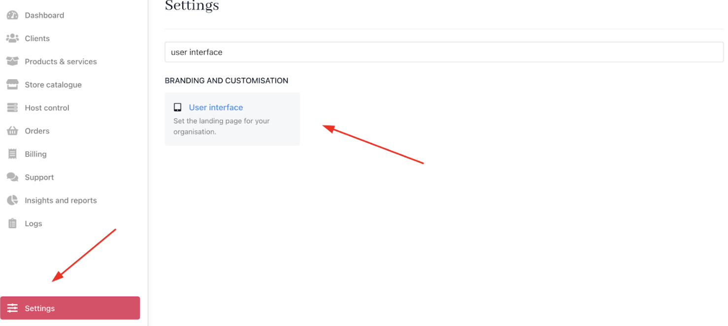
Settings > Branding and Customisation > User Interface
Client area
Adjust the look, feel, and behaviour of your client-facing portal to create a simple branded look.
Field Name | Description |
|---|---|
Landing page | Select the default page visitors see when arriving at your client portal. Options include:
|
Page after login | Determine which page clients first see after signing in:
|
Show catalogue | Control catalogue visibility based on conditions:
|
Enter key action | Define the behavior of the Enter key in forms:
|
Disable support system | Option to enable or disable the integrated support ticketing system. |
Hide client area signup/registration forms | Toggle visibility of signup and registration forms to clients. |
Custom URL for logo button | Set a personalized URL that your brand logo links to within the client area. |
Allow branding for parent clients | Enable parent clients to see brand imagery and appearance. |
Whitelabel login | Render login and password reset pages without branding for a neutral, white-labeled look. |
Client registration
Configure settings related to client account creation.
| Field Name | Description |
|---|---|
| Require phone number | Toggle requirement of a valid phone number during client signup. |
Basket
Customise the user experience and currency handling in the store's shopping basket.
Field Name | Description |
|---|---|
Default basket currency | Determine how basket currency is set for new visitors:
|
Add to basket funneling | Control what happens after users add a product to the basket:
|
Billing term display | Choose how billing terms display when selecting product options:
|
Price before discount position | Decide where the original price displays relative to the discounted price:
|
Payment term descriptions | Select cycle term description style:
|
Truncate product descriptions | Enable or disable truncation of product descriptions in listings. |
Checkout
Customise checkout page layout and appearance.
Field Name | Description |
|---|---|
Checkout flow | Choose your checkout style:
|
Checkout summary colour | Set background color for the checkout summary in one-page checkout; choose a dark or light tone for accessibility. |
Checkout summary colour 2 | Add a second background color to create a gradient effect (optional). |
Checkout summary contrast mode | Select text contrast for checkout summary to ensure readability:
|
Hide promo code field for clients and guests | Optionally hide the promotional code input box during checkout while still allowing automatic promotions. |