> ## Documentation Index
> Fetch the complete documentation index at: https://docs.upmind.com/llms.txt
> Use this file to discover all available pages before exploring further.
# Configuring Options in Cart and Portal
> A full reference for everything you can customise in Cart 2.0's storefront and Client Portal, from layouts and copy to styling and feature toggles.
* **Time** — 20 minutes
* **Difficulty** — Intermediate
**What You'll Build:** A clear understanding of every configurable element across the Cart and Client Portal, including page templates, product layouts, content overrides, design tokens, and feature visibility settings, so you can shape the customer experience from first browse through to post-purchase account management.
**Prerequisites:**
* An active [Upmind account](https://upmind.com/start) with Cart 2.0 enabled.
* Access to **Settings > Brand Settings** in your Upmind admin panel.
* A read-through of [Configuring Your Store with UI Metadata](/using-cart-20/choosing-what-to-implement-for-your-business/configuring-your-store-with-ui-metadata) to understand how context and data settings work.
* A read-through of [Setting Up Theming with CSS Variables](/using-cart-20/choosing-what-to-implement-for-your-business/setting-up-theming-with-css-variables) to understand how design tokens are applied.
* Basic familiarity with JSON and CSS syntax.
Cart 2.0 is designed to adapt to your brand and product model rather than forcing your business to adapt to a fixed checkout. Customisation is handled through a combination of **UI metadata**, **design tokens**, and **component-level configuration**, giving teams control without fragmenting logic or introducing fragile overrides.
This section covers what can be customized in the **Cart** and the **Client Portal**.
## What is configurable in the Cart
The Cart is the customer-facing purchase experience, from browsing products to confirmation. Nearly every visible and behavioural element can be adjusted without rewriting core logic. You can configure the following:
1. Layout and structure
2. Content and copy
3. Visual styling and branding
4. Feature visibility and behaviour
### 1. Layout and structure
#### **Templates**
Templates can be set on the various contexts to allow users to customise pages in their store with different layouts.
These are configured through the **UI Schema** in your brand settings. The setting key follows this format:
```text theme={null}
@context.{page}.template
```
These can be set globally (`*`) to apply that template to all applicable pages.
`JSON` **Example:**
```json JSON theme={null}
{
"@context.*.template": = "two-column-ltr"
}
```
Or by `{page}` context specifically, such as (`@context.checkout.template`) for the checkout page to use the "full" template.
`JSON` **Example:**
```json JSON theme={null}
{
"@context.checkout.template": = "full"
}
```
This sets every page to use the **Two Column (Left-to-Right)** template. You can then override individual pages by also specifying their specific context.
* @context.\*.template = two-column-ltr > all pages default to this
* @context.auth.template = canvas-card > login/register pages override to this
`JSON` **Example:**
```json JSON theme={null}
{
"@context.*.template": = "two-column-ltr",
"@context.auth.template": = "canvas-card"
}
```
In this example, every page uses the two-column layout except the login and registration pages, which use the centred card style instead.
* **Login & Registration (auth)**
| **Template Value** |
| -------------------------- |
| `two-column-ltr` (Default) |
| `two-column-rtl` |
| `split` |
| `canvas-card` |
| `surface-box` |
| `enclosed` |
Auth template context does not support `full` template.
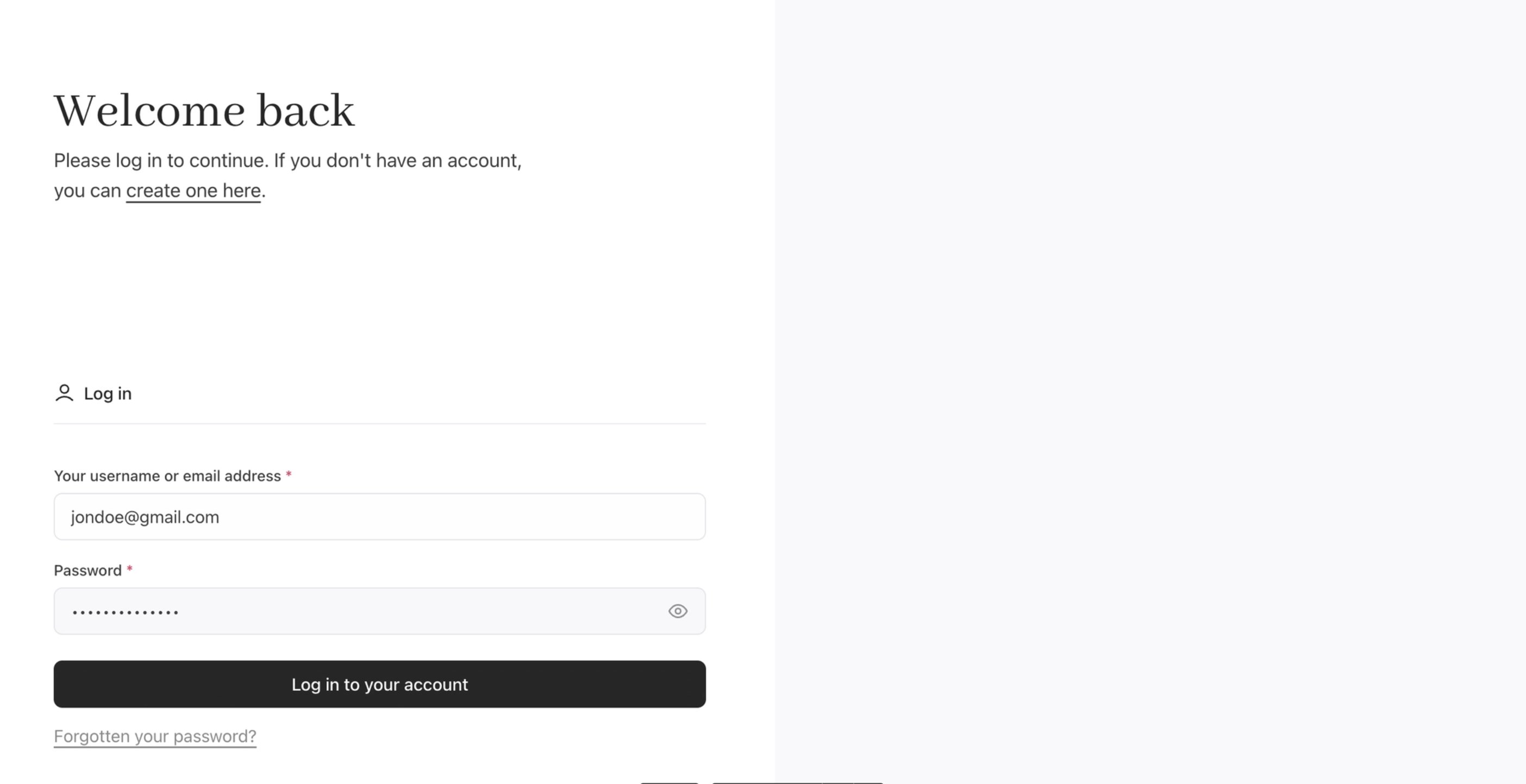
`JSON` **Example**: Registration (Split) - Full-width horizontal split. No header or footer visible. Clean, minimal design with the form centred.
```json JSON theme={null}
{
"@context.auth.template": "split"
}
```
 * **Product Configuration (configure)**
| **Template Value** |
| -------------------------- |
| `two-column-rtl` (Default) |
| `two-column-ltr` |
| `full` |
| `enclosed` |
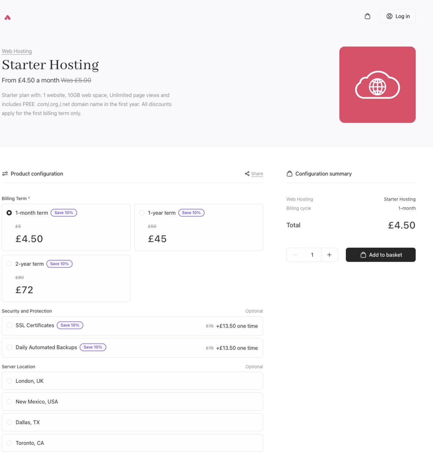
`JSON` **Example**: Product Configuration (full) - Full-width single column. All configuration options and product details stack vertically. Good for simple products with few options.
```json JSON theme={null}
{
"@context.configure.template": "full"
}
```
* **Product Configuration (configure)**
| **Template Value** |
| -------------------------- |
| `two-column-rtl` (Default) |
| `two-column-ltr` |
| `full` |
| `enclosed` |
`JSON` **Example**: Product Configuration (full) - Full-width single column. All configuration options and product details stack vertically. Good for simple products with few options.
```json JSON theme={null}
{
"@context.configure.template": "full"
}
```
 * **Basket (basket)**
| **Template Value** |
| -------------------------- |
| `two-column-ltr` (Default) |
| `two-column-rtl` |
| `full` |
| `enclosed` |
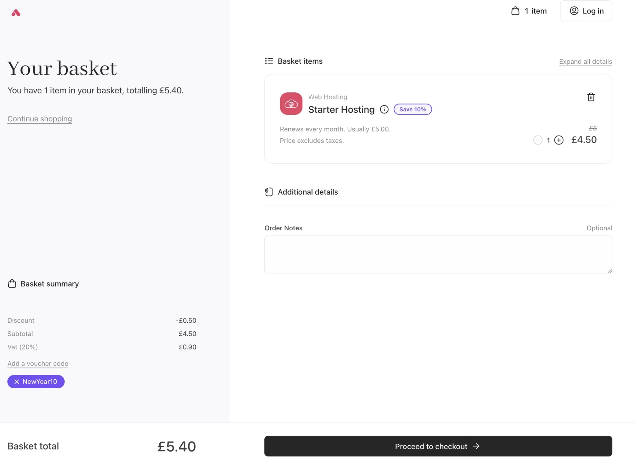
`JSON` **Example**: Basket (two-column-rtl) - Order summary on the left, product list on the right.
```json JSON theme={null}
{
"@context.basket.template": "two-column-rtl"
}
```
* **Basket (basket)**
| **Template Value** |
| -------------------------- |
| `two-column-ltr` (Default) |
| `two-column-rtl` |
| `full` |
| `enclosed` |
`JSON` **Example**: Basket (two-column-rtl) - Order summary on the left, product list on the right.
```json JSON theme={null}
{
"@context.basket.template": "two-column-rtl"
}
```
 * **Checkout (checkout)**
| **Template Value** |
| -------------------------- |
| `two-column-ltr` (Default) |
| `two-column-rtl` |
| `full` |
| `enclosed` |
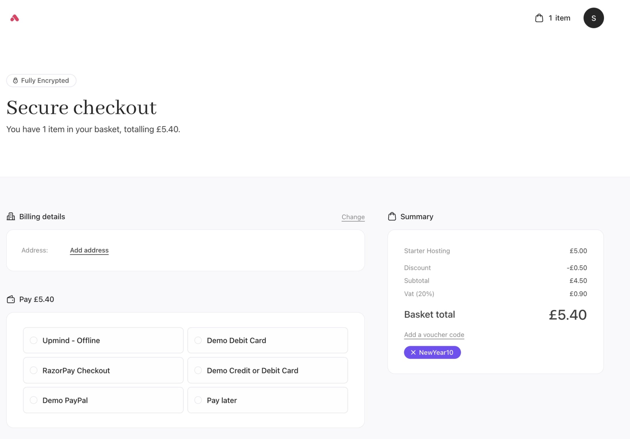
`JSON` **Example**: Checkout (enclosed) - Checkout content wrapped in a card container. Gives a self-contained, focused checkout experience.
```json JSON theme={null}
{
"@context.checkout.template": "enclosed"
}
```
* **Checkout (checkout)**
| **Template Value** |
| -------------------------- |
| `two-column-ltr` (Default) |
| `two-column-rtl` |
| `full` |
| `enclosed` |
`JSON` **Example**: Checkout (enclosed) - Checkout content wrapped in a card container. Gives a self-contained, focused checkout experience.
```json JSON theme={null}
{
"@context.checkout.template": "enclosed"
}
```
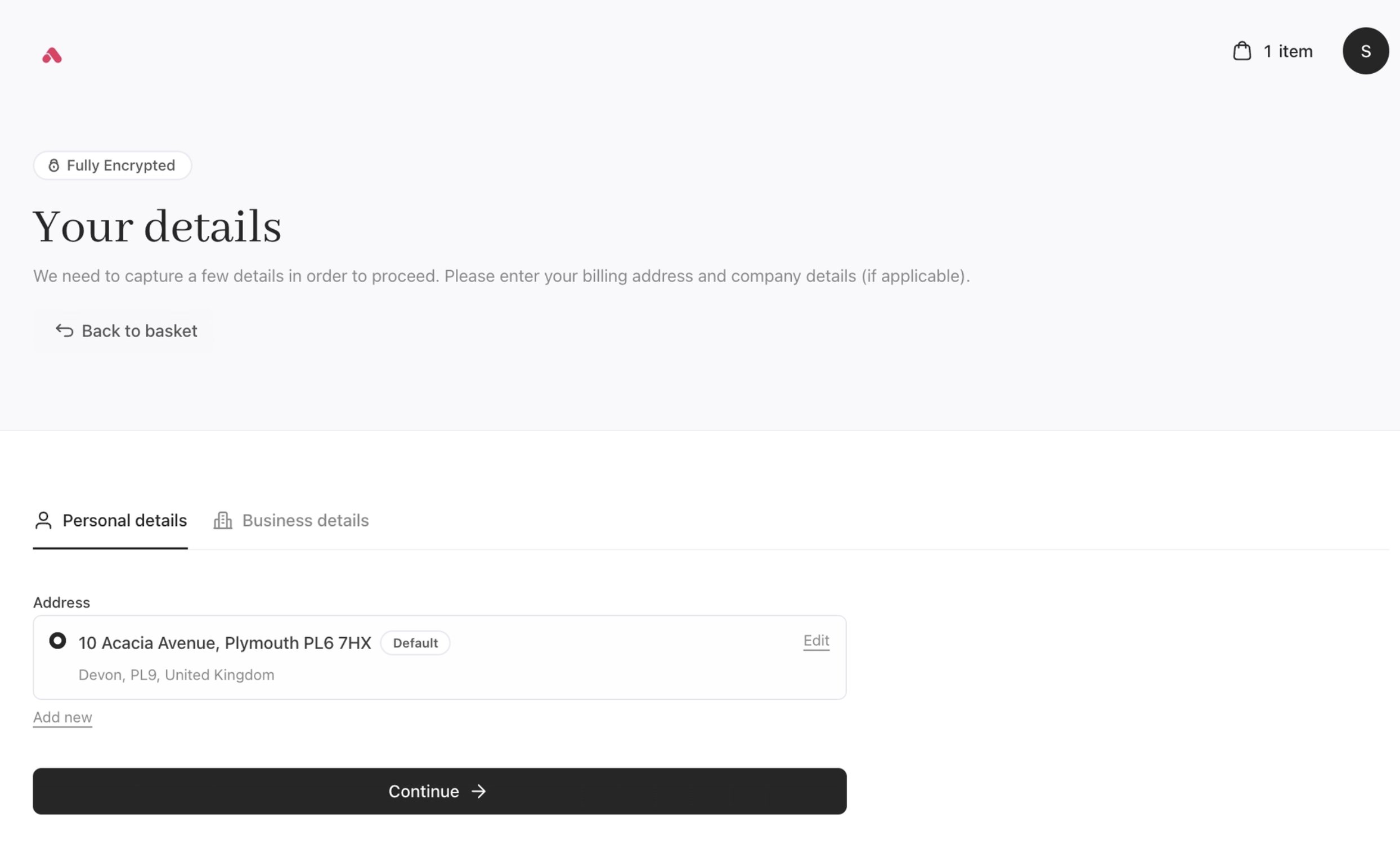
 * **Billing Details (billing\_details)**
| **Template Value** |
| -------------------------- |
| `two-column-ltr` (Default) |
| `two-column-rtl` |
| `full` |
| `enclosed` |
`JSON` **Example**: Billing details (full) - Full-width single column.
```json JSON theme={null}
{
"@context.billing_details.template": "full"
}
```
* **Billing Details (billing\_details)**
| **Template Value** |
| -------------------------- |
| `two-column-ltr` (Default) |
| `two-column-rtl` |
| `full` |
| `enclosed` |
`JSON` **Example**: Billing details (full) - Full-width single column.
```json JSON theme={null}
{
"@context.billing_details.template": "full"
}
```
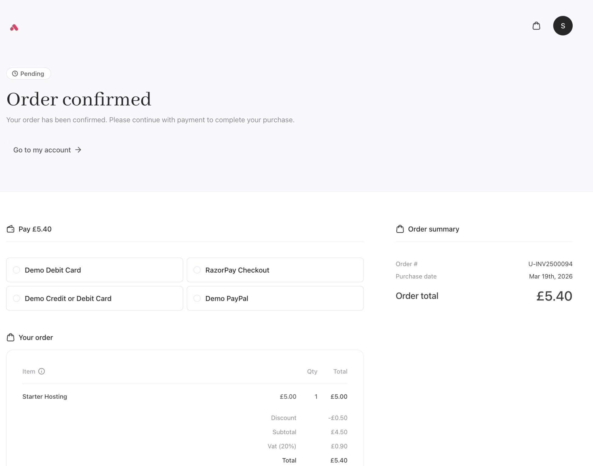
 * Order Confirmation (confirmation)
| **Template Value** |
| -------------------------- |
| `two-column-ltr` (Default) |
| `two-column-rtl` |
| `full` |
| `enclosed` |
`JSON` **Example**: Order Confirmation (full) - Full-width single column.
```json JSON theme={null}
{
"@context.confirmation.template": "full"
}
```
* Order Confirmation (confirmation)
| **Template Value** |
| -------------------------- |
| `two-column-ltr` (Default) |
| `two-column-rtl` |
| `full` |
| `enclosed` |
`JSON` **Example**: Order Confirmation (full) - Full-width single column.
```json JSON theme={null}
{
"@context.confirmation.template": "full"
}
```
 **Appendix: Template Page Contexts**
| **Context** | **Definitions** | **Configuration Key** | **Applies To** |
| ---------------- | -------------------------------------------------------------------------------------------------------------------------------------------------------------------------------------------------------------------- | ---------------------------------- | ----------------------------------------------------- |
| auth | The context for login, registration, and password recovery pages. It has the widest selection of available templates, giving you the most control over the first impression customers get when accessing your store. | @context.auth.template | Login, Registration, and Password Recovery pages |
| configure | The context for the product configuration page, where customers select options, choose billing terms, and fill in any required provisioning fields. | @context.configure.template | Product Configuration page |
| basket | The context for the basket page, where customers review their selected products, quantities, and totals before moving to checkout. | @context.basket.template | Basket / Cart page |
| checkout | The context for the checkout page, where customers enter payment details and complete their purchase. | @context.checkout.template | Checkout / Payment page |
| billing\_details | The context for the standalone billing details page, where customers enter or update the billing information tied to their account. | @context.billing\_details.template | Standalone Billing Details page |
| confirmation | The context for the order confirmation page, shown to customers after a successful purchase. | @context.confirmation.template | Order Confirmation page |
| catalogue | The context for the product catalogue page, where customers browse available products and categories. | @context.catalogue.template | Product Catalogue listing page |
| recommendations | The context for the product recommendations page, where suggested or related products are shown to customers during the buying journey. | @context.recommendations.template | Recommendations / Cross-sell page |
| \* (wildcard) | A global context that applies a setting across all pages at once. Any page with its own specific context setting will take precedence over the wildcard value. | @context.\*.template | All pages simultaneously (can be overridden per-page) |
**Appendix: Template Properties**
| **Context** | **Component** | **Template Enum** | Type | **Default** | **Template Enum Values** |
| ---------------- | ----------------------------- | ------------------------- | ------ | -------------- | ------------------------------------------------------------------------------------- |
| auth | `session/Login.vue` | `SESSION_TEMPLATE` | String | two-column-ltr | `split`, `enclosed`, `canvas-card`, `surface-box`, `two-column-ltr`, `two-column-rtl` |
| auth | `session/Register.vue` | `SESSION_TEMPLATE` | String | two-column-ltr | `split`, `enclosed`, `canvas-card`, `surface-box`, `two-column-ltr`, `two-column-rtl` |
| auth | `session/RecoverPassword.vue` | `SESSION_TEMPLATE` | String | two-column-ltr | `split`, `enclosed`, `canvas-card`, `surface-box`, `two-column-ltr`, `two-column-rtl` |
| basket | `basket/Basket.vue` | `BASKET_TEMPLATE` | String | two-column-rtl | `full`, `two-column-ltr`, `two-column-rtl`, `enclosed` |
| checkout | `checkout/Checkout.vue` | `CHECKOUT_TEMPLATE` | String | two-column-rtl | `full`, `two-column-ltr`, `two-column-rtl`, `enclosed` |
| billing\_details | `billing/Billing.vue` | `BILLING_TEMPLATE` | String | - | `full`, `two-column-ltr`, `two-column-rtl`, `enclosed` |
| configure | `product/Configure.vue` | `PRODUCT_TEMPLATE` | String | two-column-rtl | `full`, `two-column-ltr`, `two-column-rtl`, `enclosed` |
| confirmation | `order/Order.vue` | `ORDER_TEMPLATE` | String | - | `full`, `two-column-ltr`, `two-column-rtl`, `enclosed` |
| basket (edit) | `basket-product/Edit.vue` | `BASKET_PRODUCT_TEMPLATE` | String | | `full`, `two-column-ltr`, `two-column-rtl`, `enclosed` |
#### Other layout and structure settings
You can control how pages are structured across contexts such as catalogue, configuration, basket, checkout, and confirmation. These changes are driven by **context settings**, allowing different behaviour on different screens without duplication.
Configurable elements include:
**JSON Examples**
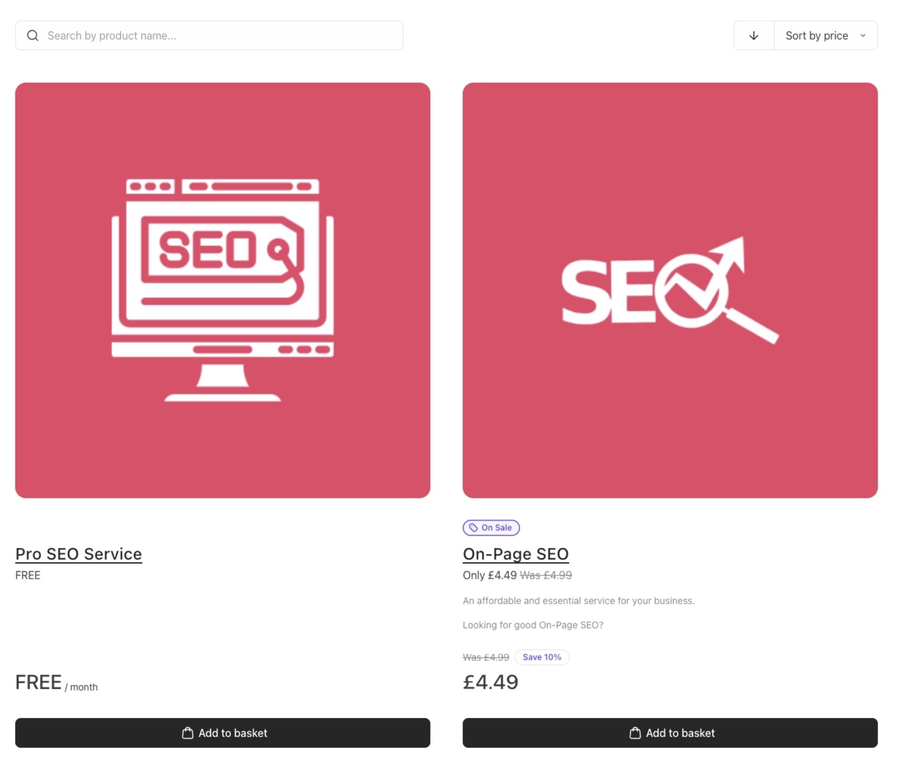
* Product listing layout (grid, list, column count by viewport). The product catalogue list appears with a 2-column layout. The default is a `3-column layout`.
`JSON` **Example**: productListLayout column.
```json JSON theme={null}
{
"@context.catalogue.productListLayout": "2-col"
}
```
**Appendix: Template Page Contexts**
| **Context** | **Definitions** | **Configuration Key** | **Applies To** |
| ---------------- | -------------------------------------------------------------------------------------------------------------------------------------------------------------------------------------------------------------------- | ---------------------------------- | ----------------------------------------------------- |
| auth | The context for login, registration, and password recovery pages. It has the widest selection of available templates, giving you the most control over the first impression customers get when accessing your store. | @context.auth.template | Login, Registration, and Password Recovery pages |
| configure | The context for the product configuration page, where customers select options, choose billing terms, and fill in any required provisioning fields. | @context.configure.template | Product Configuration page |
| basket | The context for the basket page, where customers review their selected products, quantities, and totals before moving to checkout. | @context.basket.template | Basket / Cart page |
| checkout | The context for the checkout page, where customers enter payment details and complete their purchase. | @context.checkout.template | Checkout / Payment page |
| billing\_details | The context for the standalone billing details page, where customers enter or update the billing information tied to their account. | @context.billing\_details.template | Standalone Billing Details page |
| confirmation | The context for the order confirmation page, shown to customers after a successful purchase. | @context.confirmation.template | Order Confirmation page |
| catalogue | The context for the product catalogue page, where customers browse available products and categories. | @context.catalogue.template | Product Catalogue listing page |
| recommendations | The context for the product recommendations page, where suggested or related products are shown to customers during the buying journey. | @context.recommendations.template | Recommendations / Cross-sell page |
| \* (wildcard) | A global context that applies a setting across all pages at once. Any page with its own specific context setting will take precedence over the wildcard value. | @context.\*.template | All pages simultaneously (can be overridden per-page) |
**Appendix: Template Properties**
| **Context** | **Component** | **Template Enum** | Type | **Default** | **Template Enum Values** |
| ---------------- | ----------------------------- | ------------------------- | ------ | -------------- | ------------------------------------------------------------------------------------- |
| auth | `session/Login.vue` | `SESSION_TEMPLATE` | String | two-column-ltr | `split`, `enclosed`, `canvas-card`, `surface-box`, `two-column-ltr`, `two-column-rtl` |
| auth | `session/Register.vue` | `SESSION_TEMPLATE` | String | two-column-ltr | `split`, `enclosed`, `canvas-card`, `surface-box`, `two-column-ltr`, `two-column-rtl` |
| auth | `session/RecoverPassword.vue` | `SESSION_TEMPLATE` | String | two-column-ltr | `split`, `enclosed`, `canvas-card`, `surface-box`, `two-column-ltr`, `two-column-rtl` |
| basket | `basket/Basket.vue` | `BASKET_TEMPLATE` | String | two-column-rtl | `full`, `two-column-ltr`, `two-column-rtl`, `enclosed` |
| checkout | `checkout/Checkout.vue` | `CHECKOUT_TEMPLATE` | String | two-column-rtl | `full`, `two-column-ltr`, `two-column-rtl`, `enclosed` |
| billing\_details | `billing/Billing.vue` | `BILLING_TEMPLATE` | String | - | `full`, `two-column-ltr`, `two-column-rtl`, `enclosed` |
| configure | `product/Configure.vue` | `PRODUCT_TEMPLATE` | String | two-column-rtl | `full`, `two-column-ltr`, `two-column-rtl`, `enclosed` |
| confirmation | `order/Order.vue` | `ORDER_TEMPLATE` | String | - | `full`, `two-column-ltr`, `two-column-rtl`, `enclosed` |
| basket (edit) | `basket-product/Edit.vue` | `BASKET_PRODUCT_TEMPLATE` | String | | `full`, `two-column-ltr`, `two-column-rtl`, `enclosed` |
#### Other layout and structure settings
You can control how pages are structured across contexts such as catalogue, configuration, basket, checkout, and confirmation. These changes are driven by **context settings**, allowing different behaviour on different screens without duplication.
Configurable elements include:
**JSON Examples**
* Product listing layout (grid, list, column count by viewport). The product catalogue list appears with a 2-column layout. The default is a `3-column layout`.
`JSON` **Example**: productListLayout column.
```json JSON theme={null}
{
"@context.catalogue.productListLayout": "2-col"
}
```
 * Visibility of sections such as categories, recommendations, or breadcrumbs. Breadcrumbs can be hidden globally. It is `visible` by default.
`JSON` **Example**: Breadcrumbs visibility.
```json JSON theme={null}
{
"@context.*.breadcrumbs": "hidden"
}
```
* Visibility of sections such as categories, recommendations, or breadcrumbs. Breadcrumbs can be hidden globally. It is `visible` by default.
`JSON` **Example**: Breadcrumbs visibility.
```json JSON theme={null}
{
"@context.*.breadcrumbs": "hidden"
}
```
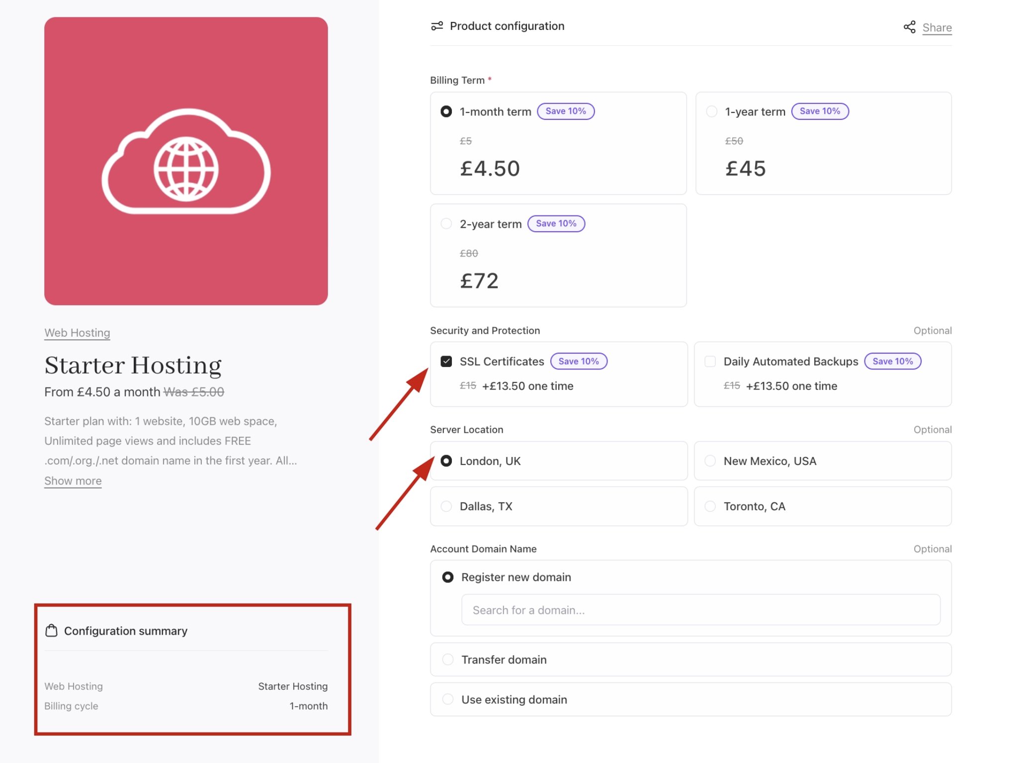
 * Placement of summaries, totals, and action buttons. Even when product options are selected, these will not show in your configuration summary. The default is `visible`.
`JSON` **Example**: productConfigOptionsSummary visibility.
```json JSON theme={null}
{
"@context.*.productConfigOptionsSummary": "hidden"
}
```
* Placement of summaries, totals, and action buttons. Even when product options are selected, these will not show in your configuration summary. The default is `visible`.
`JSON` **Example**: productConfigOptionsSummary visibility.
```json JSON theme={null}
{
"@context.*.productConfigOptionsSummary": "hidden"
}
```
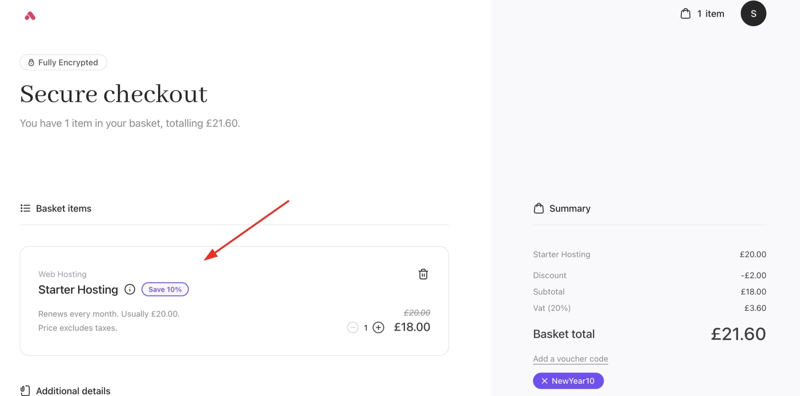
 * Step ordering and visibility within the checkout flow. Basket items can be visible in the checkout. The default is `hidden`.
`JSON` **Example**: basketItems visibility.
```json JSON theme={null}
{
"@context.checkout.basketItems": "visible"
}
```
* Step ordering and visibility within the checkout flow. Basket items can be visible in the checkout. The default is `hidden`.
`JSON` **Example**: basketItems visibility.
```json JSON theme={null}
{
"@context.checkout.basketItems": "visible"
}
```
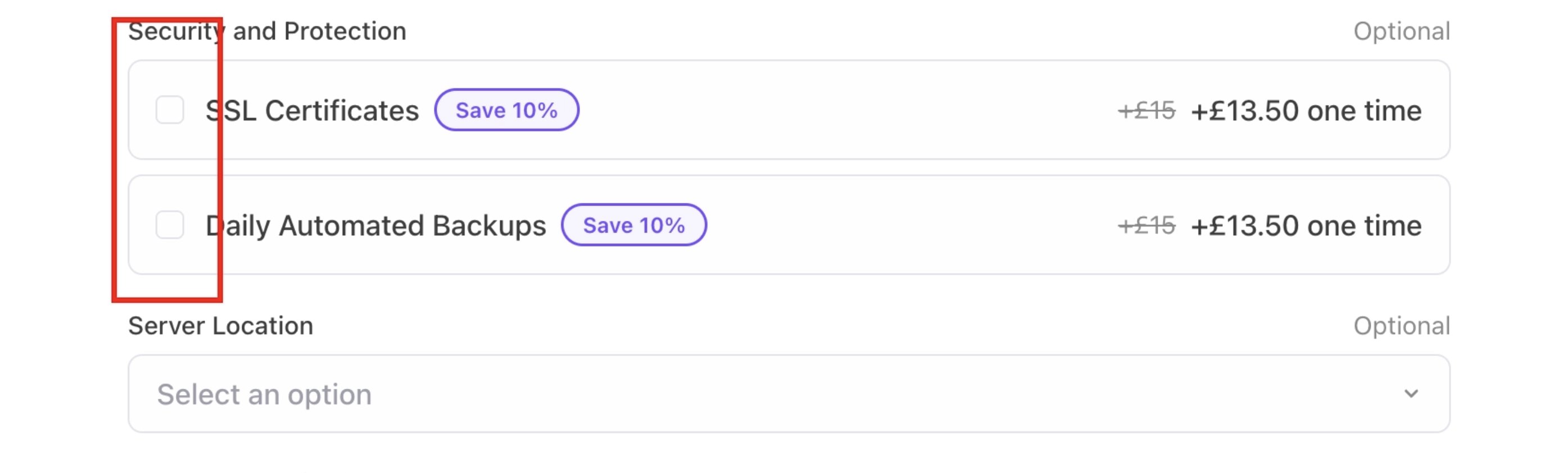
 * Control how product options are displayed and selected by the customer. Renders the option selector in particular layouts. The default is `radio-rows`.
`JSON` **Example**: optionSelector structure.
```json JSON theme={null}
{
"@context.configure.optionSelector": "select"
}
```
* Control how product options are displayed and selected by the customer. Renders the option selector in particular layouts. The default is `radio-rows`.
`JSON` **Example**: optionSelector structure.
```json JSON theme={null}
{
"@context.configure.optionSelector": "select"
}
```
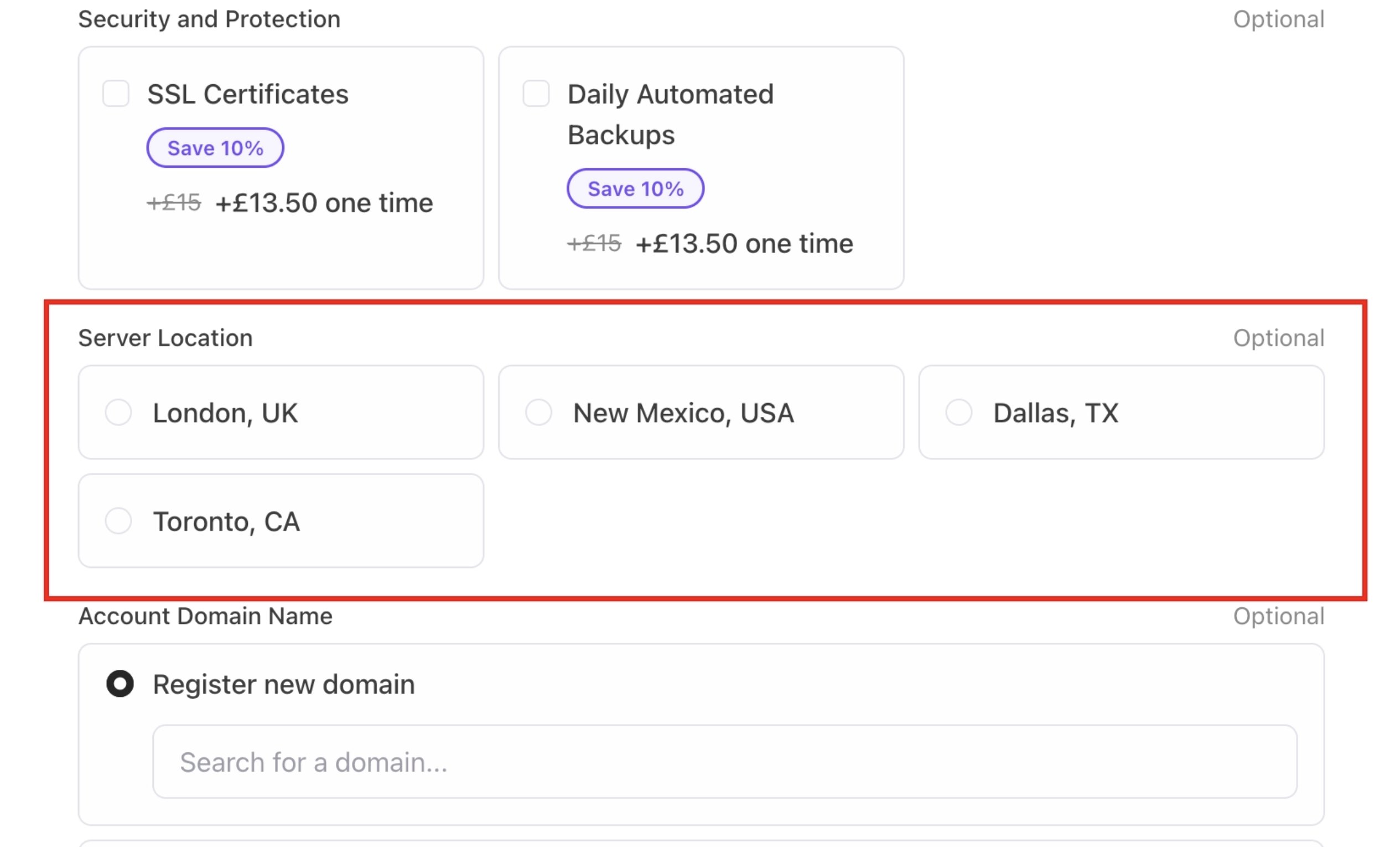
 * Set the number of columns in the option selector when using the `radio-grid` layout. Displays option cards in a column grid, adjustable from 1 to 4 columns to suit your product listing layout. The default is `2-col`.
`JSON` **Example**: optionSelectorGrid columns.
```json JSON theme={null}
{
"@context.configure.optionSelectorGrid": "3-col"
}
```
* Set the number of columns in the option selector when using the `radio-grid` layout. Displays option cards in a column grid, adjustable from 1 to 4 columns to suit your product listing layout. The default is `2-col`.
`JSON` **Example**: optionSelectorGrid columns.
```json JSON theme={null}
{
"@context.configure.optionSelectorGrid": "3-col"
}
```
 * Toggle the visibility of icons displayed alongside each selectable option. Option icons are `visible` by default. You can hide them to display option labels only.
`JSON` **Example**: optionSelectorIcons visibility.
```json JSON theme={null}
{
"@context.configure.optionSelectorIcons": "hidden"
}
```
* Assign a display name to a group of options when using the select-grouped selector layout. Shows a labelled group heading within the grouped dropdown, making it easier for customers to scan and identify related options.
`JSON` **Example**: optionGroupLabel.
```json JSON theme={null}
{
"@data.optionGroupLabel":
}
```
* Assign an icon to an option group, displayed next to the group label in a `select-grouped` layout. Shows a visual icon beside the group label to help customers quickly identify and differentiate option categories.
`JSON` **Example**: optionGroupIcon.
```json JSON theme={null}
{
"@data.optionGroupIcon": "rocket"
}
```
* Control how billing term options (e.g., monthly, yearly) are presented to the customer. Renders billing terms structure accordingly. The default is `radio-grid`.
`JSON` **Example**: termSelector structure.
```json JSON theme={null}
{
"@context.configure.termSelector": "select"
}
```
* Toggle the visibility of icons displayed alongside each selectable option. Option icons are `visible` by default. You can hide them to display option labels only.
`JSON` **Example**: optionSelectorIcons visibility.
```json JSON theme={null}
{
"@context.configure.optionSelectorIcons": "hidden"
}
```
* Assign a display name to a group of options when using the select-grouped selector layout. Shows a labelled group heading within the grouped dropdown, making it easier for customers to scan and identify related options.
`JSON` **Example**: optionGroupLabel.
```json JSON theme={null}
{
"@data.optionGroupLabel":
}
```
* Assign an icon to an option group, displayed next to the group label in a `select-grouped` layout. Shows a visual icon beside the group label to help customers quickly identify and differentiate option categories.
`JSON` **Example**: optionGroupIcon.
```json JSON theme={null}
{
"@data.optionGroupIcon": "rocket"
}
```
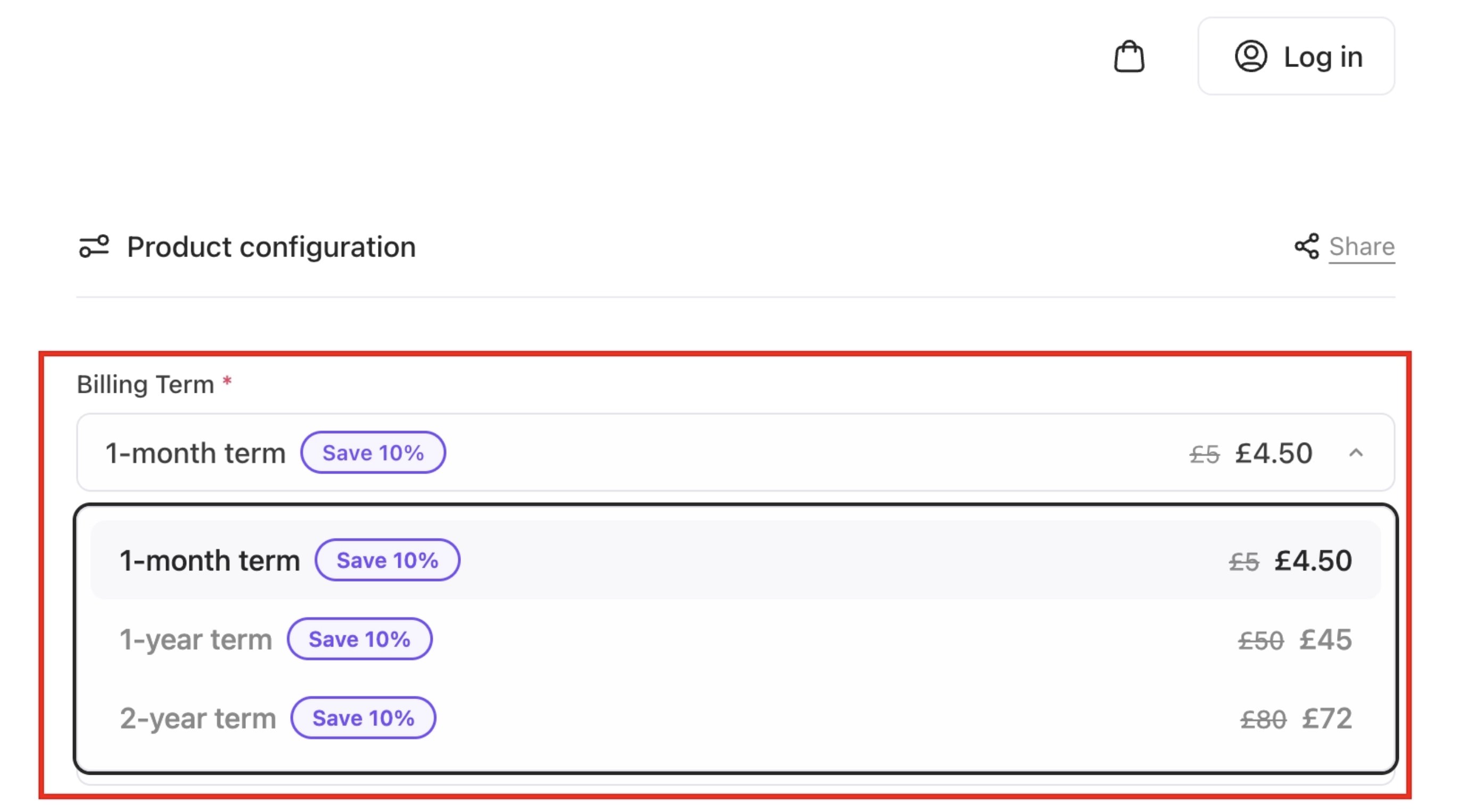
* Control how billing term options (e.g., monthly, yearly) are presented to the customer. Renders billing terms structure accordingly. The default is `radio-grid`.
`JSON` **Example**: termSelector structure.
```json JSON theme={null}
{
"@context.configure.termSelector": "select"
}
```
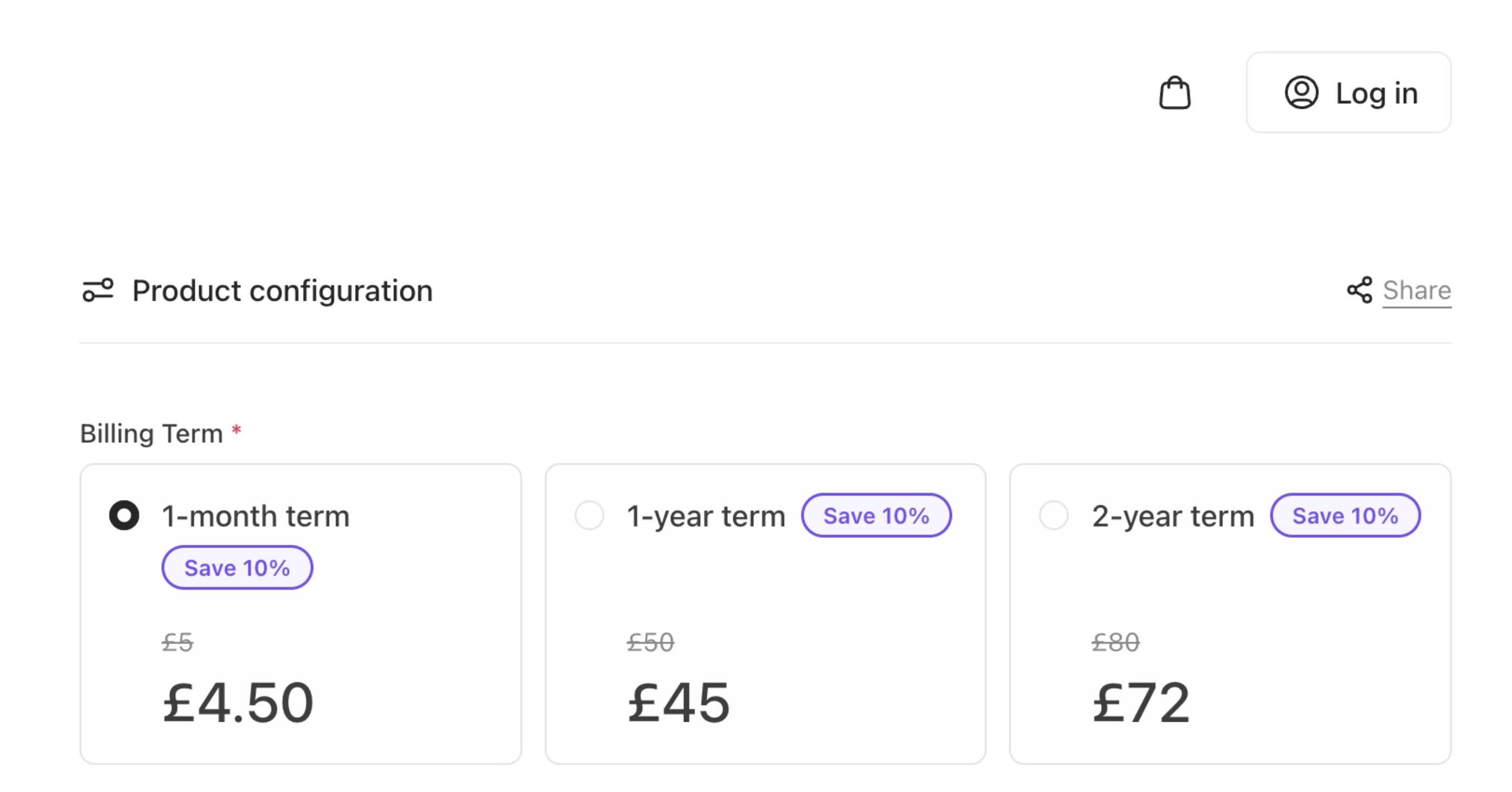
 * Set the number of columns in the term selector when using the `radio-grid` layout. Display billing term cards in various columns. The default is `2-col`.
`JSON` **Example**: termSelectorGrid columns.
```json JSON theme={null}
{
"@context.configure.termSelectorGrid": "3-col"
}
```
* Set the number of columns in the term selector when using the `radio-grid` layout. Display billing term cards in various columns. The default is `2-col`.
`JSON` **Example**: termSelectorGrid columns.
```json JSON theme={null}
{
"@context.configure.termSelectorGrid": "3-col"
}
```
 * Toggle the visibility of the billing summary shown beneath the selected term. Show a cost summary line (e.g., "Pay $12.00 today, then $X.XX/mo"). The default is `visible.`
`JSON` **Example**: termSelectorSummary visibility.
```json JSON theme={null}
{
"@context.configure.termSelectorSummary": "hidden"
}
```
### 2. Content and copy
All user-facing text is controlled through **i18n configuration in UI metadata.** Content can be overridden at brand, category, product, or option level, allowing targeted messaging where it matters most.
This includes:
**CSS Examples**
* Headings and subheadings. You can change the colour of headings in your cart.
`CSS` **Example**: Text colour display of headings.
```css CSS theme={null}
{
--text-display: #d72929;
}
```
* Toggle the visibility of the billing summary shown beneath the selected term. Show a cost summary line (e.g., "Pay $12.00 today, then $X.XX/mo"). The default is `visible.`
`JSON` **Example**: termSelectorSummary visibility.
```json JSON theme={null}
{
"@context.configure.termSelectorSummary": "hidden"
}
```
### 2. Content and copy
All user-facing text is controlled through **i18n configuration in UI metadata.** Content can be overridden at brand, category, product, or option level, allowing targeted messaging where it matters most.
This includes:
**CSS Examples**
* Headings and subheadings. You can change the colour of headings in your cart.
`CSS` **Example**: Text colour display of headings.
```css CSS theme={null}
{
--text-display: #d72929;
}
```
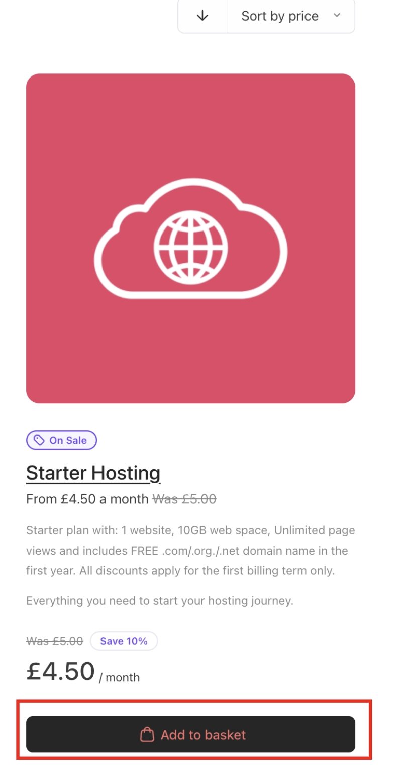
 * Button labels and call-to-action text. Colour can be changed on the text on the primary buttons.
`CSS` **Example**: Colour display of primary buttons.
```css CSS theme={null}
{
--text-button-primary: #ff6363;
}
```
* Button labels and call-to-action text. Colour can be changed on the text on the primary buttons.
`CSS` **Example**: Colour display of primary buttons.
```css CSS theme={null}
{
--text-button-primary: #ff6363;
}
```
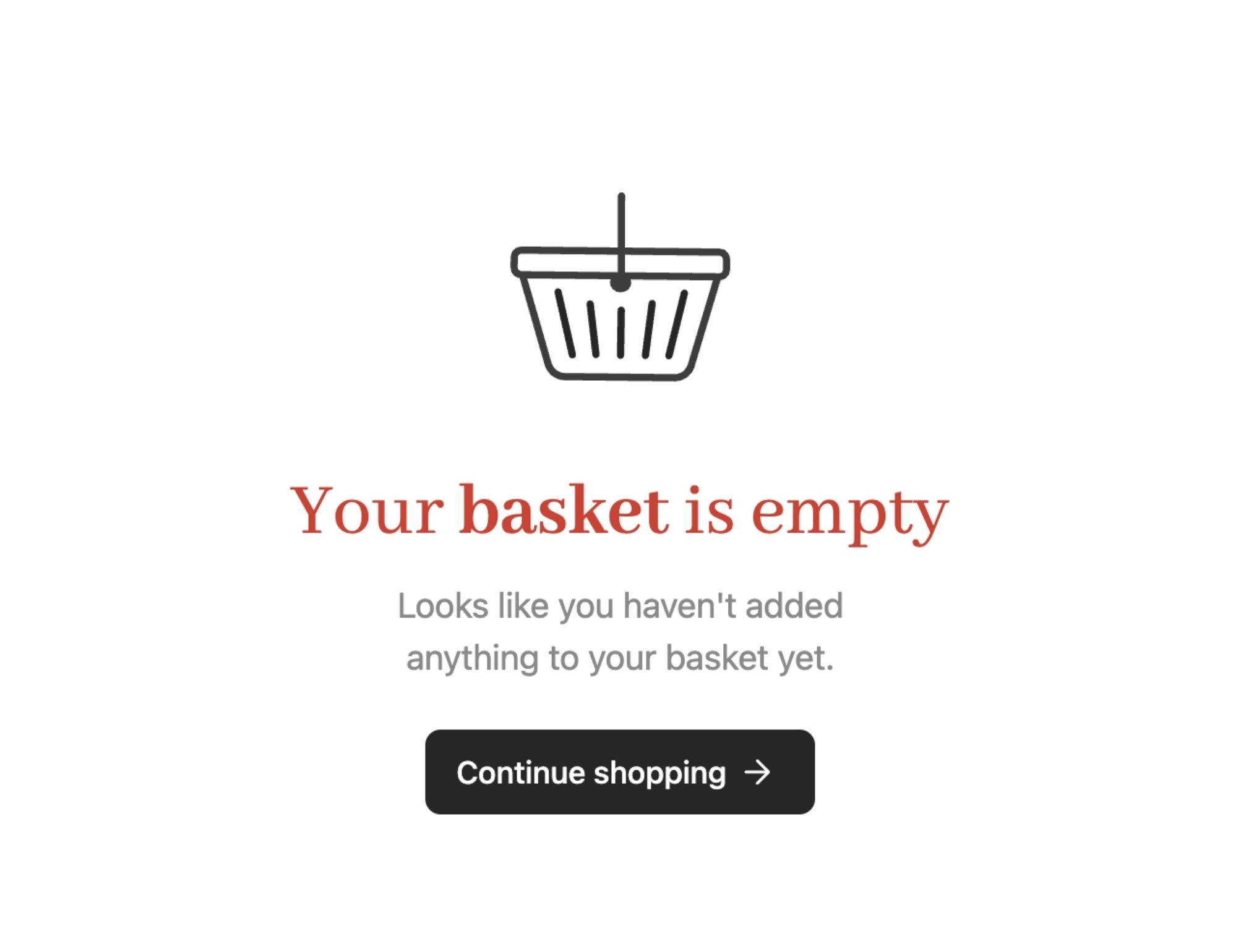
 * Empty-state messages. Colour can be changed on the text when the basket is empty.
`CSS` **Example**: Core text colour change display.
```css CSS theme={null}
{
--color-core-display: #ed1111;
}
```
* Empty-state messages. Colour can be changed on the text when the basket is empty.
`CSS` **Example**: Core text colour change display.
```css CSS theme={null}
{
--color-core-display: #ed1111;
}
```
 * Informational banners and notices.
* Legal text references. You can create your store's terms and conditions. For more information, follow this [guide](/setup-and-configuration/other-setup-items/how-to-create-terms-and-conditions).
`CSS` **Example**: Core colour of legal texts.
```css CSS theme={null}
{
--color-core-base: #ed1111;
}
```
* Informational banners and notices.
* Legal text references. You can create your store's terms and conditions. For more information, follow this [guide](/setup-and-configuration/other-setup-items/how-to-create-terms-and-conditions).
`CSS` **Example**: Core colour of legal texts.
```css CSS theme={null}
{
--color-core-base: #ed1111;
}
```
 **JSON Examples**
* Assign a custom image URL to a specific product option, displayed within the option selector. Show the specified image alongside the option label, giving customers a visual reference for each selectable product option.
`JSON` **Example**: optionImgUrl.
```json JSON theme={null}
{
"@data.optionImgUrl":
}
```
### 3. Visual styling and branding
Cart styling is controlled through **design tokens** rather than fixed CSS overrides. Because tokens are semantic, updating a primary colour or font updates the entire cart consistently, including complex components like summaries and modals.
You can configure:
**CSS Examples**
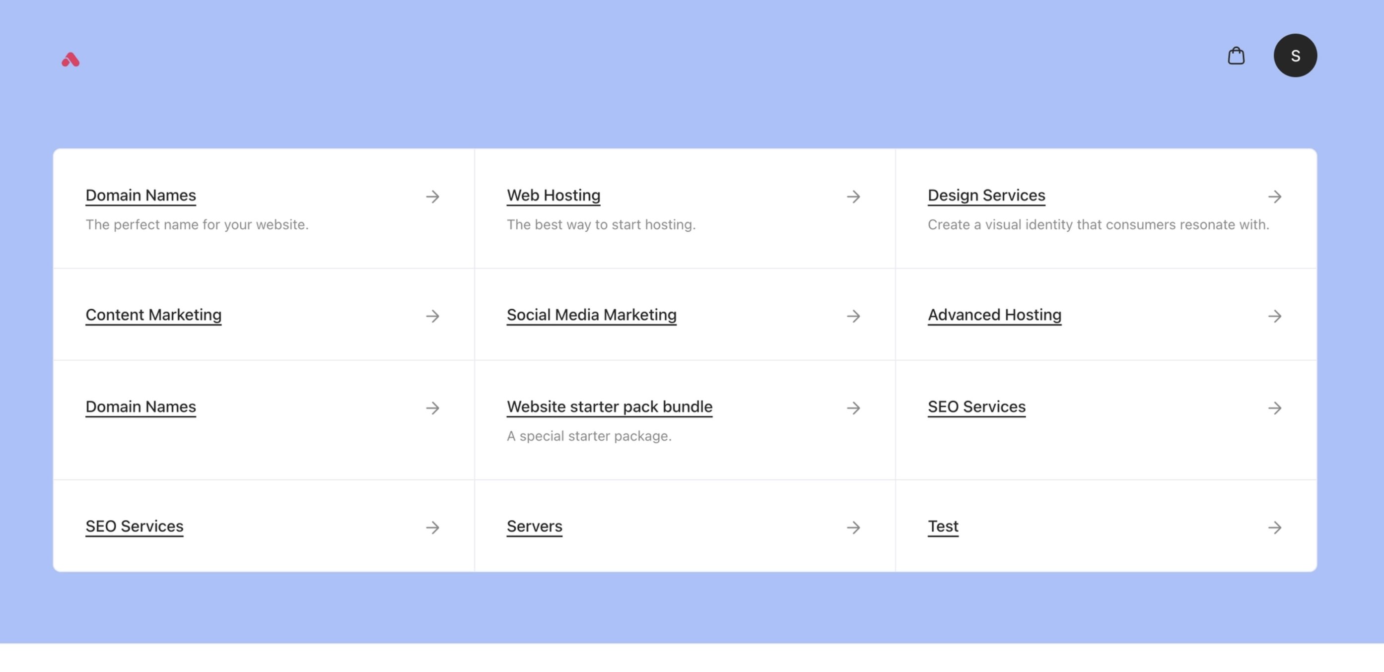
* Brand colours and accents.
`CSS` **Example**: Canvas colour.
```css CSS theme={null}
{
--color-core-canvas: #a0c3ff;
}
```
**JSON Examples**
* Assign a custom image URL to a specific product option, displayed within the option selector. Show the specified image alongside the option label, giving customers a visual reference for each selectable product option.
`JSON` **Example**: optionImgUrl.
```json JSON theme={null}
{
"@data.optionImgUrl":
}
```
### 3. Visual styling and branding
Cart styling is controlled through **design tokens** rather than fixed CSS overrides. Because tokens are semantic, updating a primary colour or font updates the entire cart consistently, including complex components like summaries and modals.
You can configure:
**CSS Examples**
* Brand colours and accents.
`CSS` **Example**: Canvas colour.
```css CSS theme={null}
{
--color-core-canvas: #a0c3ff;
}
```
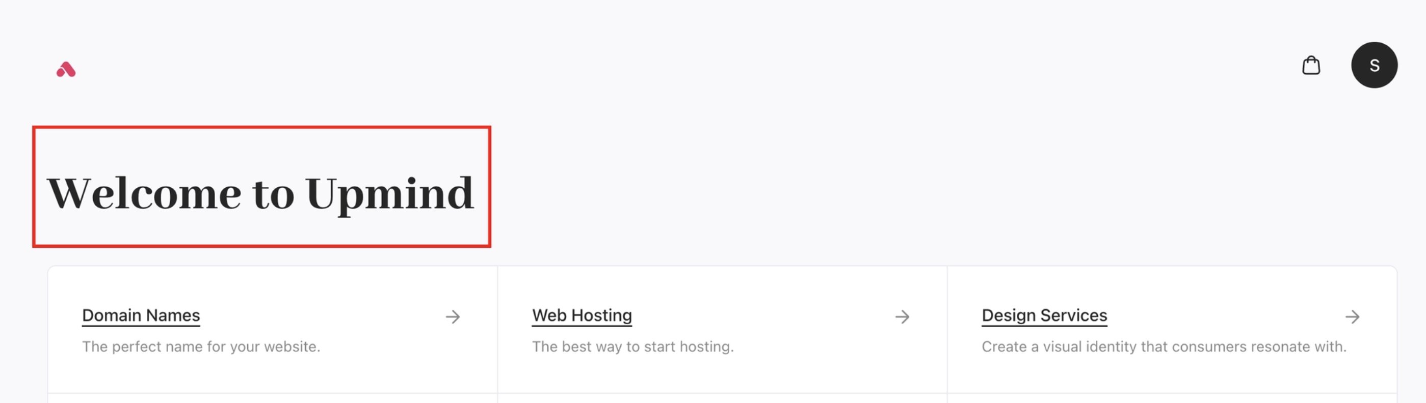
 * Typography scale and font families. You can change the font weight for display texts. Increase for bolder headings.
`CSS` **Example**: Font weight for display text.
```css CSS theme={null}
{
--font-display-weight: 1000;
}
```
* Typography scale and font families. You can change the font weight for display texts. Increase for bolder headings.
`CSS` **Example**: Font weight for display text.
```css CSS theme={null}
{
--font-display-weight: 1000;
}
```
 * Spacing and border radius.
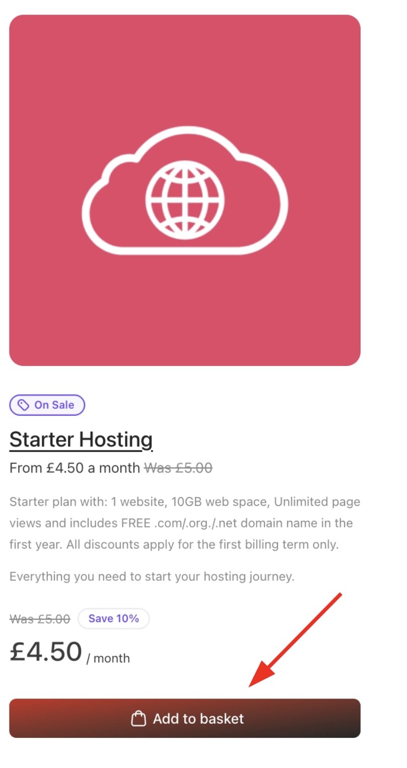
* Button styles and variant colour values. You can change the primary button backgrounds, main CTAs, and key accent elements. Gradients can also be updated.
`CSS` **Example**: Button primary colour.
```css CSS theme={null}
{
--color-primary-default: #d60e0e;
}
```
* Spacing and border radius.
* Button styles and variant colour values. You can change the primary button backgrounds, main CTAs, and key accent elements. Gradients can also be updated.
`CSS` **Example**: Button primary colour.
```css CSS theme={null}
{
--color-primary-default: #d60e0e;
}
```
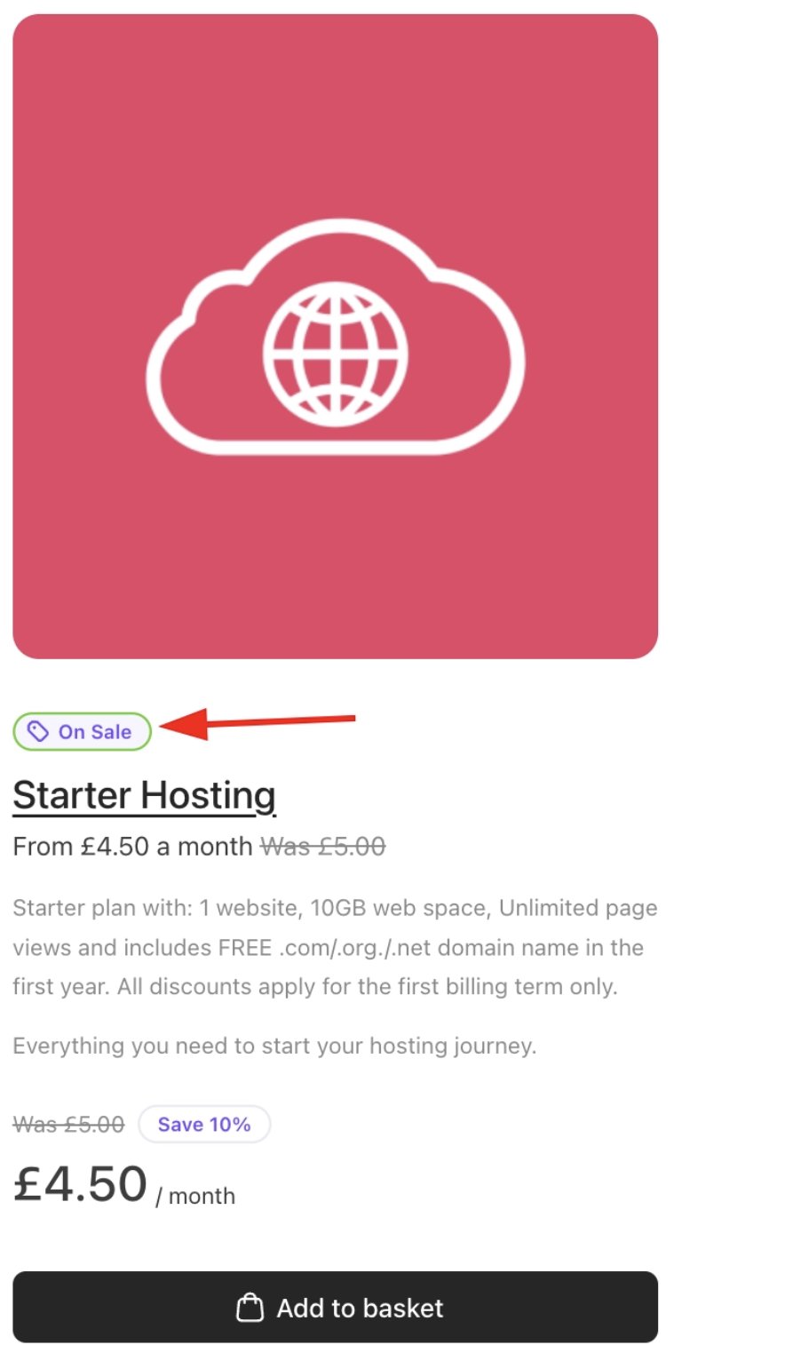
 * Badges and highlight styles. Bold promotional background for discount badges.
`CSS` **Example**: Default promo colour.
```css CSS theme={null}
{
--color-promo-default: #43d106;
}
```
* Badges and highlight styles. Bold promotional background for discount badges.
`CSS` **Example**: Default promo colour.
```css CSS theme={null}
{
--color-promo-default: #43d106;
}
```
 ### 4. Feature visibility and behaviour
Cart features can be enabled or disabled per context. This allows a checkout flow that feels intentional rather than generic.
Examples include:
**JSON Examples**
* Showing or hiding product images. Product images in recommendations can be hidden from the customer's view. The default is `visible`.
`JSON` **Example**: productImages visibility.
```json JSON theme={null}
{
"@context.recommendations.productImages": "hidden"
}
```
### 4. Feature visibility and behaviour
Cart features can be enabled or disabled per context. This allows a checkout flow that feels intentional rather than generic.
Examples include:
**JSON Examples**
* Showing or hiding product images. Product images in recommendations can be hidden from the customer's view. The default is `visible`.
`JSON` **Example**: productImages visibility.
```json JSON theme={null}
{
"@context.recommendations.productImages": "hidden"
}
```
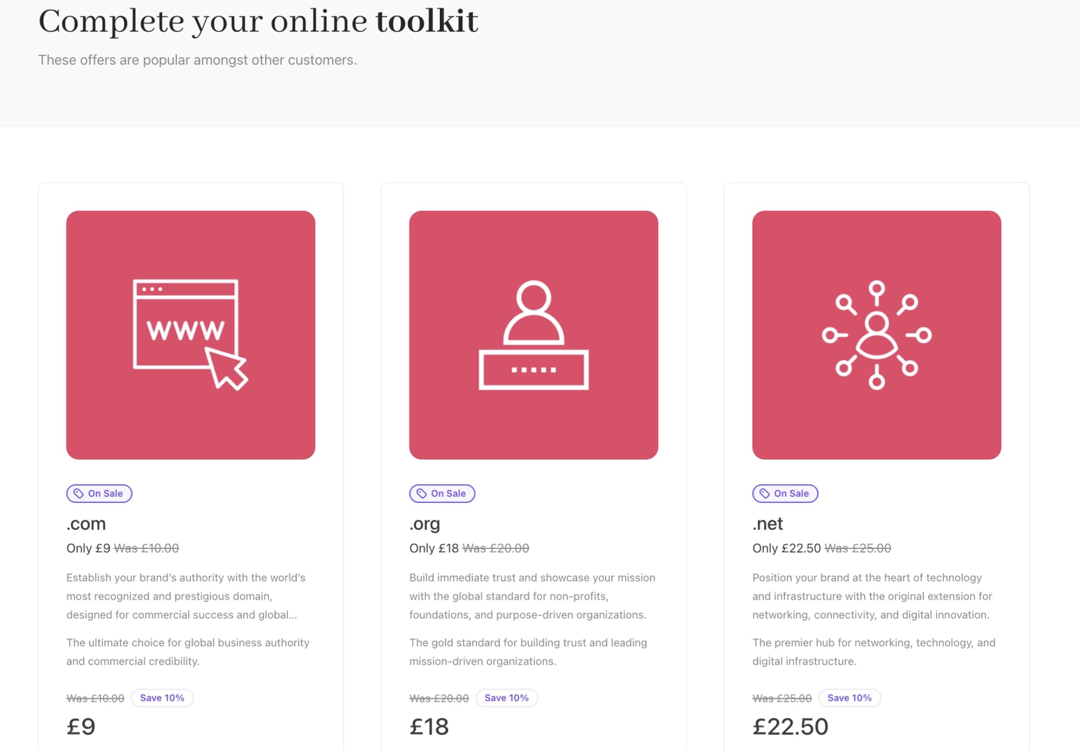
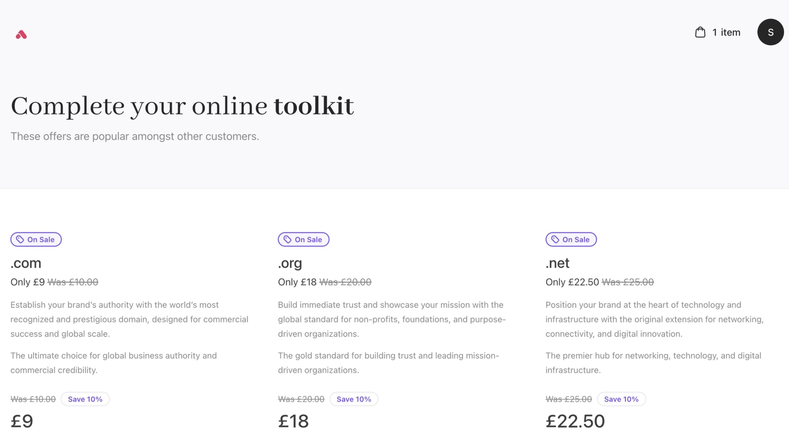 * Displaying or suppressing recommendations. Change the product style to `flush` and `carded`.
`JSON` **Example**: productStyle carded.
```json JSON theme={null}
{
"@context.recommendations.productStyle": "carded"
}
```
* Displaying or suppressing recommendations. Change the product style to `flush` and `carded`.
`JSON` **Example**: productStyle carded.
```json JSON theme={null}
{
"@context.recommendations.productStyle": "carded"
}
```
 * Controlling zero-price display behaviour.
`JSON` **Example**: zeroPriceDisplay value. Zero-price products will display `0.00` globally.
```json JSON theme={null}
{
"@context.*.zeroPriceDisplay": "numeric"
}
```
* Controlling zero-price display behaviour.
`JSON` **Example**: zeroPriceDisplay value. Zero-price products will display `0.00` globally.
```json JSON theme={null}
{
"@context.*.zeroPriceDisplay": "numeric"
}
```
 ## What is configurable in the Client Portal
The **Client Portal** is where customers manage services after purchase. It shares the same architectural principles as the **Cart** but focuses on account management rather than conversion.
### 1. Branding and layout
Portal customisation includes:
* Header and navigation structure.
* Brand identity and colour system.
* Page-level layout and spacing.
* Consistent typography across account views.
This ensures continuity between checkout and post-purchase experience. You can find more details on client area templates in this [guide](/setup-and-configuration/branding/how-to-create-client-area-templates).
### 2. Features
You can configure the features in the portal:
1. **Billing history and invoices**
The portal can provide full visibility into financial history, including:
* Invoice listings with filtering and search.
* Invoice downloads (PDF or hosted views).
* Payment status indicators (paid, overdue, refunded).
* Credit notes and adjustments.
* Transaction history.
This helps reduce support requests while giving customers transparency and self-service access to financial records. For more information, follow this guide on [billings](/client-self-service/client-area/how-do-my-clients-review-billings).
2. **Subscription controls**
Customers can manage recurring services directly within the portal.
Depending on your configuration, this can include:
* Changing billing cycles.
* Applying promotional codes.
* Enabling or disabling auto-renew.
* Managing upgrades and plan changes.
* Viewing next billing dates and renewal pricing.
This gives customers confidence and control over ongoing commitments. For more details on subscription control, you can follow the guide on [auto-renewals](/using-upmind/how-subscription-cancellation-works/turning-onoff-auto-renew).
3. **Payment method management**
Customers can securely manage their payment details, including:
* Adding new payment methods.
* Updating card details.
* Removing saved methods.
* Selecting a default payment method.
* Viewing stored payment methods for active subscriptions.
All payment processing continues to be handled by Upmind’s integrated gateways, ensuring compliance and security. For more details on payment methods, follow this [guide](/client-self-service/client-area/how-do-my-clients-add-a-payment-method).
4. **Profile and security settings**
The portal can also act as a customer account centre, allowing users to:
* Update contact information.
* Manage company details.
* Configure tax or VAT information. (For the tax guide, find more information [here](/using-upmind/invoicing-and-taxes/how-to-set-sales-taxes-eg-vat-gst)).
* Change passwords. (For the security guide, find more information [here](/client-self-service/client-area/how-do-my-clients-change-account-settings)).
* Manage authentication settings (including SSO, where enabled).
This centralises account management and reduces reliance on manual support intervention.
### 3. Messaging and guidance
Portal messaging follows the same i18n-driven approach as the cart. While messaging capabilities will expand over time, current customisation is limited to text overrides rather than structural changes.
Because the Portal and Cart share the same metadata and i18n foundation, messaging remains consistent across the storefront, checkout, and customer portal.
## What is configurable in the Client Portal
The **Client Portal** is where customers manage services after purchase. It shares the same architectural principles as the **Cart** but focuses on account management rather than conversion.
### 1. Branding and layout
Portal customisation includes:
* Header and navigation structure.
* Brand identity and colour system.
* Page-level layout and spacing.
* Consistent typography across account views.
This ensures continuity between checkout and post-purchase experience. You can find more details on client area templates in this [guide](/setup-and-configuration/branding/how-to-create-client-area-templates).
### 2. Features
You can configure the features in the portal:
1. **Billing history and invoices**
The portal can provide full visibility into financial history, including:
* Invoice listings with filtering and search.
* Invoice downloads (PDF or hosted views).
* Payment status indicators (paid, overdue, refunded).
* Credit notes and adjustments.
* Transaction history.
This helps reduce support requests while giving customers transparency and self-service access to financial records. For more information, follow this guide on [billings](/client-self-service/client-area/how-do-my-clients-review-billings).
2. **Subscription controls**
Customers can manage recurring services directly within the portal.
Depending on your configuration, this can include:
* Changing billing cycles.
* Applying promotional codes.
* Enabling or disabling auto-renew.
* Managing upgrades and plan changes.
* Viewing next billing dates and renewal pricing.
This gives customers confidence and control over ongoing commitments. For more details on subscription control, you can follow the guide on [auto-renewals](/using-upmind/how-subscription-cancellation-works/turning-onoff-auto-renew).
3. **Payment method management**
Customers can securely manage their payment details, including:
* Adding new payment methods.
* Updating card details.
* Removing saved methods.
* Selecting a default payment method.
* Viewing stored payment methods for active subscriptions.
All payment processing continues to be handled by Upmind’s integrated gateways, ensuring compliance and security. For more details on payment methods, follow this [guide](/client-self-service/client-area/how-do-my-clients-add-a-payment-method).
4. **Profile and security settings**
The portal can also act as a customer account centre, allowing users to:
* Update contact information.
* Manage company details.
* Configure tax or VAT information. (For the tax guide, find more information [here](/using-upmind/invoicing-and-taxes/how-to-set-sales-taxes-eg-vat-gst)).
* Change passwords. (For the security guide, find more information [here](/client-self-service/client-area/how-do-my-clients-change-account-settings)).
* Manage authentication settings (including SSO, where enabled).
This centralises account management and reduces reliance on manual support intervention.
### 3. Messaging and guidance
Portal messaging follows the same i18n-driven approach as the cart. While messaging capabilities will expand over time, current customisation is limited to text overrides rather than structural changes.
Because the Portal and Cart share the same metadata and i18n foundation, messaging remains consistent across the storefront, checkout, and customer portal.