> ## Documentation Index
> Fetch the complete documentation index at: https://docs.upmind.com/llms.txt
> Use this file to discover all available pages before exploring further.
# Setting Up Theming with CSS Variables
> A reference guide for using CSS variables and design tokens to style your Cart 2.0 storefront to match your brand.
* **Time** — 25 minutes
* **Difficulty** — Intermediate
**What You'll Build:** A branded theme for your Cart 2.0 storefront using CSS variable overrides, covering colours, typography, spacing, and component styles, applied through Brand Tokens and UI Metadata without touching any core code.
**Prerequisites:**
* An active [Upmind account](https://upmind.com/start).
* Access to **Settings > Brand Settings** in your Upmind admin panel.
* Basic familiarity with CSS and how CSS variables work.
* A read-through of [Configuring Your Store with UI Metadata](/using-cart-20/choosing-what-to-implement-for-your-business/configuring-your-store-with-ui-metadata) to understand how the `@context.theme` setting is applied.
* Your brand's colour palette, font choices, and any design guidelines you want to follow.
Cart and Portal theming is powered by **CSS variables (design tokens)**. This allows you to control the visual appearance of the interface without modifying core code.
The system is designed to be visually neutral by default, so it can align easily with your brand. The most effective way to customise styling is by defining CSS variables that control colours, spacing, borders, and typography.
Using CSS variables ensures:
* Centralised control of your brand styling
* Consistent appearance across cart and portal
* Upgrade-safe customisation
* No need to modify component code
### Brand-specific theming
For multi-brand setups, you can define brand-specific theme tokens.
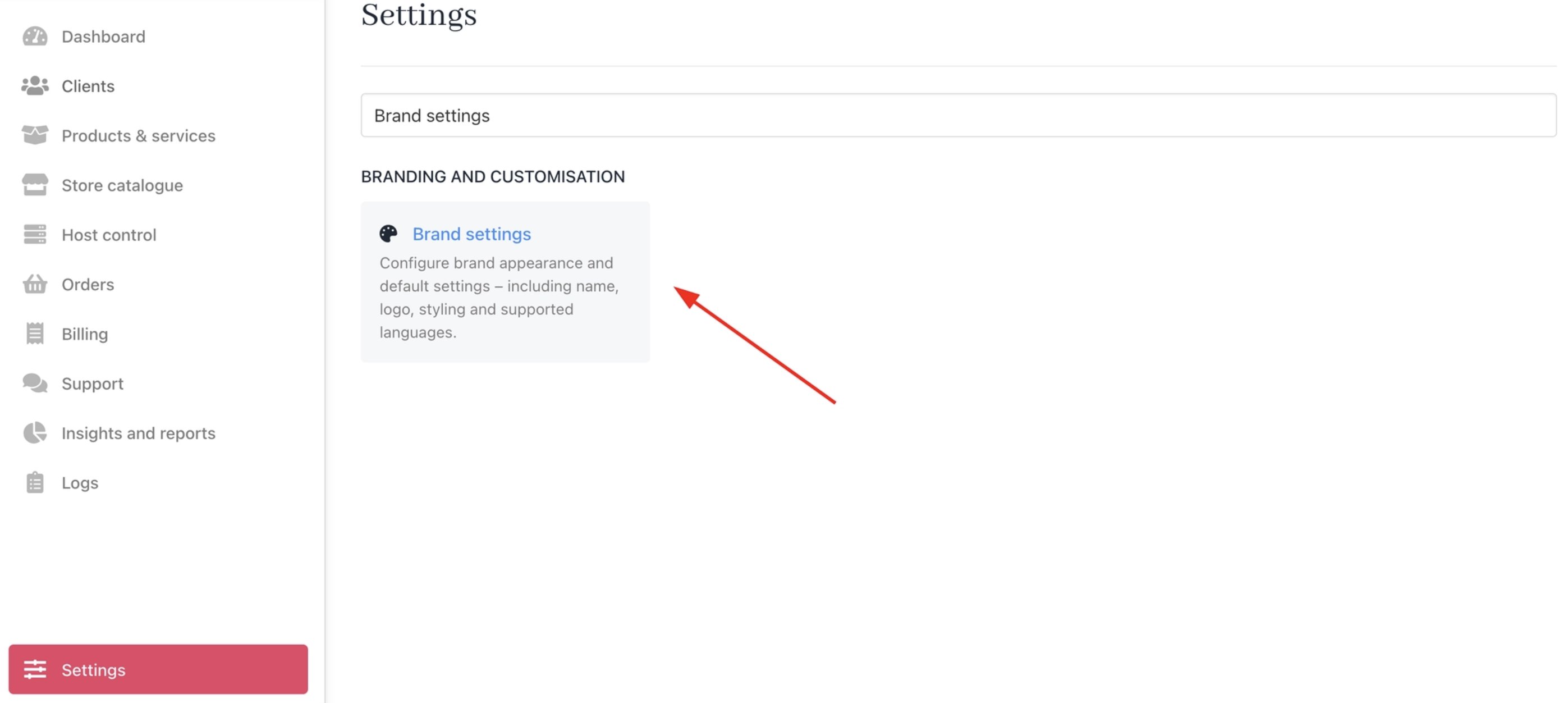
Navigate to **Settings** > **Brand Settings.**
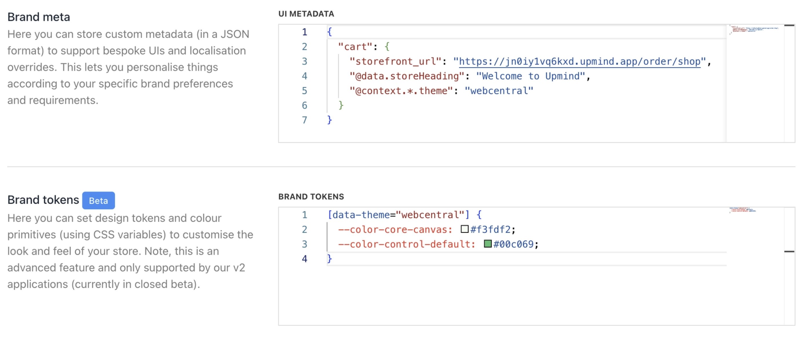
 Add your tokens inside the **Brand Tokens** field.
`CSS` **Example**:
```css CSS theme={null}
[data-theme="webcentral"] {
--color-core-canvas: #f3fdf2;
--color-control-default: #00c069;
}
```
This creates a named theme (`webcentral`) with its own colour system.
### Applying the theme
To apply a theme to a brand, define it in the **Brand Meta (UI Metadata)** field. `JSON` Example:
```json JSON theme={null}
{
"cart": {
"@context.theme": "webcentral",
}
}
```
Once applied, the cart and portal will use the CSS variables defined for that theme.
Add your tokens inside the **Brand Tokens** field.
`CSS` **Example**:
```css CSS theme={null}
[data-theme="webcentral"] {
--color-core-canvas: #f3fdf2;
--color-control-default: #00c069;
}
```
This creates a named theme (`webcentral`) with its own colour system.
### Applying the theme
To apply a theme to a brand, define it in the **Brand Meta (UI Metadata)** field. `JSON` Example:
```json JSON theme={null}
{
"cart": {
"@context.theme": "webcentral",
}
}
```
Once applied, the cart and portal will use the CSS variables defined for that theme.
 By using CSS variables:
* You can align the cart and portal with your brand quickly.
* Styling updates can be made centrally without refactoring components.
* Theming remains consistent across checkout and post-purchase views.
* Future updates to Cart 2.0 remain safe and compatible.
## **Primitive tokens**
These are the **foundational values** that define colours for the entire interface. Changing a primitive token will cascade through the theme, affecting all derived styles.
**Core Colors:** Base greys and backgrounds for general layout.
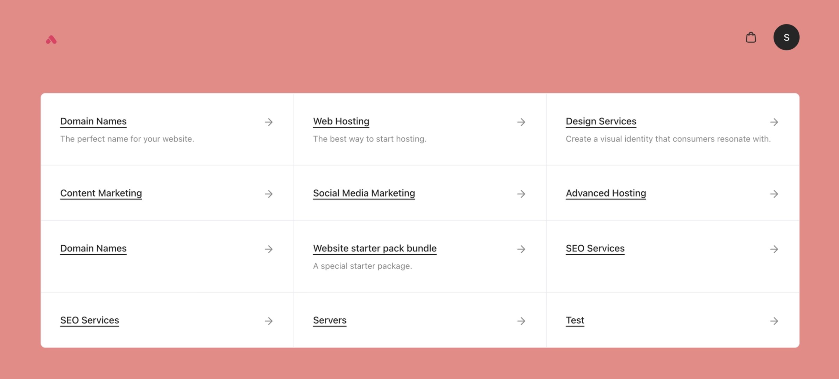
* `--color-core-canvas` – The **main page background** colour behind all content (e.g., page canvas). Usually, a very light neutral tone to reduce eye strain.
`CSS` **Example**:
```css CSS theme={null}
[data-theme="webcentral"] {
--color-core-canvas: #FF7F7F;
}
```
By using CSS variables:
* You can align the cart and portal with your brand quickly.
* Styling updates can be made centrally without refactoring components.
* Theming remains consistent across checkout and post-purchase views.
* Future updates to Cart 2.0 remain safe and compatible.
## **Primitive tokens**
These are the **foundational values** that define colours for the entire interface. Changing a primitive token will cascade through the theme, affecting all derived styles.
**Core Colors:** Base greys and backgrounds for general layout.
* `--color-core-canvas` – The **main page background** colour behind all content (e.g., page canvas). Usually, a very light neutral tone to reduce eye strain.
`CSS` **Example**:
```css CSS theme={null}
[data-theme="webcentral"] {
--color-core-canvas: #FF7F7F;
}
```
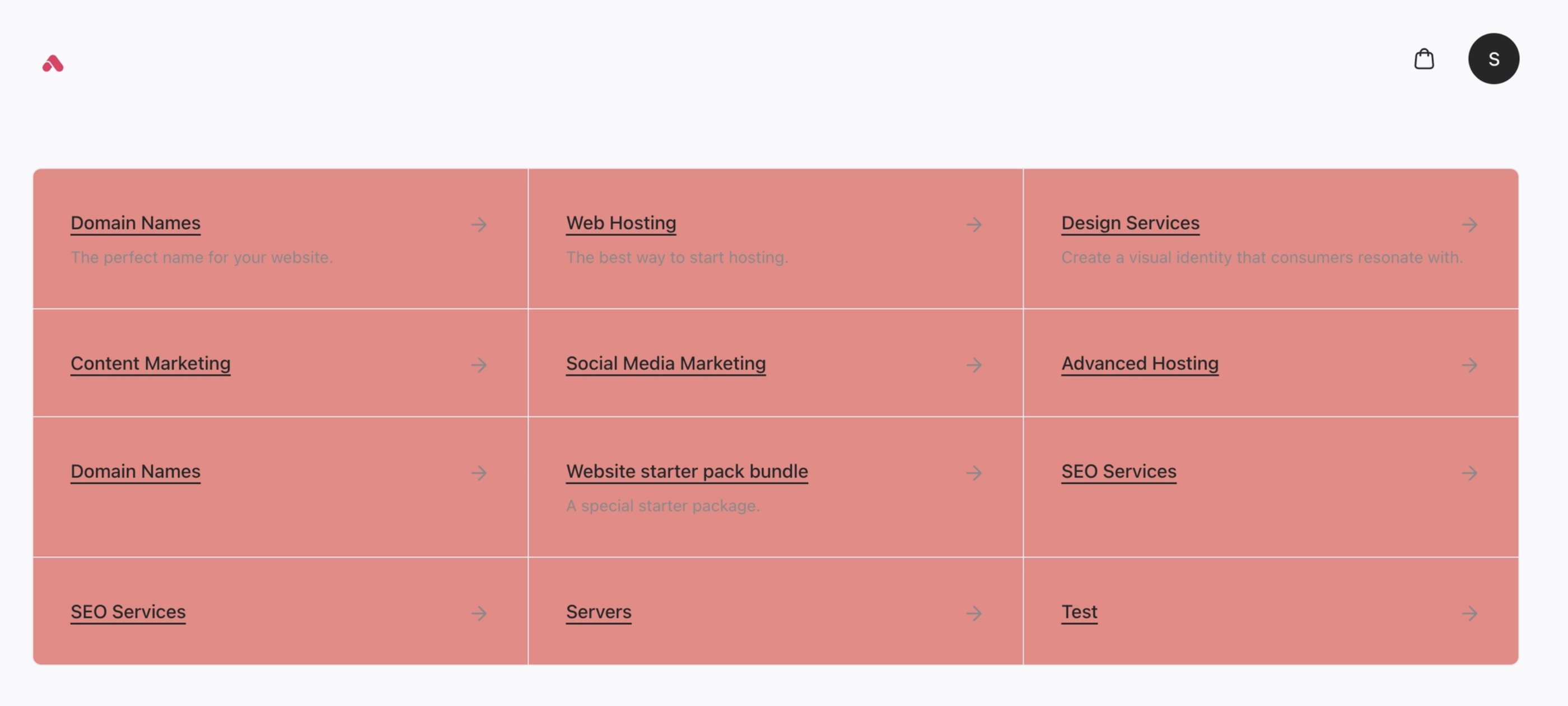
 * `--color-core-surface` – Background colour for **elevated containers** (cards, modals, panels). Contrasts with the canvas to create depth.
`CSS` **Example**:
```css CSS theme={null}
[data-theme="webcentral"] {
--color-core-surface: #FF7F7F;
}
```
* `--color-core-surface` – Background colour for **elevated containers** (cards, modals, panels). Contrasts with the canvas to create depth.
`CSS` **Example**:
```css CSS theme={null}
[data-theme="webcentral"] {
--color-core-surface: #FF7F7F;
}
```
 * `--color-core-base` – Default **body text** colour. Used for paragraphs and standard content.
`CSS` **Example**:
```css CSS theme={null}
[data-theme="webcentral"] {
--color-core-base: #FF7F7F;
}
```
* `--color-core-base` – Default **body text** colour. Used for paragraphs and standard content.
`CSS` **Example**:
```css CSS theme={null}
[data-theme="webcentral"] {
--color-core-base: #FF7F7F;
}
```
 * `--color-core-display` – High-emphasis **text** (headings, titles, prices). Darker than `-color-core-base` for emphasis.
`CSS` **Example**:
```css CSS theme={null}
[data-theme="webcentral"] {
--color-core-display: #FF7F7F;
}
```
* `--color-core-display` – High-emphasis **text** (headings, titles, prices). Darker than `-color-core-base` for emphasis.
`CSS` **Example**:
```css CSS theme={null}
[data-theme="webcentral"] {
--color-core-display: #FF7F7F;
}
```
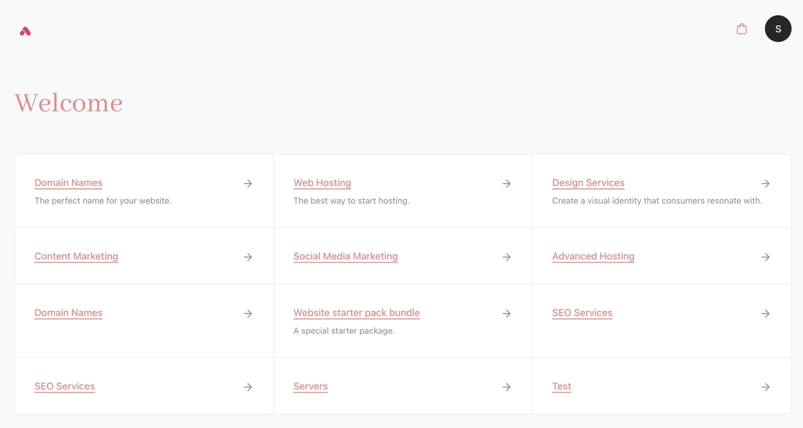 * `--color-core-muted` – Secondary text (captions, metadata, timestamps). A softer grey for supporting info.
`CSS` **Example**:
```css CSS theme={null}
[data-theme="webcentral"] {
--color-core-muted: #FF7F7F;
}
```
* `--color-core-muted` – Secondary text (captions, metadata, timestamps). A softer grey for supporting info.
`CSS` **Example**:
```css CSS theme={null}
[data-theme="webcentral"] {
--color-core-muted: #FF7F7F;
}
```
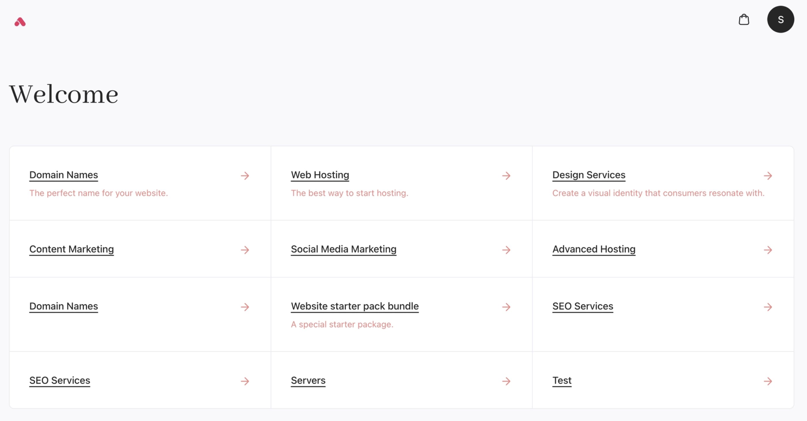 * `--color-core-faint` – Lowest-emphasis text (placeholders, disabled text, very subtle labels). Light grey near the edge of legibility.
`CSS` **Example**:
```css CSS theme={null}
[data-theme="webcentral"] {
--color-core-faint: #FF7F7F;
}
```
* `--color-core-faint` – Lowest-emphasis text (placeholders, disabled text, very subtle labels). Light grey near the edge of legibility.
`CSS` **Example**:
```css CSS theme={null}
[data-theme="webcentral"] {
--color-core-faint: #FF7F7F;
}
```
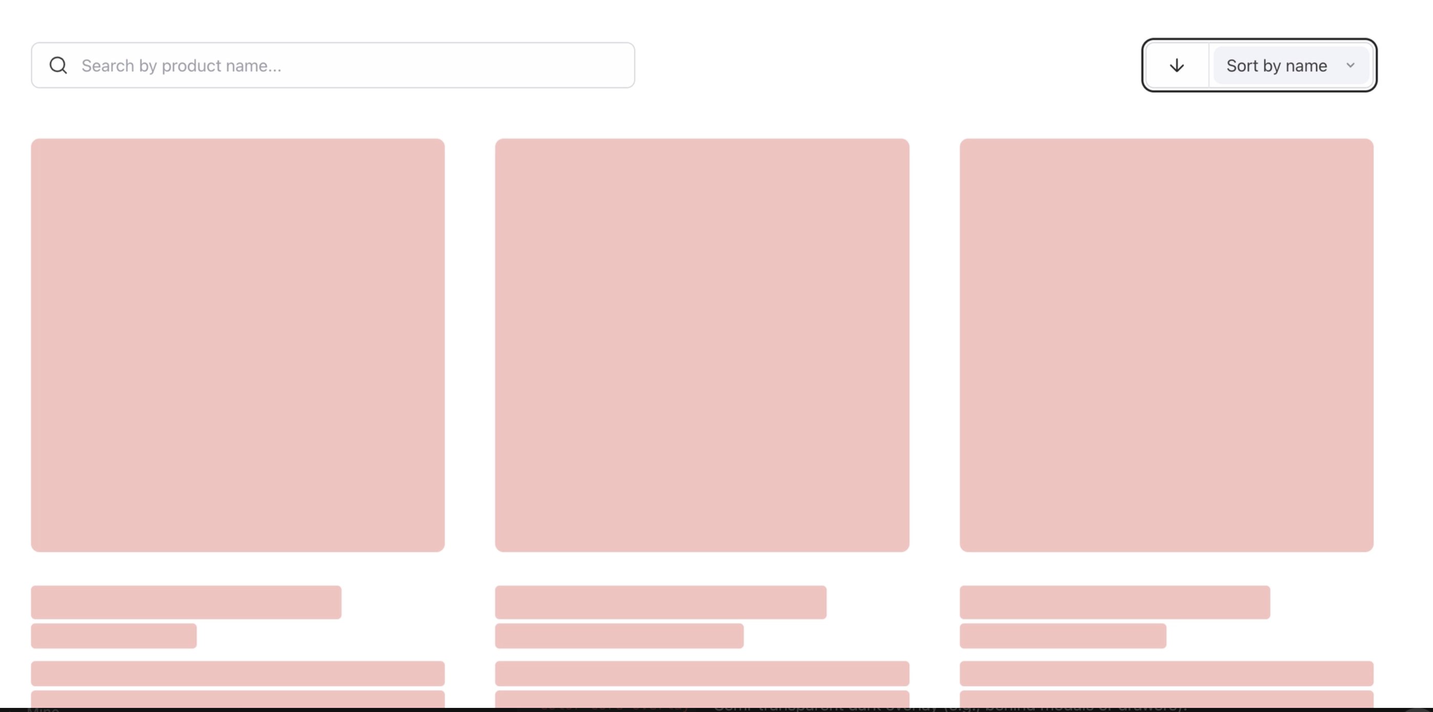
 * `--color-core-skeleton` – Semi-transparent grey for **loading placeholders** (skeleton screens). Applied behind content while data loads.
`CSS` **Example**:
```css CSS theme={null}
[data-theme="webcentral"] {
--color-core-skeleton: #FF7F7F;
}
```
* `--color-core-skeleton` – Semi-transparent grey for **loading placeholders** (skeleton screens). Applied behind content while data loads.
`CSS` **Example**:
```css CSS theme={null}
[data-theme="webcentral"] {
--color-core-skeleton: #FF7F7F;
}
```
 * `--color-core-overlay` – Semi-transparent dark overlay (e.g., behind modals or drawers). Dims the background content.
* `--color-core-overlay-contrast` – Text/icon colour on top of `-color-core-overlay`. Typically white or very light to stand out against the dark overlay.
**Control Colors:** Used for form controls (checkboxes, radios, toggles, etc.).
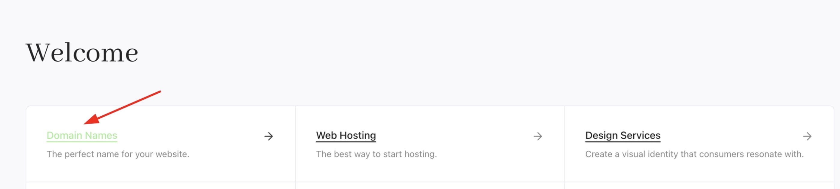
* `-color-control-default` – Fill colour for **checked/on** controls (checkbox, active radio, enabled toggle). The primary active state colour (usually dark grey/black).
`CSS` **Example**:
```css CSS theme={null}
[data-theme="webcentral"] {
--color-control-default: #90EE90;
}
```
* `--color-core-overlay` – Semi-transparent dark overlay (e.g., behind modals or drawers). Dims the background content.
* `--color-core-overlay-contrast` – Text/icon colour on top of `-color-core-overlay`. Typically white or very light to stand out against the dark overlay.
**Control Colors:** Used for form controls (checkboxes, radios, toggles, etc.).
* `-color-control-default` – Fill colour for **checked/on** controls (checkbox, active radio, enabled toggle). The primary active state colour (usually dark grey/black).
`CSS` **Example**:
```css CSS theme={null}
[data-theme="webcentral"] {
--color-control-default: #90EE90;
}
```
 * `--color-control-default-contrast` – The **icon or checkmark** colour shown on a checked control. Must contrast with `-color-control-default` (typically white).
`CSS` **Example**:
```css CSS theme={null}
[data-theme="webcentral"] {
--color-control-default-contrast: #90EE90;
}
```
* `--color-control-default-contrast` – The **icon or checkmark** colour shown on a checked control. Must contrast with `-color-control-default` (typically white).
`CSS` **Example**:
```css CSS theme={null}
[data-theme="webcentral"] {
--color-control-default-contrast: #90EE90;
}
```
 * `--color-control-default-delta` – Darker variant of the on-colour, used for hover/active feedback on checked controls.
* `--color-control-muted` – Background highlight for **focused/selected** items in dropdowns or option lists. A very light shade to indicate focus.
`CSS` **Example**:
```css CSS theme={null}
[data-theme="webcentral"] {
--color-control-muted: #90EE90;
}
```
* `--color-control-default-delta` – Darker variant of the on-colour, used for hover/active feedback on checked controls.
* `--color-control-muted` – Background highlight for **focused/selected** items in dropdowns or option lists. A very light shade to indicate focus.
`CSS` **Example**:
```css CSS theme={null}
[data-theme="webcentral"] {
--color-control-muted: #90EE90;
}
```
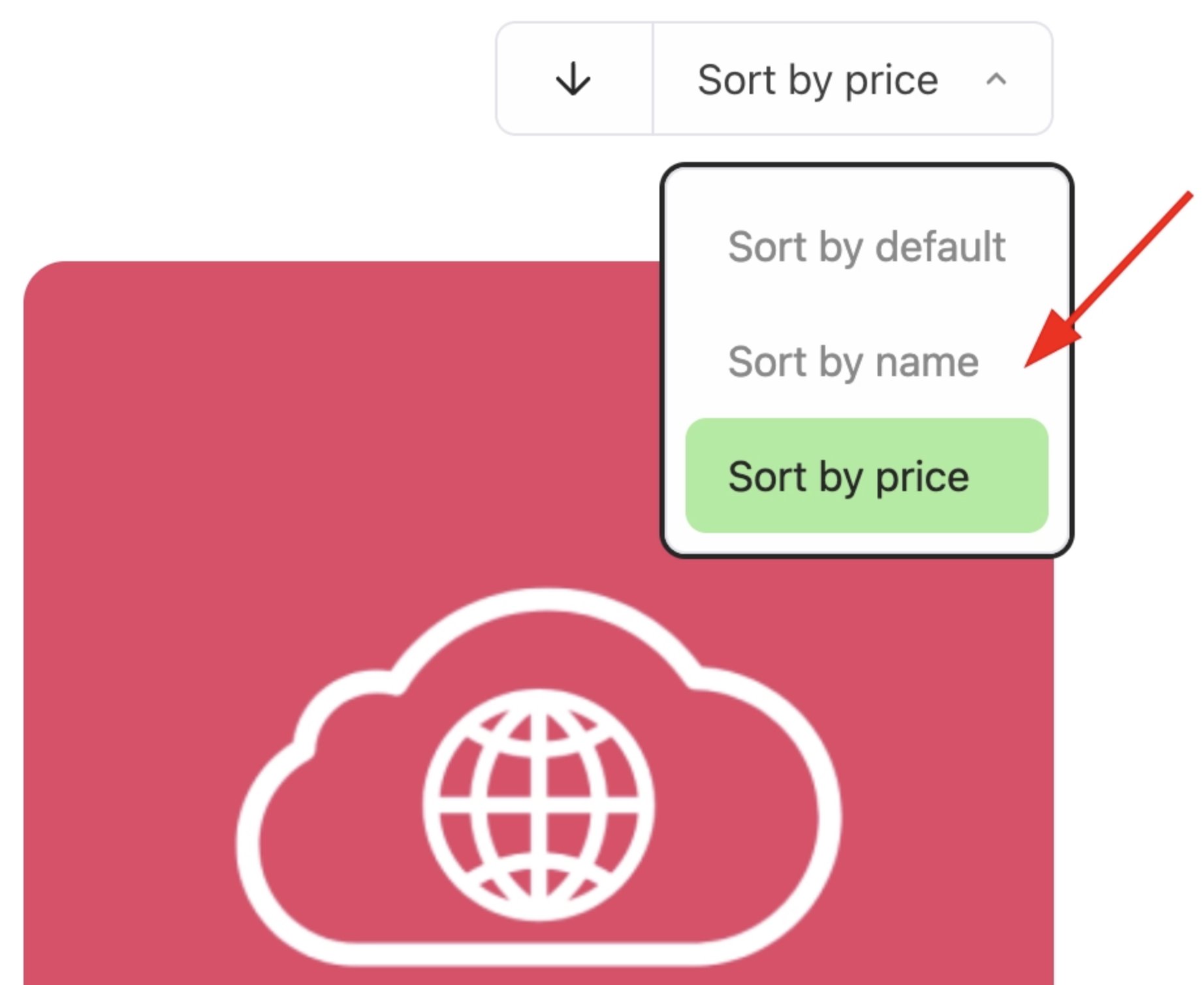 * `--color-control-muted-contrast` – Text colour used on a selected option (shown on top of `-color-control-muted` background).
`CSS` **Example**:
```css CSS theme={null}
[data-theme="webcentral"] {
--color-control-muted-contrast: #90EE90;
}
```
* `--color-control-muted-contrast` – Text colour used on a selected option (shown on top of `-color-control-muted` background).
`CSS` **Example**:
```css CSS theme={null}
[data-theme="webcentral"] {
--color-control-muted-contrast: #90EE90;
}
```
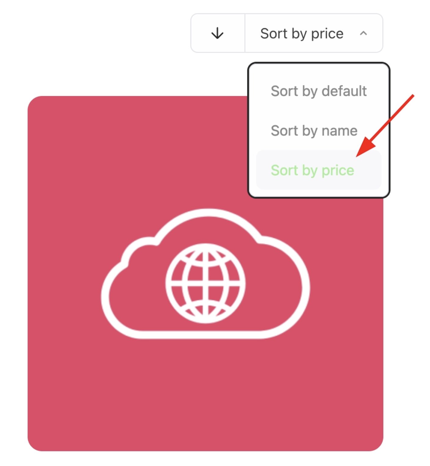 * `--color-control-stroke` – Default **border colour** for inputs, checkboxes, radios, etc. Light grey for resting state.
`CSS` **Example**:
```css CSS theme={null}
[data-theme="webcentral"] {
--color-control-stroke: #90EE90;
}
```
* `--color-control-stroke` – Default **border colour** for inputs, checkboxes, radios, etc. Light grey for resting state.
`CSS` **Example**:
```css CSS theme={null}
[data-theme="webcentral"] {
--color-control-stroke: #90EE90;
}
```
 * `--color-control-stroke-delta` – Darker border for **hover** state on controls. Provides subtle interactive feedback.
**Primary Colors:** Brand’s main colour (often used for CTAs).
* `--color-primary-default` – The **primary colour** (e.g., brand blue). Used as the base for primary button backgrounds and key accents.
`CSS` **Example**:
```css CSS theme={null}
[data-theme="webcentral"] {
--color-primary-default: #4169E1;
}
```
* `--color-control-stroke-delta` – Darker border for **hover** state on controls. Provides subtle interactive feedback.
**Primary Colors:** Brand’s main colour (often used for CTAs).
* `--color-primary-default` – The **primary colour** (e.g., brand blue). Used as the base for primary button backgrounds and key accents.
`CSS` **Example**:
```css CSS theme={null}
[data-theme="webcentral"] {
--color-primary-default: #4169E1;
}
```
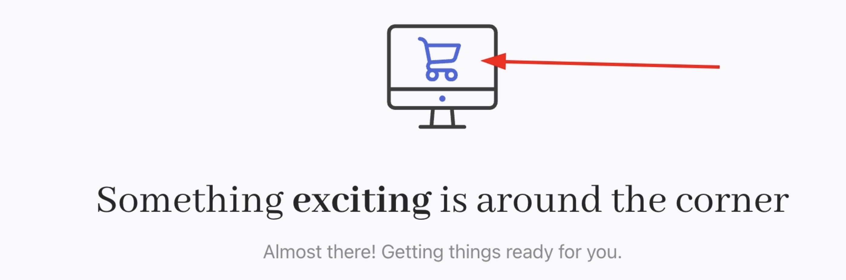 * `--color-primary-default-stop` – End colour for a primary button gradient. Changing this can create a gradient effect. If same as `-default`, buttons are solid.
* `--color-primary-default-delta` – Darker shade of primary for **hover/active** states on primary elements (buttons, links).
`CSS` **Example**:
```css CSS theme={null}
[data-theme="webcentral"] {
--color-primary-default-delta: #4169E1;
}
```
* `--color-primary-default-stop` – End colour for a primary button gradient. Changing this can create a gradient effect. If same as `-default`, buttons are solid.
* `--color-primary-default-delta` – Darker shade of primary for **hover/active** states on primary elements (buttons, links).
`CSS` **Example**:
```css CSS theme={null}
[data-theme="webcentral"] {
--color-primary-default-delta: #4169E1;
}
```
 * `--color-primary-default-contrast` – Text/icon colour on primary backgrounds (e.g., white text on primary button). Ensures accessibility contrast.
`CSS` **Example**:
```css CSS theme={null}
[data-theme="webcentral"] {
--color-primary-default-contrast: #4169E1;
}
```
* `--color-primary-default-contrast` – Text/icon colour on primary backgrounds (e.g., white text on primary button). Ensures accessibility contrast.
`CSS` **Example**:
```css CSS theme={null}
[data-theme="webcentral"] {
--color-primary-default-contrast: #4169E1;
}
```
 * `-color-primary-muted` – Very light **tinted version** of the primary colour (for subtle highlights). Used for badges or soft backgrounds instead of full primary.
* `-color-primary-muted-contrast` – Text colour on the muted-primary background (usually the primary colour itself or dark text).
**Secondary Colors:** Accent colour for secondary actions.
* `--color-secondary-default` – Base colour for secondary buttons/backgrounds. Usually a neutral tone (like very light grey).
`CSS` **Example**:
```css CSS theme={null}
[data-theme="webcentral"] {
--color-secondary-default: #4169E1;
}
```
* `-color-primary-muted` – Very light **tinted version** of the primary colour (for subtle highlights). Used for badges or soft backgrounds instead of full primary.
* `-color-primary-muted-contrast` – Text colour on the muted-primary background (usually the primary colour itself or dark text).
**Secondary Colors:** Accent colour for secondary actions.
* `--color-secondary-default` – Base colour for secondary buttons/backgrounds. Usually a neutral tone (like very light grey).
`CSS` **Example**:
```css CSS theme={null}
[data-theme="webcentral"] {
--color-secondary-default: #4169E1;
}
```
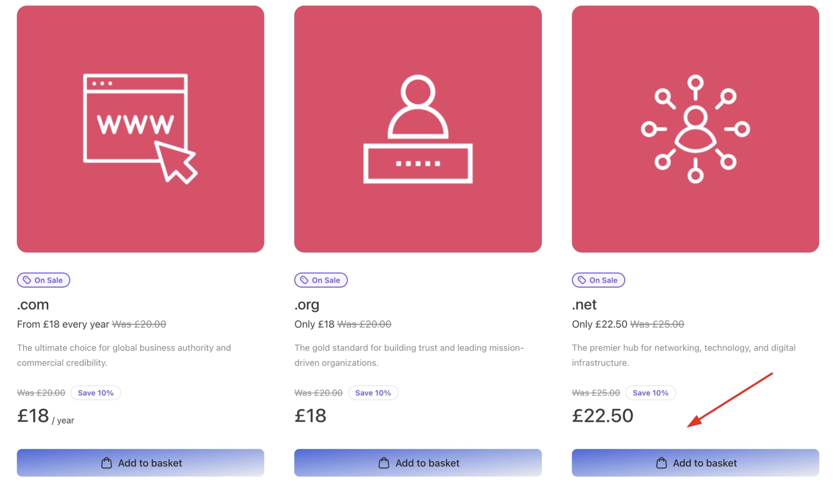 * `--color-secondary-default-stop` – Gradient end for secondary buttons. If different from default, creates a subtle gradient on secondary CTAs.
* `--color-secondary-default-delta` – Darker shade for **hover/active** on secondary elements.
`CSS` **Example**:
```css CSS theme={null}
[data-theme="webcentral"] {
--color-secondary-default-delta: #4169E1;
}
```
* `--color-secondary-default-stop` – Gradient end for secondary buttons. If different from default, creates a subtle gradient on secondary CTAs.
* `--color-secondary-default-delta` – Darker shade for **hover/active** on secondary elements.
`CSS` **Example**:
```css CSS theme={null}
[data-theme="webcentral"] {
--color-secondary-default-delta: #4169E1;
}
```
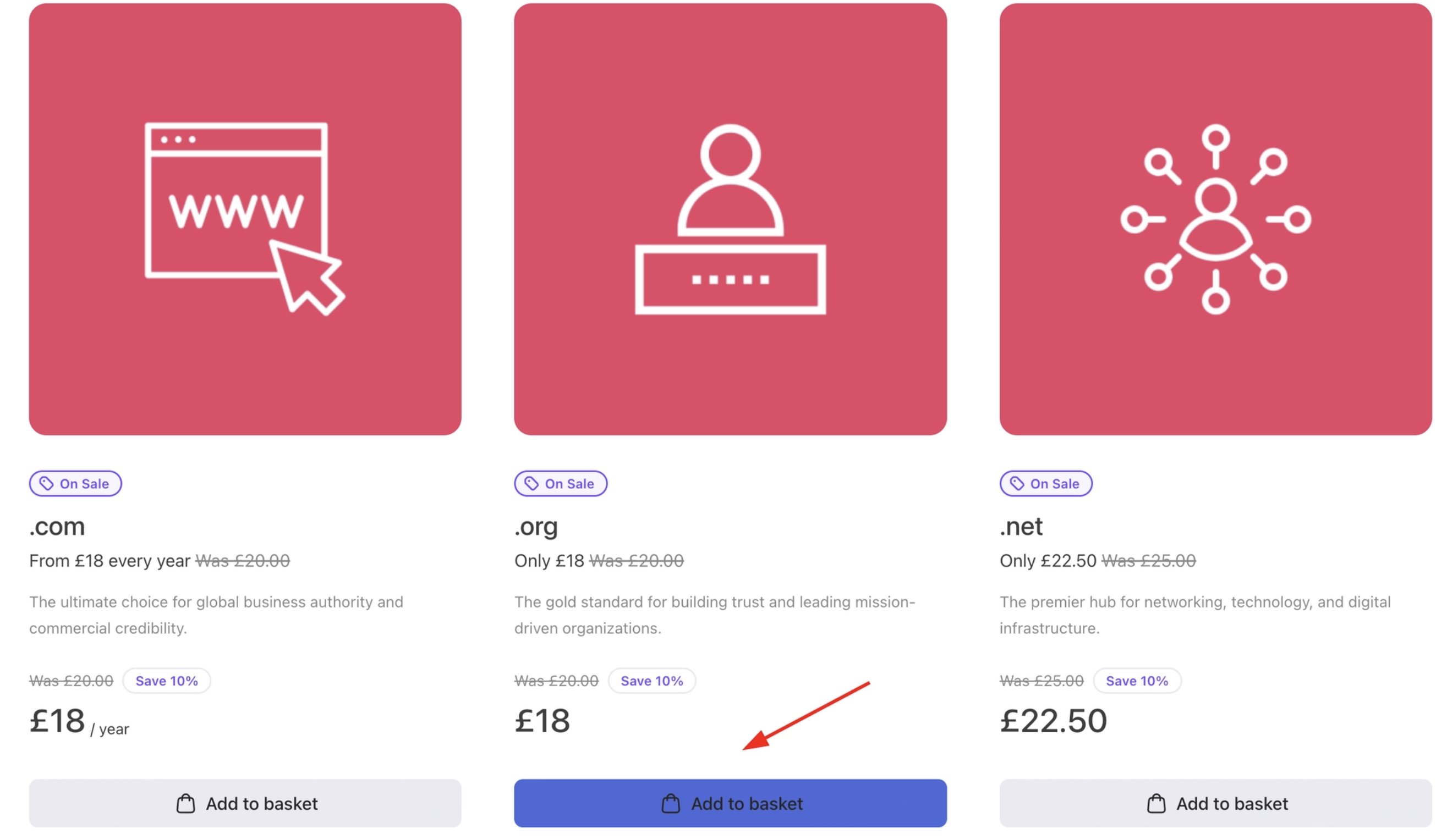 * `--color-secondary-default-contrast` – Text/icon colour on secondary backgrounds (commonly dark text on the light secondary colour).
**Neutral Colors:** Tones for non-branded UI elements.
* `--color-neutral-default` – Medium-grey used for neutral buttons or UI elements that shouldn’t draw attention.
* `--color-neutral-default-delta` – Darker variant for neutral buttons on hover or focus.
* `--color-neutral-default-contrast` – Text colour on `neutral-default` backgrounds (often white for readability).
* `--color-neutral-muted` – Very light grey (almost white) for backgrounds of subtle elements (chips, tags, low-emphasis containers).
* `--color-neutral-muted-delta` – Slightly darker version for hover on muted backgrounds.
* `--color-neutral-muted-contrast` – Text colour on `neutral-muted` backgrounds (dark grey for contrast).
* `--color-neutral-stroke` – Border colour for surfaces (cards, dividers, table rows). Subtle light line.
* `--color-neutral-stroke-delta` – Darker border for hover or emphasis on neutral outlines.
**Promo Colors:** Bright accent for marketing/promotions.
* `--color-promo-default` – Bold colour (often a vivid purple/blue) for sale badges, discount banners, or promotional highlights.
`CSS` **Example**:
```css CSS theme={null}
[data-theme="webcentral"] {
--color-promo-default: #90EE90;
}
```
* `--color-secondary-default-contrast` – Text/icon colour on secondary backgrounds (commonly dark text on the light secondary colour).
**Neutral Colors:** Tones for non-branded UI elements.
* `--color-neutral-default` – Medium-grey used for neutral buttons or UI elements that shouldn’t draw attention.
* `--color-neutral-default-delta` – Darker variant for neutral buttons on hover or focus.
* `--color-neutral-default-contrast` – Text colour on `neutral-default` backgrounds (often white for readability).
* `--color-neutral-muted` – Very light grey (almost white) for backgrounds of subtle elements (chips, tags, low-emphasis containers).
* `--color-neutral-muted-delta` – Slightly darker version for hover on muted backgrounds.
* `--color-neutral-muted-contrast` – Text colour on `neutral-muted` backgrounds (dark grey for contrast).
* `--color-neutral-stroke` – Border colour for surfaces (cards, dividers, table rows). Subtle light line.
* `--color-neutral-stroke-delta` – Darker border for hover or emphasis on neutral outlines.
**Promo Colors:** Bright accent for marketing/promotions.
* `--color-promo-default` – Bold colour (often a vivid purple/blue) for sale badges, discount banners, or promotional highlights.
`CSS` **Example**:
```css CSS theme={null}
[data-theme="webcentral"] {
--color-promo-default: #90EE90;
}
```
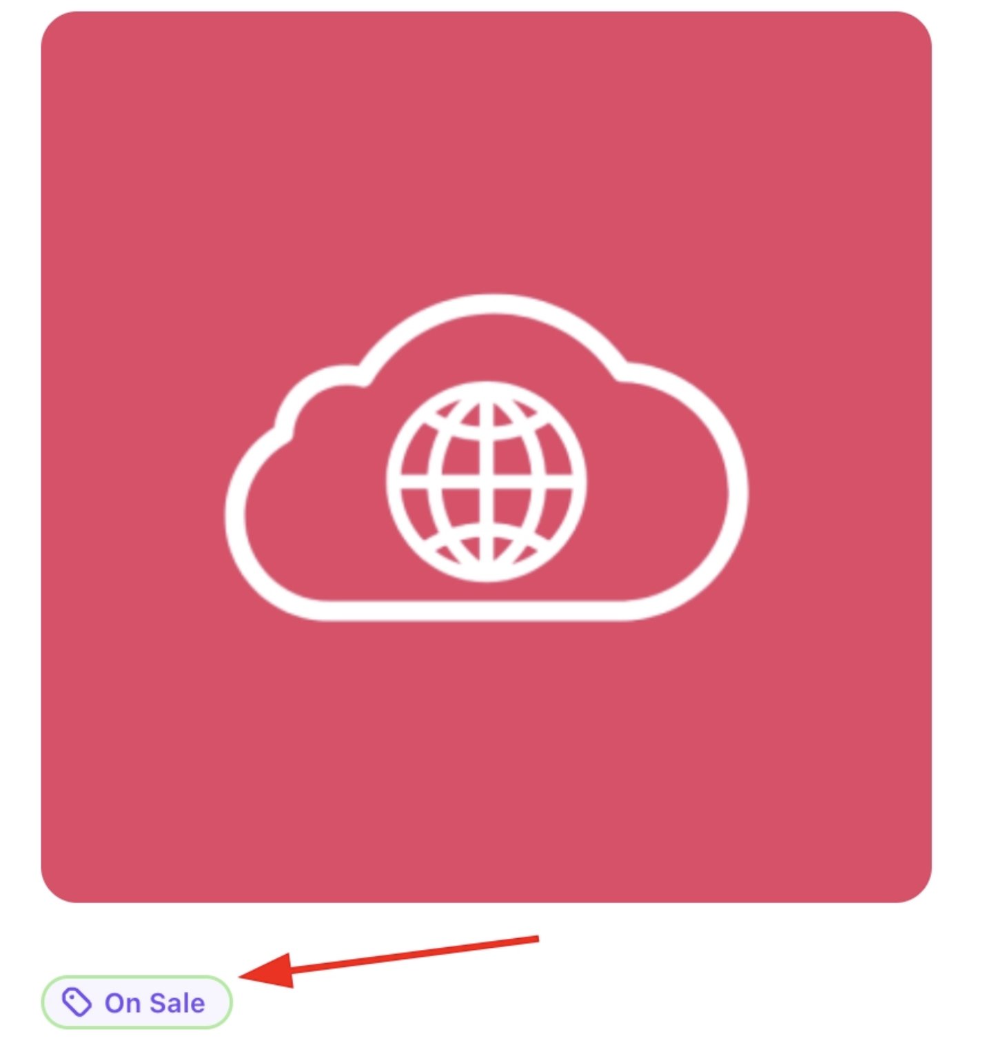 * `--color-promo-default-contrast` – Text colour on promo backgrounds (usually white).
* `--color-promo-muted` – Very light tint of promo colour for subtle emphasis.
`CSS` **Example**:
```css CSS theme={null}
[data-theme="webcentral"] {
--color-promo-muted: #90EE90;
}
```
* `--color-promo-default-contrast` – Text colour on promo backgrounds (usually white).
* `--color-promo-muted` – Very light tint of promo colour for subtle emphasis.
`CSS` **Example**:
```css CSS theme={null}
[data-theme="webcentral"] {
--color-promo-muted: #90EE90;
}
```
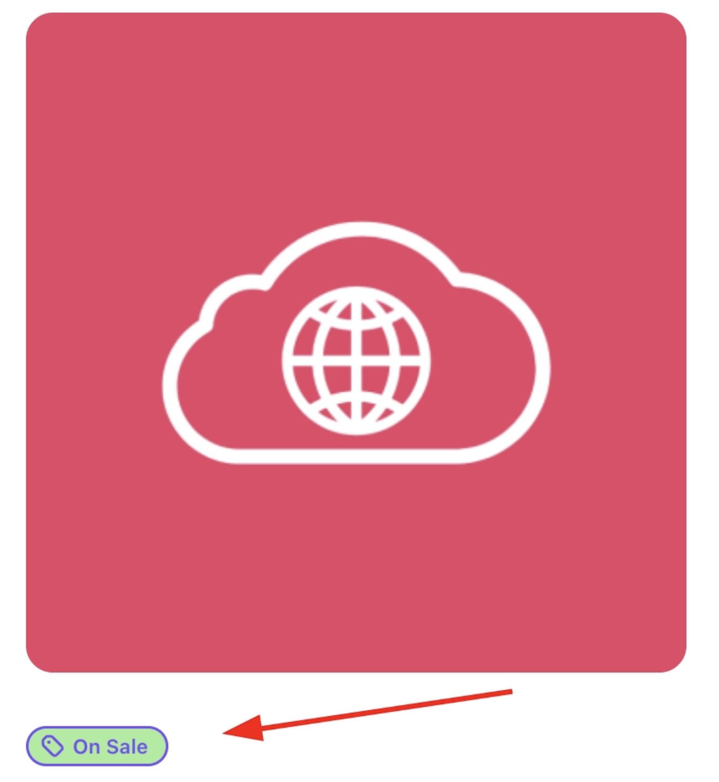 * `--color-promo-muted-contrast` – Text colour on soft promo backgrounds (often the promo colour itself).
**Danger Colors:** For error and destructive states.
* `--color-danger-default` – Vivid red for error badges, delete buttons, and alerts. Grabs immediate attention.
* `--color-danger-default-delta` – Darker red for hover on danger elements.
* `--color-danger-default-contrast` – Text colour on danger backgrounds (often a very light pink or white).
* `--color-danger-muted` – Light pink background for inline error messages or validation hints.
* `--color-danger-muted-contrast` – Text colour on muted-danger backgrounds (usually the danger red itself).
**Warning Colors:** For cautionary notices.
* `--color-warning-default` – Amber/yellow for warnings, alert banners, or pending states. High visibility.
* `--color-warning-default-contrast` – Text colour on warning backgrounds (dark brownish-amber).
* `--color-warning-muted` – Very light yellow for inline caution notes.
* `--color-warning-muted-contrast` – Text colour on soft-warning backgrounds (darker amber for readability).
**Success Colors:** For positive/confirmation states.
* `--color-success-default` – Bright green for success messages, completed status, etc. Conveys “all good.”
* `--color-success-default-contrast` – Dark green text on `success` backgrounds.
* `--color-success-muted` – Pale green for inline confirmations or subtle success indicators.
* `--color-success-muted-contrast` – Text colour on muted-success backgrounds (usually a mid-green).
**Info Colors:** For neutral informational elements.
* `--color-info-default` – Calm blue for tooltips, help badges, or info banners.
* `--color-info-default-contrast` – Text colour on info backgrounds (usually white).
* `--color-info-muted` – Very light blue tint for inline tips or notices.
* `--color-info-muted-contrast` – Text colour on muted-info backgrounds (the info blue itself).
## **Semantic Tokens**
These tokens **map primitives to actual UI uses** (backgrounds, text, borders, accents). They help maintain consistency by using the core colour values where needed.
**Background (Layout):** Surface and canvas layers.
* `--bg-canvas: var(--color-core-canvas)` - The overall page background in layout.
* `--bg-surface: var(--color-core-surface)` - Used for card and panel backgrounds.
* `--bg-skeleton: var(--color-core-skeleton)` - Background for loading skeleton screens.
* `--bg-overlay: var(--color-core-overlay)` - Dark overlay behind modals/drawers.
* `--bg-tooltip: var(--color-core-overlay)` – Usually same as overlay. Background for tooltip bubbles (dark background).
**Background (Form Controls):** Checkbox, radio, toggle states.
* `--bg-control-checked-contrast: var(--color-control-default-contrast)` - Background of a **checked/on** control (checkbox, radio, toggle).
* `--bg-control-checked: var(--color-control-default)` - Hover fill for an already-checked control.
* `--bg-control-checked-hover: var(--color-control-default-delta)` - The checkmark/radio dot colour on checked controls.
* `--bg-control-unchecked: var(--color-control-stroke)` - Background (track) colour of an **unchecked/off** toggle.
* `--bg-control-unchecked-hover: var(--color-control-stroke-delta)` - Hover fill for an unchecked toggle track.
* `--bg-control-selected: var(--color-control-muted)` - Background for **focused/selected** dropdown items or options.
* `--bg-control-surface: var(--color-control-default-contrast)` - Background for form fields (usually white).
* `--bg-control-ring: var(--color-control-default)` - Colour used for focus rings on form controls.
**Background (Buttons):** Button backgrounds and gradients.
* `--bg-button-primary-0: var(--color-primary-default)` - **Primary button** start colour (often same as `-primary-default`).
* `--bg-button-primary-1: var(--color-primary-default-stop)` - **Primary button** end colour (for gradient).
* `--bg-button-primary-hover-0: var(--color-primary-default-delta)` - Hover start for primary button.
* `--bg-button-primary-hover-1: var(--color-primary-default-delta)` - Hover end for primary button.
* `--bg-button-primary-ring: var(--color-primary-default-delta)` - Focus ring colour for primary buttons.
* `--bg-button-secondary-0: var(--color-secondary-default)` - Secondary button start colour.
* `--bg-button-secondary-1: var(--color-secondary-default-stop)` - Secondary button end colour.
* `--bg-button-secondary-hover-0: var(--color-secondary-default-delta)` - Hover start for secondary button.
* `--bg-button-secondary-hover-1: var(--color-secondary-default-delta)` - Hover end for secondary button.
* `--bg-button-neutral-ring: var(--color-neutral-default-delta)` - Focus ring for secondary buttons.
* `--bg-button-neutral-0: var(--color-neutral-default)` - Neutral (tertiary) button colour.
* `--bg-button-neutral-1: var(--color-neutral-default)` - (Solid colour, no gradient by default).
* `--bg-button-neutral-hover-0: var(--color-neutral-default-delta)` - Hover start for neutral buttons.
* `--bg-button-neutral-hover-1: var(--color-neutral-default-delta)` - Hover end for neutral buttons.
* `--bg-button-subtle-ring: var(--color-neutral-default-delta)` - Focus ring for neutral buttons.
* `--bg-button-subtle-0: var(--color-neutral-muted)` - Subtle (minimal) button background.
* `--bg-button-subtle-1: var(--color-neutral-muted)` - (Solid light colour).
* `--bg-button-subtle-hover-0: var(--color-neutral-muted-delta)` - Hover start for subtle buttons.
* `--bg-button-subtle-hover-1: var(--color-neutral-muted-delta)` - Hover end for subtle buttons.
* `--bg-button-danger-ring: var(--color-danger-default-delta)` - Focus ring for subtle buttons.
* `--bg-button-danger-0: var(--color-danger-default)` - Hover start for danger buttons.
* `--bg-button-danger-1: var(--color-danger-default)` - Hover end for danger buttons.
* `--bg-button-danger-hover-0: var(--color-danger-default-delta)`
* `--bg-button-danger-hover-1: var(--color-danger-default-delta)` - Focus ring for danger buttons.
* `--bg-button-outline` – Transparent (default for outline buttons).
* `--bg-button-outline-hover: var(--color-neutral-muted-delta)` - Hover fill for outline buttons.
* `--bg-button-outline-ring: var(--color-neutral-default-delta)` - Outline button focus ring.
* `-bg-button-ghost` – Transparent (default for ghost buttons).
* `--bg-button-ghost-hover: var(--color-neutral-muted-delta)` - Hover fill for ghost buttons.
* `--bg-button-ghost-ring: var(--color-neutral-default-delta)` - Ghost button focus ring.
**Background (Accents/Badges):** Colored backgrounds for labels and tags.
* `--bg-accent-primary: var(--color-primary-default)` - Solid background for **primary accents** (featured badges, selected tabs).
* `--bg-accent-primary-muted: var(--color-primary-muted)` - Lighter tint of primary for inline tags or subtle highlights.
* `--bg-accent-neutral: var(--color-neutral-default)` - Solid neutral background for generic tags/status.
* `--bg-accent-neutral-muted: var(--color-neutral-muted)` - Light neutral background for subtle chips or pills.
* `--bg-accent-promo: var(--color-promo-default)` - Bold promotional background (sale badges, etc).
* `--bg-accent-promo-muted: var(--color-promo-muted)` - Soft promo tint for less intense callouts.
* `--bg-accent-danger: var(--color-danger-default)` - Solid danger background for error badges or alerts.
* `--bg-accent-danger-muted: var(--color-danger-muted)` - Light danger background for inline error messages.
* `--bg-accent-warning: var(--color-warning-default)` - Solid warning background for attention badges.
* `--bg-accent-warning-muted: var(--color-warning-muted)` - Soft warning background for subtler notices.
* `--bg-accent-success: var(--color-success-default)` - Solid success background for completion badges.
* `--bg-accent-success-muted: var(--color-success-muted)` - Soft success background for inline confirmations.
* `--bg-accent-info: var(--color-info-default)` - Solid info background for informational badges.
* `--bg-accent-info-muted: var(--color-info-muted)` - Soft info background for tips or notes.
**Border Colors:** For outlines and dividers.
* `--border-surface: var(--color-neutral-stroke)` - Default border colour for cards, panels, tables, and dividers (a light grey).
* `--border-button-outline: var(--color-neutral-stroke)` - Border for outline buttons (same as surface border).
* `--border-button-outline-hover: var(--color-neutral-stroke-delta)` - Darker border on hover for outline buttons.
* `--border-control-default: var(--color-control-stroke)` - Default border on form inputs and controls.
* `--border-control-hover: var(--color-control-stroke-delta)` - Hover border on inputs to signal interactivity.
* `--border-control-selected: var(--color-control-default)` - Border on focused/selected inputs (darker than default).
* `--border-accent-primary: var(--color-primary-default)` - Coloured border for emphasis (active nav items, featured cards).
* `--border-accent-secondary: var(--color-secondary-default)` - Coloured border for secondary grouping.
* `--border-accent-neutral: var(--color-neutral-default)` - Bold neutral-coloured border.
* `--border-accent-promo: var(--color-promo-default)` - Promotional coloured border for marketing emphasis.
* `--border-accent-danger: var(--color-danger-default)` - Danger border for error highlighting.
* `--border-accent-warning: var(--color-warning-default)` - Warning border for cautionary emphasis.
* `--border-accent-success: var(--color-success-default)` - Success border for positive states.
* `--border-accent-info: var(--color-info-default)` - Info border for informational emphasis.
**Icon Colors:** Default icon shades.
* `--icon-primary: var(--color-primary-default)` - Brand-coloured icons (sparingly for key actions).
* `--icon-neutral: var(--color-core-base)` - Default grey icon colour (matches body text).
**Text Colors:** Typography colors for hierarchy.
* `--text-base: var(--color-core-base)` - Default paragraph text colour.
* `--text-display: var(--color-core-display)` - High-emphasis text (used on headings, etc).
* `--text-muted: var(--color-core-muted)` - Secondary/de-emphasised text (captions, helper text).
* `--text-faint: var(--color-core-faint)` - Low-emphasis text (placeholders, disabled text).
* `-text-primary` – #ffffff. Always used on a primary-colored background (white text on primary buttons/areas).
* `--text-tooltip: var(--color-core-overlay-contrast)` - Text colour inside tooltips (light text on dark tooltip).
**Text (Buttons & Controls):** Text for interactive elements.
* `--text-control-selected: var(--color-control-muted-contrast)` - Text for currently selected/highlighted items in dropdowns, comboboxes, and option lists.
* `--text-button-primary: var(--color-primary-default-contrast)` - Text on primary buttons (white or light).
* `--text-button-secondary: var(--color-secondary-default-contrast)` - Text on secondary buttons (dark).
* `--text-button-neutral: var(--color-neutral-default-contrast)` - Text on neutral buttons (white).
* `--text-button-subtle: var(--color-neutral-muted-contrast)` - Text on subtle buttons (dark grey).
* `--text-button-danger: var(--color-danger-default-contrast)` - Text on danger buttons (light).
* `--text-button-danger-link: var(--color-danger-default)` - Used for text links styled as danger (red link).
* `--text-button-danger-link-hover: var(--color-danger-default-delta)` - Darker red on hover for danger links.
* `--text-button-outline: var(--color-core-display)` - Text on outline buttons (dark text on transparent bg).
* `--text-button-ghost: var(--color-core-display)` - Text on ghost buttons (dark text).
* `--text-button-link: var(--color-core-display)` - Text for inline link-style buttons.
* `--text-button-link-hover: var(--color-control-default)` - Text on link-hover (slightly darker).
* `--text-button-muted-link: var(--color-core-muted)` - De-emphasised link text (grey link).
* `--text-button-muted-link-hover: var(--color-control-default)` - Hover color for muted link (darkens).
**Text (Accents):** For coloured text or text on coloured backgrounds.
* `--text-accent-primary: var(--color-primary-default)` - Primary coloured text (emphasis colour).
* `--text-accent-primary-muted-contrast: var(--color-primary-muted-contrast)` - Text on solid primary backgrounds.
* `--text-accent-primary-contrast: var(--color-primary-default-contrast)` - Text on light primary tints.
* `--text-accent-neutral: var(--color-neutral-default)` - Neutral accent text.
* `--text-accent-neutral-contrast: var(--color-neutral-default-contrast)` - Text on solid neutral backgrounds.
* `--text-accent-neutral-muted-contrast: var(--color-neutral-muted-contrast)` - Text on light neutral backgrounds.
* `--text-accent-promo: var(--color-promo-default)` - Promotional text colour.
* `--text-accent-promo-contrast: var(--color-promo-default-contrast)` - Text on solid promo backgrounds.
* `--text-accent-promo-muted-contrast: var(--color-promo-muted-contrast)` - Text on light promo backgrounds.
* `--text-accent-danger: var(--color-danger-default)` - Danger text colour (red text).
* `--text-accent-danger-contrast: var(--color-danger-default-contrast)` - Text on solid danger backgrounds.
* `--text-accent-danger-muted-contrast: var(--color-danger-muted-contrast)` - Text on light danger backgrounds.
* `--text-accent-warning: var(--color-warning-default)` - Warning text colour (amber text).
* `--text-accent-warning-contrast: var(--color-warning-default-contrast)` - Text on solid warning backgrounds.
* `--text-accent-warning-muted-contrast: var(--color-warning-muted-contrast)` - Text on light warning backgrounds.
* `--text-accent-success: var(--color-success-default)` - Success text colour (green text).
* `--text-accent-success-contrast: var(--color-success-default-contrast)` - Text on solid success backgrounds.
* `--text-accent-success-muted-contrast: var(--color-success-muted-contrast)` - Text on light success backgrounds.
* `--text-accent-info: var(--color-info-default)` - Info text colour (blue text).
* `--text-accent-info-contrast: var(--color-info-default-contrast)` - Text on solid info backgrounds.
* `--text-accent-info-muted-contrast: var(--color-info-muted-contrast)` - Text on light info backgrounds.
## **Component Tokens**
These tokens control **component-specific styling** like shapes, spacing, and typography. They ensure consistency across UI elements.
**Corner Radii:** Rounding for component corners.
* `--button-radius` – Rounding for buttons. Higher value makes more rounded buttons.
`CSS` **Example**:
```css CSS theme={null}
[data-theme="webcentral"] {
--button-radius: 32px;
}
```
* `--color-promo-muted-contrast` – Text colour on soft promo backgrounds (often the promo colour itself).
**Danger Colors:** For error and destructive states.
* `--color-danger-default` – Vivid red for error badges, delete buttons, and alerts. Grabs immediate attention.
* `--color-danger-default-delta` – Darker red for hover on danger elements.
* `--color-danger-default-contrast` – Text colour on danger backgrounds (often a very light pink or white).
* `--color-danger-muted` – Light pink background for inline error messages or validation hints.
* `--color-danger-muted-contrast` – Text colour on muted-danger backgrounds (usually the danger red itself).
**Warning Colors:** For cautionary notices.
* `--color-warning-default` – Amber/yellow for warnings, alert banners, or pending states. High visibility.
* `--color-warning-default-contrast` – Text colour on warning backgrounds (dark brownish-amber).
* `--color-warning-muted` – Very light yellow for inline caution notes.
* `--color-warning-muted-contrast` – Text colour on soft-warning backgrounds (darker amber for readability).
**Success Colors:** For positive/confirmation states.
* `--color-success-default` – Bright green for success messages, completed status, etc. Conveys “all good.”
* `--color-success-default-contrast` – Dark green text on `success` backgrounds.
* `--color-success-muted` – Pale green for inline confirmations or subtle success indicators.
* `--color-success-muted-contrast` – Text colour on muted-success backgrounds (usually a mid-green).
**Info Colors:** For neutral informational elements.
* `--color-info-default` – Calm blue for tooltips, help badges, or info banners.
* `--color-info-default-contrast` – Text colour on info backgrounds (usually white).
* `--color-info-muted` – Very light blue tint for inline tips or notices.
* `--color-info-muted-contrast` – Text colour on muted-info backgrounds (the info blue itself).
## **Semantic Tokens**
These tokens **map primitives to actual UI uses** (backgrounds, text, borders, accents). They help maintain consistency by using the core colour values where needed.
**Background (Layout):** Surface and canvas layers.
* `--bg-canvas: var(--color-core-canvas)` - The overall page background in layout.
* `--bg-surface: var(--color-core-surface)` - Used for card and panel backgrounds.
* `--bg-skeleton: var(--color-core-skeleton)` - Background for loading skeleton screens.
* `--bg-overlay: var(--color-core-overlay)` - Dark overlay behind modals/drawers.
* `--bg-tooltip: var(--color-core-overlay)` – Usually same as overlay. Background for tooltip bubbles (dark background).
**Background (Form Controls):** Checkbox, radio, toggle states.
* `--bg-control-checked-contrast: var(--color-control-default-contrast)` - Background of a **checked/on** control (checkbox, radio, toggle).
* `--bg-control-checked: var(--color-control-default)` - Hover fill for an already-checked control.
* `--bg-control-checked-hover: var(--color-control-default-delta)` - The checkmark/radio dot colour on checked controls.
* `--bg-control-unchecked: var(--color-control-stroke)` - Background (track) colour of an **unchecked/off** toggle.
* `--bg-control-unchecked-hover: var(--color-control-stroke-delta)` - Hover fill for an unchecked toggle track.
* `--bg-control-selected: var(--color-control-muted)` - Background for **focused/selected** dropdown items or options.
* `--bg-control-surface: var(--color-control-default-contrast)` - Background for form fields (usually white).
* `--bg-control-ring: var(--color-control-default)` - Colour used for focus rings on form controls.
**Background (Buttons):** Button backgrounds and gradients.
* `--bg-button-primary-0: var(--color-primary-default)` - **Primary button** start colour (often same as `-primary-default`).
* `--bg-button-primary-1: var(--color-primary-default-stop)` - **Primary button** end colour (for gradient).
* `--bg-button-primary-hover-0: var(--color-primary-default-delta)` - Hover start for primary button.
* `--bg-button-primary-hover-1: var(--color-primary-default-delta)` - Hover end for primary button.
* `--bg-button-primary-ring: var(--color-primary-default-delta)` - Focus ring colour for primary buttons.
* `--bg-button-secondary-0: var(--color-secondary-default)` - Secondary button start colour.
* `--bg-button-secondary-1: var(--color-secondary-default-stop)` - Secondary button end colour.
* `--bg-button-secondary-hover-0: var(--color-secondary-default-delta)` - Hover start for secondary button.
* `--bg-button-secondary-hover-1: var(--color-secondary-default-delta)` - Hover end for secondary button.
* `--bg-button-neutral-ring: var(--color-neutral-default-delta)` - Focus ring for secondary buttons.
* `--bg-button-neutral-0: var(--color-neutral-default)` - Neutral (tertiary) button colour.
* `--bg-button-neutral-1: var(--color-neutral-default)` - (Solid colour, no gradient by default).
* `--bg-button-neutral-hover-0: var(--color-neutral-default-delta)` - Hover start for neutral buttons.
* `--bg-button-neutral-hover-1: var(--color-neutral-default-delta)` - Hover end for neutral buttons.
* `--bg-button-subtle-ring: var(--color-neutral-default-delta)` - Focus ring for neutral buttons.
* `--bg-button-subtle-0: var(--color-neutral-muted)` - Subtle (minimal) button background.
* `--bg-button-subtle-1: var(--color-neutral-muted)` - (Solid light colour).
* `--bg-button-subtle-hover-0: var(--color-neutral-muted-delta)` - Hover start for subtle buttons.
* `--bg-button-subtle-hover-1: var(--color-neutral-muted-delta)` - Hover end for subtle buttons.
* `--bg-button-danger-ring: var(--color-danger-default-delta)` - Focus ring for subtle buttons.
* `--bg-button-danger-0: var(--color-danger-default)` - Hover start for danger buttons.
* `--bg-button-danger-1: var(--color-danger-default)` - Hover end for danger buttons.
* `--bg-button-danger-hover-0: var(--color-danger-default-delta)`
* `--bg-button-danger-hover-1: var(--color-danger-default-delta)` - Focus ring for danger buttons.
* `--bg-button-outline` – Transparent (default for outline buttons).
* `--bg-button-outline-hover: var(--color-neutral-muted-delta)` - Hover fill for outline buttons.
* `--bg-button-outline-ring: var(--color-neutral-default-delta)` - Outline button focus ring.
* `-bg-button-ghost` – Transparent (default for ghost buttons).
* `--bg-button-ghost-hover: var(--color-neutral-muted-delta)` - Hover fill for ghost buttons.
* `--bg-button-ghost-ring: var(--color-neutral-default-delta)` - Ghost button focus ring.
**Background (Accents/Badges):** Colored backgrounds for labels and tags.
* `--bg-accent-primary: var(--color-primary-default)` - Solid background for **primary accents** (featured badges, selected tabs).
* `--bg-accent-primary-muted: var(--color-primary-muted)` - Lighter tint of primary for inline tags or subtle highlights.
* `--bg-accent-neutral: var(--color-neutral-default)` - Solid neutral background for generic tags/status.
* `--bg-accent-neutral-muted: var(--color-neutral-muted)` - Light neutral background for subtle chips or pills.
* `--bg-accent-promo: var(--color-promo-default)` - Bold promotional background (sale badges, etc).
* `--bg-accent-promo-muted: var(--color-promo-muted)` - Soft promo tint for less intense callouts.
* `--bg-accent-danger: var(--color-danger-default)` - Solid danger background for error badges or alerts.
* `--bg-accent-danger-muted: var(--color-danger-muted)` - Light danger background for inline error messages.
* `--bg-accent-warning: var(--color-warning-default)` - Solid warning background for attention badges.
* `--bg-accent-warning-muted: var(--color-warning-muted)` - Soft warning background for subtler notices.
* `--bg-accent-success: var(--color-success-default)` - Solid success background for completion badges.
* `--bg-accent-success-muted: var(--color-success-muted)` - Soft success background for inline confirmations.
* `--bg-accent-info: var(--color-info-default)` - Solid info background for informational badges.
* `--bg-accent-info-muted: var(--color-info-muted)` - Soft info background for tips or notes.
**Border Colors:** For outlines and dividers.
* `--border-surface: var(--color-neutral-stroke)` - Default border colour for cards, panels, tables, and dividers (a light grey).
* `--border-button-outline: var(--color-neutral-stroke)` - Border for outline buttons (same as surface border).
* `--border-button-outline-hover: var(--color-neutral-stroke-delta)` - Darker border on hover for outline buttons.
* `--border-control-default: var(--color-control-stroke)` - Default border on form inputs and controls.
* `--border-control-hover: var(--color-control-stroke-delta)` - Hover border on inputs to signal interactivity.
* `--border-control-selected: var(--color-control-default)` - Border on focused/selected inputs (darker than default).
* `--border-accent-primary: var(--color-primary-default)` - Coloured border for emphasis (active nav items, featured cards).
* `--border-accent-secondary: var(--color-secondary-default)` - Coloured border for secondary grouping.
* `--border-accent-neutral: var(--color-neutral-default)` - Bold neutral-coloured border.
* `--border-accent-promo: var(--color-promo-default)` - Promotional coloured border for marketing emphasis.
* `--border-accent-danger: var(--color-danger-default)` - Danger border for error highlighting.
* `--border-accent-warning: var(--color-warning-default)` - Warning border for cautionary emphasis.
* `--border-accent-success: var(--color-success-default)` - Success border for positive states.
* `--border-accent-info: var(--color-info-default)` - Info border for informational emphasis.
**Icon Colors:** Default icon shades.
* `--icon-primary: var(--color-primary-default)` - Brand-coloured icons (sparingly for key actions).
* `--icon-neutral: var(--color-core-base)` - Default grey icon colour (matches body text).
**Text Colors:** Typography colors for hierarchy.
* `--text-base: var(--color-core-base)` - Default paragraph text colour.
* `--text-display: var(--color-core-display)` - High-emphasis text (used on headings, etc).
* `--text-muted: var(--color-core-muted)` - Secondary/de-emphasised text (captions, helper text).
* `--text-faint: var(--color-core-faint)` - Low-emphasis text (placeholders, disabled text).
* `-text-primary` – #ffffff. Always used on a primary-colored background (white text on primary buttons/areas).
* `--text-tooltip: var(--color-core-overlay-contrast)` - Text colour inside tooltips (light text on dark tooltip).
**Text (Buttons & Controls):** Text for interactive elements.
* `--text-control-selected: var(--color-control-muted-contrast)` - Text for currently selected/highlighted items in dropdowns, comboboxes, and option lists.
* `--text-button-primary: var(--color-primary-default-contrast)` - Text on primary buttons (white or light).
* `--text-button-secondary: var(--color-secondary-default-contrast)` - Text on secondary buttons (dark).
* `--text-button-neutral: var(--color-neutral-default-contrast)` - Text on neutral buttons (white).
* `--text-button-subtle: var(--color-neutral-muted-contrast)` - Text on subtle buttons (dark grey).
* `--text-button-danger: var(--color-danger-default-contrast)` - Text on danger buttons (light).
* `--text-button-danger-link: var(--color-danger-default)` - Used for text links styled as danger (red link).
* `--text-button-danger-link-hover: var(--color-danger-default-delta)` - Darker red on hover for danger links.
* `--text-button-outline: var(--color-core-display)` - Text on outline buttons (dark text on transparent bg).
* `--text-button-ghost: var(--color-core-display)` - Text on ghost buttons (dark text).
* `--text-button-link: var(--color-core-display)` - Text for inline link-style buttons.
* `--text-button-link-hover: var(--color-control-default)` - Text on link-hover (slightly darker).
* `--text-button-muted-link: var(--color-core-muted)` - De-emphasised link text (grey link).
* `--text-button-muted-link-hover: var(--color-control-default)` - Hover color for muted link (darkens).
**Text (Accents):** For coloured text or text on coloured backgrounds.
* `--text-accent-primary: var(--color-primary-default)` - Primary coloured text (emphasis colour).
* `--text-accent-primary-muted-contrast: var(--color-primary-muted-contrast)` - Text on solid primary backgrounds.
* `--text-accent-primary-contrast: var(--color-primary-default-contrast)` - Text on light primary tints.
* `--text-accent-neutral: var(--color-neutral-default)` - Neutral accent text.
* `--text-accent-neutral-contrast: var(--color-neutral-default-contrast)` - Text on solid neutral backgrounds.
* `--text-accent-neutral-muted-contrast: var(--color-neutral-muted-contrast)` - Text on light neutral backgrounds.
* `--text-accent-promo: var(--color-promo-default)` - Promotional text colour.
* `--text-accent-promo-contrast: var(--color-promo-default-contrast)` - Text on solid promo backgrounds.
* `--text-accent-promo-muted-contrast: var(--color-promo-muted-contrast)` - Text on light promo backgrounds.
* `--text-accent-danger: var(--color-danger-default)` - Danger text colour (red text).
* `--text-accent-danger-contrast: var(--color-danger-default-contrast)` - Text on solid danger backgrounds.
* `--text-accent-danger-muted-contrast: var(--color-danger-muted-contrast)` - Text on light danger backgrounds.
* `--text-accent-warning: var(--color-warning-default)` - Warning text colour (amber text).
* `--text-accent-warning-contrast: var(--color-warning-default-contrast)` - Text on solid warning backgrounds.
* `--text-accent-warning-muted-contrast: var(--color-warning-muted-contrast)` - Text on light warning backgrounds.
* `--text-accent-success: var(--color-success-default)` - Success text colour (green text).
* `--text-accent-success-contrast: var(--color-success-default-contrast)` - Text on solid success backgrounds.
* `--text-accent-success-muted-contrast: var(--color-success-muted-contrast)` - Text on light success backgrounds.
* `--text-accent-info: var(--color-info-default)` - Info text colour (blue text).
* `--text-accent-info-contrast: var(--color-info-default-contrast)` - Text on solid info backgrounds.
* `--text-accent-info-muted-contrast: var(--color-info-muted-contrast)` - Text on light info backgrounds.
## **Component Tokens**
These tokens control **component-specific styling** like shapes, spacing, and typography. They ensure consistency across UI elements.
**Corner Radii:** Rounding for component corners.
* `--button-radius` – Rounding for buttons. Higher value makes more rounded buttons.
`CSS` **Example**:
```css CSS theme={null}
[data-theme="webcentral"] {
--button-radius: 32px;
}
```
 * `--control-radius` – Rounding for inputs, selects, toggles. Usually same as `button-radius`.
`CSS` **Example**:
```css CSS theme={null}
[data-theme="webcentral"] {
--control-radius: 32px;
}
```
* `--control-radius` – Rounding for inputs, selects, toggles. Usually same as `button-radius`.
`CSS` **Example**:
```css CSS theme={null}
[data-theme="webcentral"] {
--control-radius: 32px;
}
```
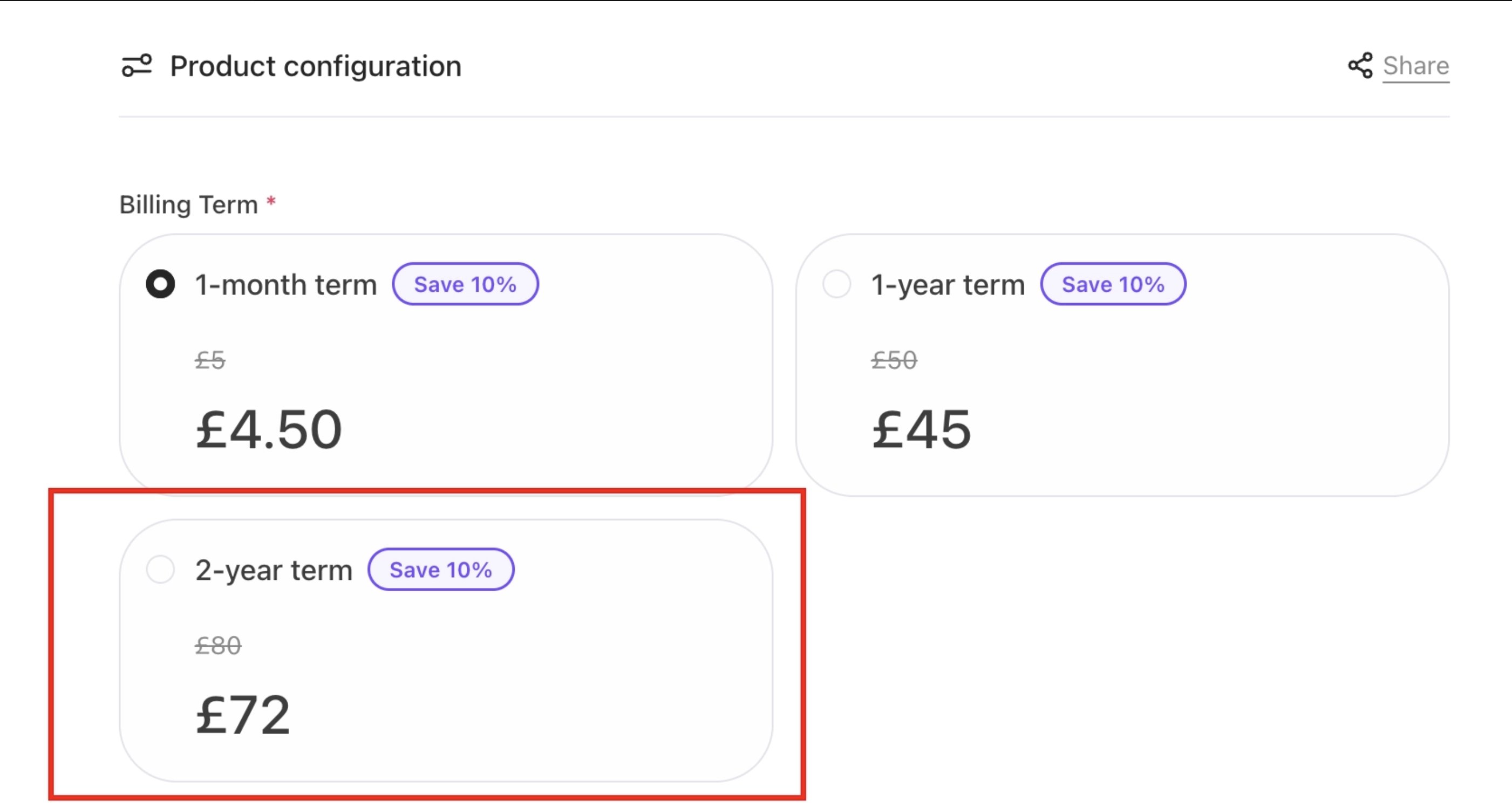 * `--badge-radius` – Rounding for badges/tags (often pill-shaped).
* `--image-radius` – Rounding for images or avatars (corners on images).
`CSS` **Example**:
```css CSS theme={null}
[data-theme="webcentral"] {
--image-radius: 128px;
}
```
* `--badge-radius` – Rounding for badges/tags (often pill-shaped).
* `--image-radius` – Rounding for images or avatars (corners on images).
`CSS` **Example**:
```css CSS theme={null}
[data-theme="webcentral"] {
--image-radius: 128px;
}
```
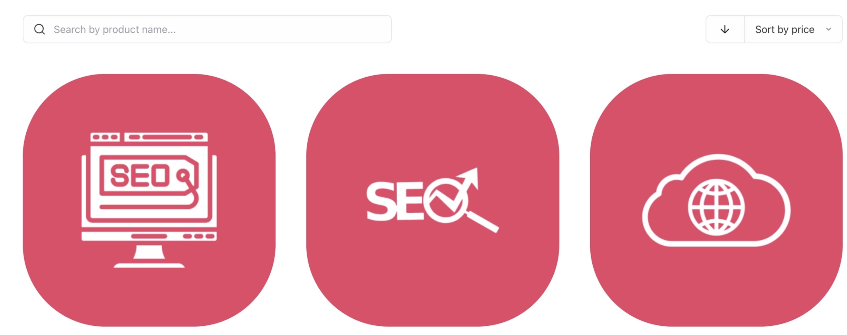 * `--card-radius` – Rounding for cards, panels, modals.
`CSS` **Example**:
```css CSS theme={null}
[data-theme="webcentral"] {
--card-radius: 128px;
}
```
* `--card-radius` – Rounding for cards, panels, modals.
`CSS` **Example**:
```css CSS theme={null}
[data-theme="webcentral"] {
--card-radius: 128px;
}
```
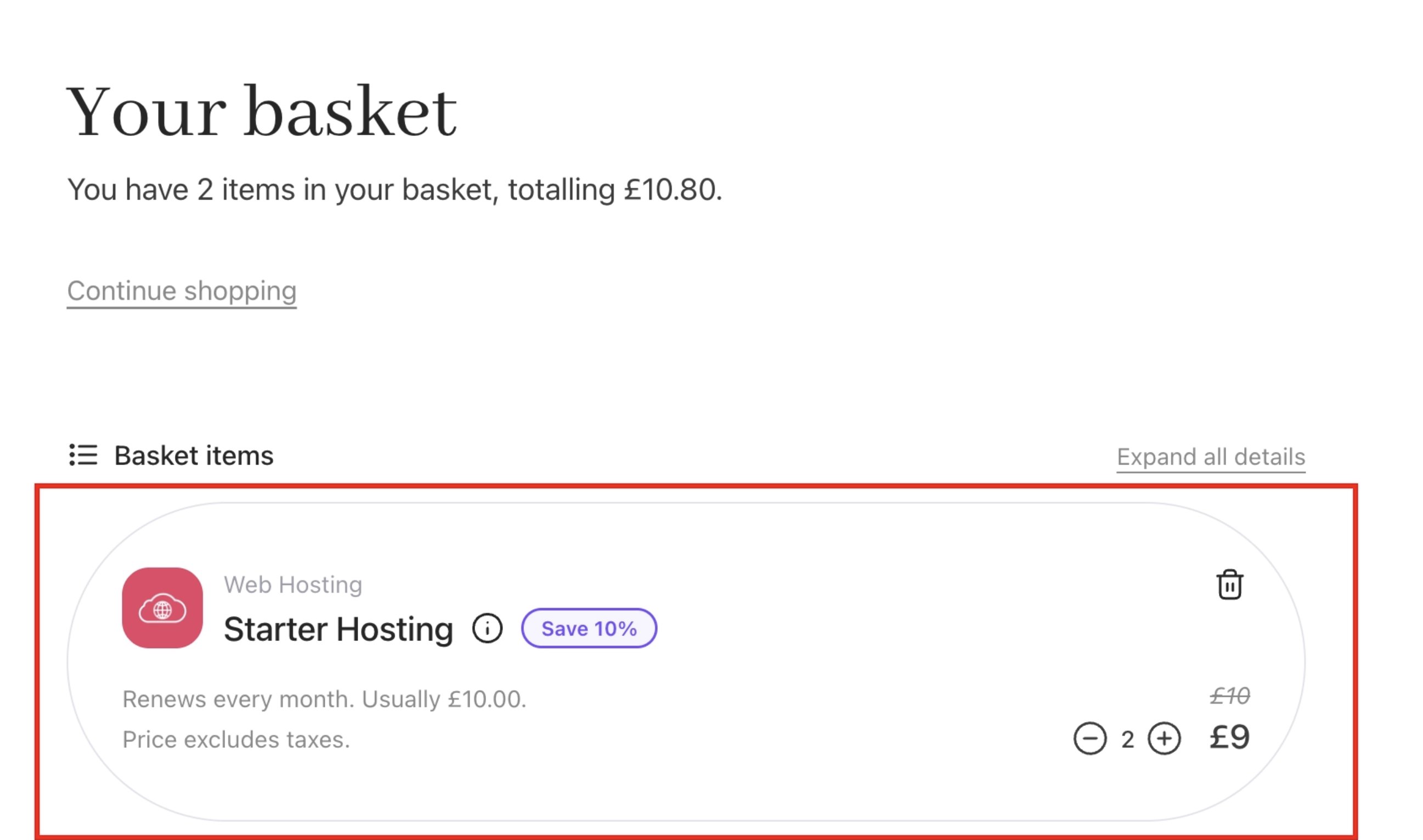 * `--message-radius` – Rounding for alerts/toasts messages.
**Stroke Width:** Thickness of line icons and badge outlines.
* `--stroke-icon` – Line thickness for general icons. Adjusts how bold or light icon strokes appear.
`CSS` **Example**:
```css CSS theme={null}
[data-theme="webcentral"] {
--stroke-icon: 6px;
}
```
* `--message-radius` – Rounding for alerts/toasts messages.
**Stroke Width:** Thickness of line icons and badge outlines.
* `--stroke-icon` – Line thickness for general icons. Adjusts how bold or light icon strokes appear.
`CSS` **Example**:
```css CSS theme={null}
[data-theme="webcentral"] {
--stroke-icon: 6px;
}
```
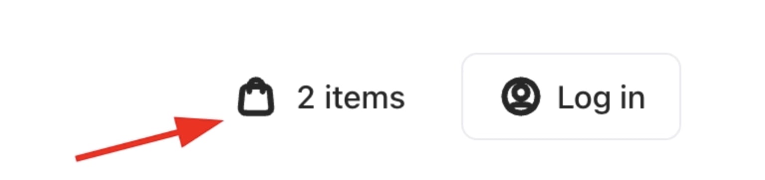 * `--stroke-badge` – Thickness for badge iconography (slightly bolder for small icons).
**Letter Spacing (Tracking):** Horizontal spacing of letters.
* `--tracking-normal` – Default spacing (used for most body text).
* `--tracking-tight` – Condensed spacing (for large headings or condensed text).
* `--tracking-wide` – Expanded spacing (for uppercase labels or small-caps).
**Display Font (Heading) Tokens:** Typography settings for large display text (headings).
* `--font-display-weight` – Base font weight for display text (headings).
`CSS` **Example**:
```css CSS theme={null}
[data-theme="webcentral"] {
--font-display-weight: 800
}
```
* `--stroke-badge` – Thickness for badge iconography (slightly bolder for small icons).
**Letter Spacing (Tracking):** Horizontal spacing of letters.
* `--tracking-normal` – Default spacing (used for most body text).
* `--tracking-tight` – Condensed spacing (for large headings or condensed text).
* `--tracking-wide` – Expanded spacing (for uppercase labels or small-caps).
**Display Font (Heading) Tokens:** Typography settings for large display text (headings).
* `--font-display-weight` – Base font weight for display text (headings).
`CSS` **Example**:
```css CSS theme={null}
[data-theme="webcentral"] {
--font-display-weight: 800
}
```
 * `--font-display-transform` – Text-transform for headings (e.g. uppercase if set).
* `--font-display-tracking` – Letter spacing for display text (usually `tight` for big headings).
**Display Font (Bold Variant):** Settings for bold emphasis in headings.
* `--font-display-bold: var(--font-display)` – Font family for bold display text (inherits default display font).
* `--font-display-bold-weight` – Font weight for bold headings (commonly 700).
* `--font-display-bold-transform: var(--font-display-transform)` – Text-transform for bold display (usually same as display).
* `--font-display-bold-tracking: var(--font-display-tracking)` – Letter spacing for bold display (same as display).
**Font Size Scale:** Type scale values and line heights. Each size has a default `line-height` (and tight/loose variants). Base font sizes from extra-small (0.75rem) up to 6xl (3.75rem).
* `--text-xs: 0.75rem; /* 12px */ --text-xs--line-height: 20px; --text-xs--line-height-tight: 16px; --text-xs--line-height-loose: 24px;`
* `--text-sm: 0.875rem; /* 14px */ --text-sm--line-height: 24px; --text-sm--line-height-tight: 20px; --text-sm--line-height-loose: 28px;`
* `--text-md: 1rem; /* 16px */ --text-md--line-height: 28px; --text-md--line-height-tight: 24px; --text-md--line-height-loose: 32px;`
* `--text-lg: 1.125rem; /* 18px */ --text-lg--line-height: 28px; --text-lg--line-height-tight: 24px; --text-lg--line-height-loose: 32px;`
* `--text-xl: 1.25rem; /* 20px */ --text-xl--line-height: 32px; --text-xl--line-height-tight: 28px; --text-xl--line-height-loose: 36px;`
* `--text-2xl: 1.5rem; /* 24px */ --text-2xl--line-height: 36px; --text-2xl--line-height-tight: 32px; --text-2xl--line-height-loose: 40px;`
* `--text-3xl: 1.875rem; /* 30px */ --text-3xl--line-height: 44px; --text-3xl--line-height-tight: 40px; --text-3xl--line-height-loose: 48px;`
* `--text-4xl: 2.5rem; /* 40px */ --text-4xl--line-height: 44px; --text-4xl--line-height-tight: 40px; --text-4xl--line-height-loose: 48px;`
* `--text-5xl: 3rem; /* 48px */ --text-5xl--line-height: 60px; --text-5xl--line-height-tight: 56px; --text-5xl--line-height-loose: 64px;`
* `--text-6xl: 3.75rem; /* 60px */ --text-6xl--line-height: 72px; --text-6xl--line-height-tight: 64px; --text-6xl--line-height-loose: 80px;`
Each size has associated line-height tokens (e.g. `-text-md--line-height` = 28px) and tighter/looser variants.
Each token above can be overridden in your theme to customise the look and feel of the cart. They work together to ensure consistent design: primitives set the base colours, semantic tokens apply them to UI elements, and component tokens handle shapes and typography.
## **Complete example**
The following CSS and JSON blocks bring together primitive, semantic, and component tokens into a single working theme definition. It covers colours, typography, spacing, and component shapes, and shows how a named theme is structured and applied to your storefront.
### Step 1: Define your theme in Brand Tokens
Add the following to the **Brand Tokens** field under **Settings > Brand Settings (**`CSS` Example):
```css CSS theme={null}
[data-theme="yourbrand"] {
/* Core colors */
--color-core-canvas: #f8f9fc;
--color-core-surface: #ffffff;
--color-core-base: #374151;
--color-core-display: #111827;
--color-core-muted: #6b7280;
--color-core-faint: #d1d5db;
--color-core-skeleton: rgba(0, 0, 0, 0.06);
--color-core-overlay: rgba(0, 0, 0, 0.45);
--color-core-overlay-contrast: #ffffff;
/* Control colors */
--color-control-default: #1d4ed8;
--color-control-default-contrast: #ffffff;
--color-control-default-delta: #1e40af;
--color-control-muted: #eff6ff;
--color-control-muted-contrast: #1d4ed8;
--color-control-stroke: #d1d5db;
--color-control-stroke-delta: #9ca3af;
/* Primary colors */
--color-primary-default: #1d4ed8;
--color-primary-default-stop: #1d4ed8;
--color-primary-default-delta: #1e40af;
--color-primary-default-contrast: #ffffff;
--color-primary-muted: #eff6ff;
--color-primary-muted-contrast: #1d4ed8;
/* Secondary colors */
--color-secondary-default: #f3f4f6;
--color-secondary-default-stop: #f3f4f6;
--color-secondary-default-delta: #e5e7eb;
--color-secondary-default-contrast: #111827;
/* Neutral colors */
--color-neutral-default: #6b7280;
--color-neutral-default-delta: #4b5563;
--color-neutral-default-contrast: #ffffff;
--color-neutral-muted: #f3f4f6;
--color-neutral-muted-delta: #e5e7eb;
--color-neutral-muted-contrast: #111827;
--color-neutral-stroke: #e5e7eb;
--color-neutral-stroke-delta: #d1d5db;
/* Promo colors */
--color-promo-default: #7c3aed;
--color-promo-default-contrast: #ffffff;
--color-promo-muted: #f5f3ff;
--color-promo-muted-contrast: #7c3aed;
/* Danger colors */
--color-danger-default: #dc2626;
--color-danger-default-delta: #b91c1c;
--color-danger-default-contrast: #ffffff;
--color-danger-muted: #fef2f2;
--color-danger-muted-contrast: #dc2626;
/* Warning colors */
--color-warning-default: #d97706;
--color-warning-default-contrast: #78350f;
--color-warning-muted: #fffbeb;
--color-warning-muted-contrast: #92400e;
/* Success colors */
--color-success-default: #16a34a;
--color-success-default-contrast: #ffffff;
--color-success-muted: #f0fdf4;
--color-success-muted-contrast: #15803d;
/* Info colors */
--color-info-default: #0284c7;
--color-info-default-contrast: #ffffff;
--color-info-muted: #f0f9ff;
--color-info-muted-contrast: #0369a1;
/* Corner radii */
--button-radius: 8px;
--control-radius: 8px;
--badge-radius: 999px;
--image-radius: 8px;
--card-radius: 12px;
--message-radius: 8px;
/* Stroke width */
--stroke-icon: 1.75px;
--stroke-badge: 2px;
/* Letter spacing */
--tracking-normal: 0em;
--tracking-tight: -0.02em;
--tracking-wide: 0.05em;
/* Display font */
--font-display-weight: 700;
--font-display-transform: none;
--font-display-tracking: var(--tracking-tight);
--font-display-bold-weight: 800;
--font-display-bold-transform: none;
--font-display-bold-tracking: var(--tracking-tight);
}
```
### Step 2: Apply your theme in UI Metadata
Add the following to the **Brand Meta (UI Metadata)** field under **Settings > Brand Settings (**`JSON` Example):
```json JSON theme={null}
{
"@context.*.theme": "yourbrand"
}
```
### Step 3: Load a custom font (optional)
To use a custom font alongside your theme, add the font URL as a data property in the same UI Metadata field **(**`JSON` Example):
```json JSON theme={null}
{
"@context.*.theme": "yourbrand",
"@data.displayFontLink": "https://fonts.googleapis.com/css2?family=Inter:wght@400;600;700;800&display=swap"
}
```
## Error handling and invalid values
CSS variable overrides in Cart 2.0 do not produce visible errors when an invalid value is used. The browser will silently ignore any unrecognised or malformed value and fall back to the inherited default for that token.
This means a typo or unsupported value will not break your storefront's layout, but the styling change will have no effect, which can be easy to miss.
`CSS` **Example:**
```css CSS theme={null}
[data-theme="webcentral"] {
--color-primary-default: brandblue;
}
```
`brandblue` is not a valid CSS colour value. The browser will ignore it and fall back to the default primary colour already defined in the theme. No error will appear in the UI.
**Common mistakes to watch for:**
* Using an invalid colour format (e.g. `brandblue` instead of a hex, RGB, or HSL value).
* Missing the `px` unit on spacing or radius tokens (e.g. `-button-radius: 32` instead of `-button-radius: 32px`).
* A typo in the token name (e.g. `-color-primary-defualt` instead of `-color-primary-default`) — The token is silently skipped, and the default value is used.
* Applying a token outside its `[data-theme]` block can cause it to override the wrong theme or apply globally when not intended.
* Mismatched theme name between Brand Tokens and the `@context.theme` value in UI Metadata — If the names do not match exactly, no theme tokens will be applied.
The safest way to confirm a token is working is to inspect the element in your browser's developer tools after saving, and verify that the CSS variable resolves to the expected value rather than falling back to the default.
* `--font-display-transform` – Text-transform for headings (e.g. uppercase if set).
* `--font-display-tracking` – Letter spacing for display text (usually `tight` for big headings).
**Display Font (Bold Variant):** Settings for bold emphasis in headings.
* `--font-display-bold: var(--font-display)` – Font family for bold display text (inherits default display font).
* `--font-display-bold-weight` – Font weight for bold headings (commonly 700).
* `--font-display-bold-transform: var(--font-display-transform)` – Text-transform for bold display (usually same as display).
* `--font-display-bold-tracking: var(--font-display-tracking)` – Letter spacing for bold display (same as display).
**Font Size Scale:** Type scale values and line heights. Each size has a default `line-height` (and tight/loose variants). Base font sizes from extra-small (0.75rem) up to 6xl (3.75rem).
* `--text-xs: 0.75rem; /* 12px */ --text-xs--line-height: 20px; --text-xs--line-height-tight: 16px; --text-xs--line-height-loose: 24px;`
* `--text-sm: 0.875rem; /* 14px */ --text-sm--line-height: 24px; --text-sm--line-height-tight: 20px; --text-sm--line-height-loose: 28px;`
* `--text-md: 1rem; /* 16px */ --text-md--line-height: 28px; --text-md--line-height-tight: 24px; --text-md--line-height-loose: 32px;`
* `--text-lg: 1.125rem; /* 18px */ --text-lg--line-height: 28px; --text-lg--line-height-tight: 24px; --text-lg--line-height-loose: 32px;`
* `--text-xl: 1.25rem; /* 20px */ --text-xl--line-height: 32px; --text-xl--line-height-tight: 28px; --text-xl--line-height-loose: 36px;`
* `--text-2xl: 1.5rem; /* 24px */ --text-2xl--line-height: 36px; --text-2xl--line-height-tight: 32px; --text-2xl--line-height-loose: 40px;`
* `--text-3xl: 1.875rem; /* 30px */ --text-3xl--line-height: 44px; --text-3xl--line-height-tight: 40px; --text-3xl--line-height-loose: 48px;`
* `--text-4xl: 2.5rem; /* 40px */ --text-4xl--line-height: 44px; --text-4xl--line-height-tight: 40px; --text-4xl--line-height-loose: 48px;`
* `--text-5xl: 3rem; /* 48px */ --text-5xl--line-height: 60px; --text-5xl--line-height-tight: 56px; --text-5xl--line-height-loose: 64px;`
* `--text-6xl: 3.75rem; /* 60px */ --text-6xl--line-height: 72px; --text-6xl--line-height-tight: 64px; --text-6xl--line-height-loose: 80px;`
Each size has associated line-height tokens (e.g. `-text-md--line-height` = 28px) and tighter/looser variants.
Each token above can be overridden in your theme to customise the look and feel of the cart. They work together to ensure consistent design: primitives set the base colours, semantic tokens apply them to UI elements, and component tokens handle shapes and typography.
## **Complete example**
The following CSS and JSON blocks bring together primitive, semantic, and component tokens into a single working theme definition. It covers colours, typography, spacing, and component shapes, and shows how a named theme is structured and applied to your storefront.
### Step 1: Define your theme in Brand Tokens
Add the following to the **Brand Tokens** field under **Settings > Brand Settings (**`CSS` Example):
```css CSS theme={null}
[data-theme="yourbrand"] {
/* Core colors */
--color-core-canvas: #f8f9fc;
--color-core-surface: #ffffff;
--color-core-base: #374151;
--color-core-display: #111827;
--color-core-muted: #6b7280;
--color-core-faint: #d1d5db;
--color-core-skeleton: rgba(0, 0, 0, 0.06);
--color-core-overlay: rgba(0, 0, 0, 0.45);
--color-core-overlay-contrast: #ffffff;
/* Control colors */
--color-control-default: #1d4ed8;
--color-control-default-contrast: #ffffff;
--color-control-default-delta: #1e40af;
--color-control-muted: #eff6ff;
--color-control-muted-contrast: #1d4ed8;
--color-control-stroke: #d1d5db;
--color-control-stroke-delta: #9ca3af;
/* Primary colors */
--color-primary-default: #1d4ed8;
--color-primary-default-stop: #1d4ed8;
--color-primary-default-delta: #1e40af;
--color-primary-default-contrast: #ffffff;
--color-primary-muted: #eff6ff;
--color-primary-muted-contrast: #1d4ed8;
/* Secondary colors */
--color-secondary-default: #f3f4f6;
--color-secondary-default-stop: #f3f4f6;
--color-secondary-default-delta: #e5e7eb;
--color-secondary-default-contrast: #111827;
/* Neutral colors */
--color-neutral-default: #6b7280;
--color-neutral-default-delta: #4b5563;
--color-neutral-default-contrast: #ffffff;
--color-neutral-muted: #f3f4f6;
--color-neutral-muted-delta: #e5e7eb;
--color-neutral-muted-contrast: #111827;
--color-neutral-stroke: #e5e7eb;
--color-neutral-stroke-delta: #d1d5db;
/* Promo colors */
--color-promo-default: #7c3aed;
--color-promo-default-contrast: #ffffff;
--color-promo-muted: #f5f3ff;
--color-promo-muted-contrast: #7c3aed;
/* Danger colors */
--color-danger-default: #dc2626;
--color-danger-default-delta: #b91c1c;
--color-danger-default-contrast: #ffffff;
--color-danger-muted: #fef2f2;
--color-danger-muted-contrast: #dc2626;
/* Warning colors */
--color-warning-default: #d97706;
--color-warning-default-contrast: #78350f;
--color-warning-muted: #fffbeb;
--color-warning-muted-contrast: #92400e;
/* Success colors */
--color-success-default: #16a34a;
--color-success-default-contrast: #ffffff;
--color-success-muted: #f0fdf4;
--color-success-muted-contrast: #15803d;
/* Info colors */
--color-info-default: #0284c7;
--color-info-default-contrast: #ffffff;
--color-info-muted: #f0f9ff;
--color-info-muted-contrast: #0369a1;
/* Corner radii */
--button-radius: 8px;
--control-radius: 8px;
--badge-radius: 999px;
--image-radius: 8px;
--card-radius: 12px;
--message-radius: 8px;
/* Stroke width */
--stroke-icon: 1.75px;
--stroke-badge: 2px;
/* Letter spacing */
--tracking-normal: 0em;
--tracking-tight: -0.02em;
--tracking-wide: 0.05em;
/* Display font */
--font-display-weight: 700;
--font-display-transform: none;
--font-display-tracking: var(--tracking-tight);
--font-display-bold-weight: 800;
--font-display-bold-transform: none;
--font-display-bold-tracking: var(--tracking-tight);
}
```
### Step 2: Apply your theme in UI Metadata
Add the following to the **Brand Meta (UI Metadata)** field under **Settings > Brand Settings (**`JSON` Example):
```json JSON theme={null}
{
"@context.*.theme": "yourbrand"
}
```
### Step 3: Load a custom font (optional)
To use a custom font alongside your theme, add the font URL as a data property in the same UI Metadata field **(**`JSON` Example):
```json JSON theme={null}
{
"@context.*.theme": "yourbrand",
"@data.displayFontLink": "https://fonts.googleapis.com/css2?family=Inter:wght@400;600;700;800&display=swap"
}
```
## Error handling and invalid values
CSS variable overrides in Cart 2.0 do not produce visible errors when an invalid value is used. The browser will silently ignore any unrecognised or malformed value and fall back to the inherited default for that token.
This means a typo or unsupported value will not break your storefront's layout, but the styling change will have no effect, which can be easy to miss.
`CSS` **Example:**
```css CSS theme={null}
[data-theme="webcentral"] {
--color-primary-default: brandblue;
}
```
`brandblue` is not a valid CSS colour value. The browser will ignore it and fall back to the default primary colour already defined in the theme. No error will appear in the UI.
**Common mistakes to watch for:**
* Using an invalid colour format (e.g. `brandblue` instead of a hex, RGB, or HSL value).
* Missing the `px` unit on spacing or radius tokens (e.g. `-button-radius: 32` instead of `-button-radius: 32px`).
* A typo in the token name (e.g. `-color-primary-defualt` instead of `-color-primary-default`) — The token is silently skipped, and the default value is used.
* Applying a token outside its `[data-theme]` block can cause it to override the wrong theme or apply globally when not intended.
* Mismatched theme name between Brand Tokens and the `@context.theme` value in UI Metadata — If the names do not match exactly, no theme tokens will be applied.
The safest way to confirm a token is working is to inspect the element in your browser's developer tools after saving, and verify that the CSS variable resolves to the expected value rather than falling back to the default.