> ## Documentation Index
> Fetch the complete documentation index at: https://docs.upmind.com/llms.txt
> Use this file to discover all available pages before exploring further.
# Configuring Your Store with UI Metadata
> A complete reference for using UI Metadata to control how your Cart 2.0 storefront looks, behaves, and what it shows.
* **Time** — 20 minutes
* **Difficulty** — Intermediate
**What You'll Build:** A working UI Metadata configuration that controls your storefront's layout, content, and behaviour, using context and data settings to customise everything from product layouts and pricing display to store copy and feature toggles, without touching any code.
**Prerequisites:**
* An active [Upmind account](https://upmind.com/start).
* Basic familiarity with Cart 2.0.
* Access to **Settings > Brand Settings** in your Upmind admin panel.
* A basic understanding of JSON formatting.
* A read-through of [Understanding the Cart Architecture](/using-cart-20/getting-started-with-cart-20/understanding-the-cart-architecture) to understand how configuration levels and inheritance work.
Cart 2.0 is designed to work **out of the box**, with no configuration required. If you do nothing, the cart uses **recommended built-in defaults** that work for most use cases.
What’s new in Cart 2.0 is the **level of control** you now have when you do want to customise things. Compared to the original cart, you can finely control:
* Page templates.
* How components render.
* Visual behaviour across different pages.
* Whether certain features are enabled or disabled.
An **admin configurator panel** is planned for **2026**. Until then, all configuration is done by saving JSON settings into **UI Metadata** fields.
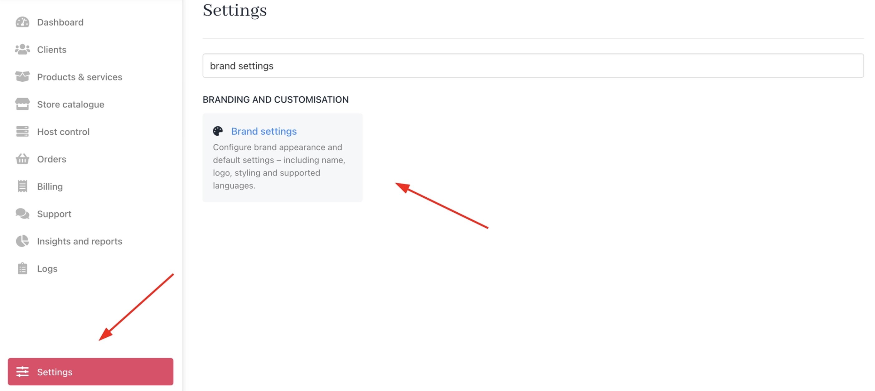
You can access the UI Metadata from **Settings** > **Brand Settings** under **Branding and Customisation**.
 ## How configuration works
The Cart 2.0 uses **two types of settings**, each with a clear purpose.
### 1. Context settings
Control **how things look and behave,** such as layout and visibility.
Examples:
* Layout and spacing.
* Visibility of components.
* Page behaviour.
* Responsive behaviour by device size.
* SEO settings.
### 2. Data settings
Control **what content, values, and features are used and shown,** such as headings, badges, and toggles.
Examples:
* Text and labels.
* Feature toggles.
* Upsells and cross-sells.
* Store copy and messaging.
All settings are **optional**. If a setting is not defined, the cart automatically falls back to a built-in default.
### 3. Configuration levels and how inheritance works in practice
## 1. Context settings (`@context`)
Use `@context` when you want to control **layout, behaviour, or visual presentation** of cart pages.
### Key format
```text theme={null}
@context..[/] = value
```
### Context (``)
Defines where the setting applies:
* `catalogue`
* `configure`
* `recommendations`
* `basket`
* `auth`
* `billing_details`
* `checkout`
* `confirmation`
Using `*` (global default) applies the setting everywhere unless overridden.
### Setting (``)
Defines what you are changing, for example:
* `productImages`
* `productListLayout`
* `zeroPriceDisplay`
### Modifier (`/`, optional)
Used for responsive behaviour:
* `sm` – Mobile
* `md` – Tablet
* `lg` – Desktop
If no modifier is used, the setting applies to **all viewports**.
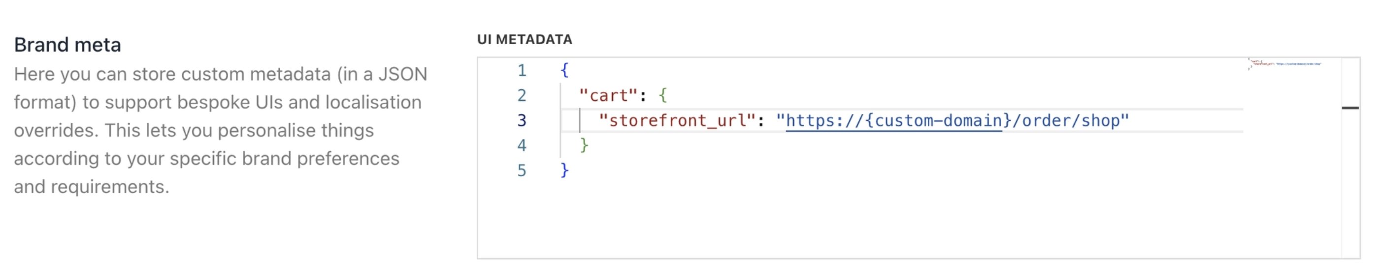
To switch to Cart 2.0 and implement context settings, provide the following `JSON` in your UI Metadata:
```json JSON theme={null}
{
"cart": {
"storefront_url": "https://{custom-domain}/order/shop"
}
}
```
## How configuration works
The Cart 2.0 uses **two types of settings**, each with a clear purpose.
### 1. Context settings
Control **how things look and behave,** such as layout and visibility.
Examples:
* Layout and spacing.
* Visibility of components.
* Page behaviour.
* Responsive behaviour by device size.
* SEO settings.
### 2. Data settings
Control **what content, values, and features are used and shown,** such as headings, badges, and toggles.
Examples:
* Text and labels.
* Feature toggles.
* Upsells and cross-sells.
* Store copy and messaging.
All settings are **optional**. If a setting is not defined, the cart automatically falls back to a built-in default.
### 3. Configuration levels and how inheritance works in practice
## 1. Context settings (`@context`)
Use `@context` when you want to control **layout, behaviour, or visual presentation** of cart pages.
### Key format
```text theme={null}
@context..[/] = value
```
### Context (``)
Defines where the setting applies:
* `catalogue`
* `configure`
* `recommendations`
* `basket`
* `auth`
* `billing_details`
* `checkout`
* `confirmation`
Using `*` (global default) applies the setting everywhere unless overridden.
### Setting (``)
Defines what you are changing, for example:
* `productImages`
* `productListLayout`
* `zeroPriceDisplay`
### Modifier (`/`, optional)
Used for responsive behaviour:
* `sm` – Mobile
* `md` – Tablet
* `lg` – Desktop
If no modifier is used, the setting applies to **all viewports**.
To switch to Cart 2.0 and implement context settings, provide the following `JSON` in your UI Metadata:
```json JSON theme={null}
{
"cart": {
"storefront_url": "https://{custom-domain}/order/shop"
}
}
```
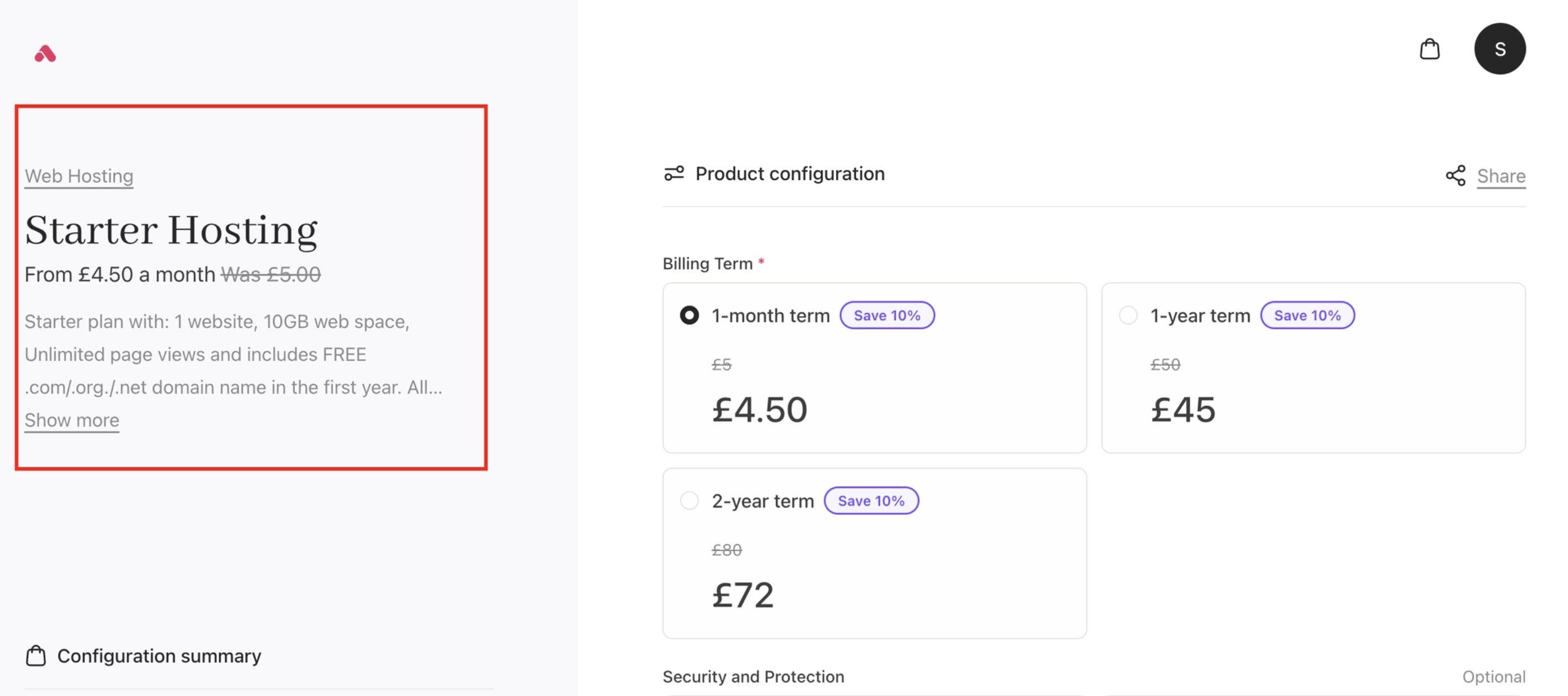
 ### Example 1: Show or hide product images
Global default: show product images everywhere.
`JSON` Example:
```json JSON theme={null}
{
"@context.*.productImages": "visible"
}
```
On the configure page: hide product images.
`JSON` Example:
```json JSON theme={null}
{
"@context.configure.productImages": "hidden"
}
```
**Result:**
* Catalogue, basket, checkout, etc. > product images are **visible**
* Configure page > product images are **hidden**
If this is set at the **brand level**, all products inherit it unless overridden at the category or product level.
### Example 1: Show or hide product images
Global default: show product images everywhere.
`JSON` Example:
```json JSON theme={null}
{
"@context.*.productImages": "visible"
}
```
On the configure page: hide product images.
`JSON` Example:
```json JSON theme={null}
{
"@context.configure.productImages": "hidden"
}
```
**Result:**
* Catalogue, basket, checkout, etc. > product images are **visible**
* Configure page > product images are **hidden**
If this is set at the **brand level**, all products inherit it unless overridden at the category or product level.
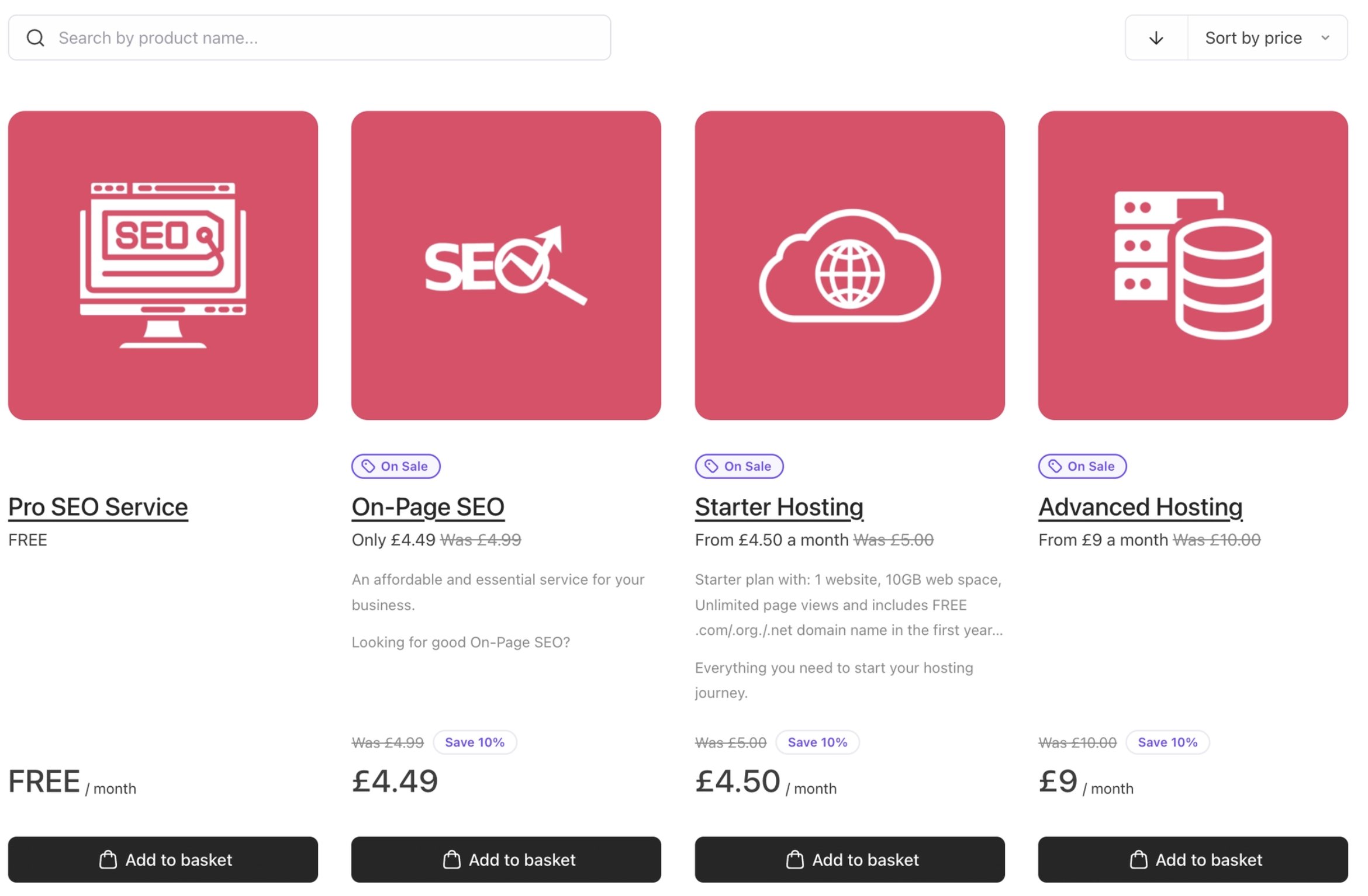
 ### Example 2: Display “0.00” prices as “Free”
Show "Free" instead of 0.00 across all contexts.
`JSON` Example:
```json JSON theme={null}
{
"@context.*.zeroPriceDisplay": "label"
}
```
* `"label"` > displays **Free**
* `"numeric"` > displays **0.00**
This applies globally, but can be overridden for specific categories or products.
### Example 2: Display “0.00” prices as “Free”
Show "Free" instead of 0.00 across all contexts.
`JSON` Example:
```json JSON theme={null}
{
"@context.*.zeroPriceDisplay": "label"
}
```
* `"label"` > displays **Free**
* `"numeric"` > displays **0.00**
This applies globally, but can be overridden for specific categories or products.
 ### Example 3: Change product list layout by viewport
Default: 4 columns on catalogue (all viewports).
`JSON` Example:
```json JSON theme={null}
{
"@context.catalogue.productListLayout": "4-col"
}
```
Default: 3 columns on catalogue (all viewports).
`JSON` Example:
```json JSON theme={null}
{
"@context.catalogue.productListLayout": "3-col",
}
```
Mobile (sm): switch to 1 column.
`JSON` Example:
```json JSON theme={null}
{
"@context.catalogue.productListLayout/sm": "1-col",
}
```
Tablet (md): use 2 columns.
`JSON` Example:
```json JSON theme={null}
{
"@context.catalogue.productListLayout/md": "2-col"
}
```
**Behaviour:**
* Desktop > 3 columns
* Tablet > 2 columns
* Mobile > 1 column
This allows responsive layouts without custom code.
### Example 3: Change product list layout by viewport
Default: 4 columns on catalogue (all viewports).
`JSON` Example:
```json JSON theme={null}
{
"@context.catalogue.productListLayout": "4-col"
}
```
Default: 3 columns on catalogue (all viewports).
`JSON` Example:
```json JSON theme={null}
{
"@context.catalogue.productListLayout": "3-col",
}
```
Mobile (sm): switch to 1 column.
`JSON` Example:
```json JSON theme={null}
{
"@context.catalogue.productListLayout/sm": "1-col",
}
```
Tablet (md): use 2 columns.
`JSON` Example:
```json JSON theme={null}
{
"@context.catalogue.productListLayout/md": "2-col"
}
```
**Behaviour:**
* Desktop > 3 columns
* Tablet > 2 columns
* Mobile > 1 column
This allows responsive layouts without custom code.
 ### SEO Settings
SEO settings in Upmind let you define meta information at three scope levels (Brand, Product Category, and Product) across any context. You can customise page titles, descriptions, and other metadata to match different parts of your storefront.
Users can also override SEO metadata at any level, so a specific product or category can have its own meta details that take priority over broader brand-level defaults.
`JSON` **Example**: Overriding the SEO page title across your brand.
```json JSON theme={null}
{
"@context.*.seoTitle": "Build YOur Website | Top Hosting Services"
"@context.configure.seoDescription": "Build YOur Website | Top Hosting Services"
}
```
**Appendix: SEO Settings**
| **Setting** | **Description** |
| ----------------------- | ------------------------------------------ |
| `seoTitle` | Page \ tag. |
| `seoDescription` | Meta description for search engines. |
| `seoCanonical` | Canonical URL for the page. |
| `seoOgTitle` | Open Graph title for social sharing. |
| `seoOgDescription` | Open Graph description for social sharing. |
| `seoOgImage` | Open Graph image URL for social sharing. |
| `seoTwitterTitle` | Twitter card title. |
| `seoTwitterDescription` | Twitter card description. |
| `seoTwitterImage` | Twitter card image URL. |
**Appendix: UI Properties**
| **Property** | **Description** | **Default** | Enum Values | **Contexts** | **Scope** |
| ------------------------------ | ------------------------------------------------------------------------------------------------------------------------- | ------------ | ---------------------------------------------------- | ------------------------------------------------------------------------------------------------------------ | --------------------------------------------------------- |
| `activeCategoryBadge` | Controls whether the badge is displayed on the currently active category in the catalogue. | visible | visible \| hidden | catalogue | brand |
| `activeCategoryDescription` | Controls whether the description for the currently active category is shown in the catalogue. | visible | visible \| hidden | catalogue | brand |
| `basketFields` | Controls whether custom fields are visible in the basket and checkout pages. | hidden | visible \| hidden | basket (`Locked`), checkout | brand |
| `basketItems` | Controls whether the list of individual basket items is shown during checkout. | hidden | visible \| hidden | checkout | brand |
| `basketSummary` | Controls whether the order summary panel is displayed in the basket and authentication contexts. | visible | visible \| hidden | auth, checkout (`Locked`) | brand |
| `basketTaxes` | Controls whether taxes are shown as a separate line item or consolidated into the order total. | consolidated | consolidated \| visible | basket, auth, checkout, confirmation | brand |
| `billingDetails` | Controls whether customers can edit their billing details during checkout, or whether those fields are read-only. | readonly | readonly \| editable | billing\_details (`Locked`), checkout | brand |
| `breadcrumbs` | Controls how breadcrumb navigation is displayed across cart pages, with options for full, condensed, or hidden display. | parent | hidden \| condensed \| parent \| visible | all | brand, product category, product |
| `categoryBadge` | Controls whether a custom badge is shown on category cards in the catalogue. | visible | visible \| hidden | catalogue | brand, product category |
| `categoryExcerpt` | Controls whether the short description beneath a category card is visible in the catalogue. | visible | visible \| hidden | catalogue | brand, product category |
| `categoryIcon` | Controls whether icons are shown alongside category names in the catalogue. | hidden | visible \| hidden | catalogue | brand, product category |
| `categoryImageFallback` | Controls whether a fallback placeholder image is shown when no category image has been uploaded. | visible | visible \| hidden | catalogue | brand, product category |
| `categoryImageRatio` | Sets the aspect ratio used for category images displayed in the catalogue. | 1:1 | 1:1 \| 3:2 \| 4:3 \| 16:9 \| 18:6 \| auto | catalogue | brand, product category |
| `categoryImages` | Controls whether images are shown on product category cards in the catalogue. | hidden | visible \| hidden | catalogue | brand, product category |
| `categoryList` | Controls whether categories are displayed as a static grid or a scrollable carousel. | grid | carousel \| grid \| grid-facet | catalogue, recommendations | brand, product category |
| `categoryListLayout` | Sets the number of columns used when categories are displayed in a grid layout. | 3-col | 1-col \| 2-col \| 3-col \| 4-col \| 5-col \| 6-col | catalogue, recommendations | brand, product category |
| `iconVariant` | Sets the visual style of icons used throughout the storefront, such as line, solid, duotone, or duocolor. | line | line \| solid \| duotone \| duocolor | all | brand |
| `optionGroupDescription` | Controls how descriptions for option groups are displayed, as a tooltip, inline beneath the label, or hidden entirely. | tooltip | tooltip \| inline \| hidden | configure | brand, product category, product, option category |
| `optionGroupDividers` | Controls the style of divider lines shown between option groups on the product configuration page. | hidden | hidden \| solid \| dashed \| dotted | configure | brand, product category, product |
| `optionGroupSpacing` | Controls the amount of vertical spacing between option groups on the product configuration page. | 4 | 2 \| 4 \| 6 \| 8 \| 10 | configure | brand, product category, product |
| `optionItemBenefits` | Controls whether benefit lists are shown alongside individual selectable product options. | visible | visible \| hidden | configure, basket, checkout | brand, product category, product, option category, option |
| `optionItemDescription` | Controls how descriptions for individual option items are displayed, inline, as a tooltip, or hidden. | inline | tooltip \| inline \| hidden | configure | brand, product category, product, option category, option |
| `optionSelector` | Controls the component used to display and select sub-product options, such as a radio grid, radio rows, or dropdown. | radio-rows | radio-grid \| radio-rows \| select \| select-grouped | configure | brand, product category, product, option category |
| `optionSelectorGrid` | Sets the number of columns in the option selector when using the radio-grid layout. | 2-col | 1-col \| 2-col \| 3-col \| 4-col | configure | brand, product category, product, option category |
| `optionSelectorIcons` | Controls whether icons are shown alongside each selectable option in the option selector. | visible | visible \| hidden | configure | brand, product category, product, option category |
| `optionUpsells` | Controls whether upsell suggestions for product options are shown in the basket and checkout. | visible | visible \| hidden | basket, checkout | brand, product category, product, option category |
| `paymentGatewaysCap` | Sets the maximum number of payment methods displayed before a "show more" option appears at checkout. | 5 | 1 \| 2 \| 3 \| 4 \| 5 \| 6 \| 7 \| 8 \| none | checkout | brand, product category, product |
| `productAnchorPrice` | Controls whether the original or reference price is shown alongside the current product price. | visible | visible \| hidden | catalogue, configure, recommendations | brand, product category, product |
| `productBadge` | Controls whether promotional or informational badges are shown on product cards. | visible | visible \| hidden | catalogue, configure, recommendations | brand, product category, product |
| `productBenefits` | Controls whether the benefits list is shown on product cards in the catalogue and recommendations. | visible | visible \| hidden | catalogue, recommendations | brand, product category, product |
| `productCategory` | Controls whether the category label is shown on individual product cards throughout the cart. | hidden | visible \| hidden | catalogue, configure, recommendations | brand, product category, product |
| `productConfigFieldsSummary` | Controls whether a summary of completed configuration fields is shown on the product configuration page. | hidden | visible \| hidden | configure | brand, product category, product |
| `productConfigOptionsSummary` | Controls whether selected option details are shown in the configuration summary panel. | visible | visible \| hidden | configure, basket | brand, product category, product |
| `productConfigSummary` | Controls whether the overall configuration summary is shown during product setup and in the basket. | visible | visible \| hidden | configure, basket (`Locked`) | brand, product category, product |
| `productDescription` | Controls how the full product description is displayed, fully visible, clamped to a set number of lines, or hidden. | clamped | visible \| hidden \| clamped | configure | brand, product category, product |
| `productDescriptionClamp` | Sets the number of lines shown before the product description is clamped and truncated. | 3 | 3 \| 4 \| 5 \| 6 \| 7 \| 8 | configure | brand, product category, product |
| `productExcerpt` | Controls whether the short product description is shown on catalogue and recommendation cards. | visible | visible \| hidden | catalogue, recommendations | brand, product category, product |
| `productImageFallback` | Controls whether a placeholder image is shown when no product image has been uploaded. | visible | visible \| hidden | catalogue, configure, recommendations, basket, confirmation | brand, product category, product |
| `productImageRatio` | Sets the aspect ratio used for product images across catalogue, configuration, basket, and confirmation pages. | 1:1 | 1:1 \| 3:2 \| 4:3 \| 16:9 \| 18:6 \| auto | catalogue, configure, recommendations, basket, confirmation | brand, product category, product |
| `productImages` | Controls whether product images are shown across catalogue, configuration, basket, and confirmation pages. | visible | visible \| hidden | catalogue, configure, recommendations, basket, confirmation | brand, product category, product |
| `productImagesStyle` | Controls how multiple product images are displayed, such as a single image, carousel, or grid. | auto | single \| carousel \| grid \| auto | catalogue, configure, recommendations, basket, confirmation | brand, product category, product |
| `productList` | Controls the overall display style for the product listing, such as a standard grid or domain-aware catalogue format. | grid | grid \| carousel \| dac | catalogue, recommendations | brand, product category |
| `productListLayout` | Sets the number of columns used when products are displayed in a grid layout. | 3-col | 1-col \| 2-col \| 3-col \| 4-col | catalogue, recommendations | brand, product category |
| `productNativeRecommendations` | Controls whether Upmind's built-in product recommendations are shown on the recommendations page. | visible | visible \| hidden | recommendations | brand, product category, product |
| `productOrientation` | Controls whether product cards are displayed in a vertical or horizontal orientation. | vertical | vertical \| horizontal | catalogue, recommendations | brand, product category, product |
| `productPriceSummary` | Controls whether the pricing summary is shown on product cards in the catalogue and recommendations. | visible | visible \| hidden | catalogue, recommendations | brand, product category, product |
| `productStyle` | Controls the visual style of product cards, either as flush (borderless) or carded (with border and background). | flush | flush \| carded \| flush-carded | catalogue, recommendations | brand, product category, product |
| `productTermSelector` | Controls whether billing term options are shown directly on product cards in the catalogue, recommendations, and basket. | hidden | visible \| hidden | catalogue, recommendations, basket | brand, product category, product |
| `template` | Sets the page layout for a given context, defining how content and sidebars are structurally arranged. | undefined | | all | brand |
| `termSelector` | Controls the component used to present billing term options to customers, such as a radio grid, radio rows, or dropdown. | radio-grid | radio-grid \| radio-rows \| select | configure | brand, product category, product |
| `termSelectorGrid` | Sets the number of columns in the term selector when using the radio-grid layout. | 2-col | 1-col \| 2-col (default) \| 3-col \| 4-col | configure | brand, product category, product |
| `termSelectorSummary` | Controls whether the billing cost summary is shown beneath the selected billing term on the configuration page. | visible | visible \| hidden | configure | brand, product category, product |
| `theme` | Sets the named theme applied to the storefront, linking it to the corresponding CSS variable definitions in Brand Tokens. | default | default | all | brand |
| `trustMessaging` | Controls whether the trust messaging section is shown on the configuration, basket, and checkout pages. | visible | visible \| hidden | configure, basket, checkout | brand, product category, product |
| `zeroPriceDisplay` | Controls whether products with a zero price are displayed as `0.00` or as `Free`. | label | numeric \| label | catalogue, configure, recommendations, basket, auth (`Locked`), checkout (`Locked`), confirmation (`Locked`) | brand, product category, product, option category, option |
`Locked` - This means that some properties have forced values in certain contexts.
## 2. Data settings (`@data`)
Use `@data` when you want to control **content**, **relationships**, or **feature toggles**.
Data settings define *what* the cart shows or enables, rather than *how* it looks. They can also vary by **context** and **viewport modifier**, so the same data property can have different values on mobile, tablet, or desktop.
**Key format:**
```text theme={null}
@data.<setting>[/<modifier>] = value
```
For example:
* `@data.storeHeading` applies the default value.
* `@data.storeHeading/md` applies the value on tablet.
* `@data.storeHeading/lg` applies the value on desktop.
<Warning>
Data settings do not use context wildcards.
</Warning>
This makes it possible to customise store copy and other data-driven content to different screens while keeping the configuration centralised.
To switch to Cart 2.0 and implement data settings, provide the following `JSON` in your UI Metadata:
<CodeGroup>
```json JSON theme={null}
{
"cart": {
"@data.storeUrl": "https://{custom-domain}/order/shop"
}
}
```
</CodeGroup>
<Frame caption="UI Metadata for data settings">
<img src="https://mintcdn.com/upmind/c5sDUwEs8YpzGbjA/images/fb/99e9ca5bbfd81c00.png?fit=max&auto=format&n=c5sDUwEs8YpzGbjA&q=85&s=9f130ac0b42b4eafbc09e2f35f575a37" alt="UI Metadata for data settings" className="mx-auto" style={{ width:"99%" }} width="2798" height="578" data-path="images/fb/99e9ca5bbfd81c00.png" />
</Frame>
### Example 1: Set basic store copy
`JSON` Example:
<CodeGroup>
```json JSON theme={null}
{
"@data.storeHeading": "Welcome to Example Hosting",
"@data.storeSubHeading": "Choose the right plan for your website.",
}
```
</CodeGroup>
This controls user-facing text displayed in the cart.
<Frame caption="Heading and subheading">
<img src="https://mintcdn.com/upmind/1-uICsJi9zYpvJVH/images/fb/89bf7c6f6acb64b8.png?fit=max&auto=format&n=1-uICsJi9zYpvJVH&q=85&s=80e24cf67e673f43687d7e7b2769c421" alt="Heading and subheading" className="mx-auto" style={{ width:"99%" }} width="2802" height="1108" data-path="images/fb/89bf7c6f6acb64b8.png" />
</Frame>
### Example 2: Disable the catalogue
`JSON` Example:
<CodeGroup>
```json JSON theme={null}
{"@data.catalogueDisabled":true}
```
</CodeGroup>
When enabled, the catalogue is hidden, and users can only access individual product pages directly.
<Frame caption="When catalogue is disabled, it will take you to the basket screen">
<img src="https://mintcdn.com/upmind/JUoAg6onJmXk_-rR/images/fb/e4b02848c03fef55.png?fit=max&auto=format&n=JUoAg6onJmXk_-rR&q=85&s=4982e30a614f79aafc24f6a37db10b44" alt="When catalogue is disabled, it will take you to the basket screen" className="mx-auto" style={{ width:"99%" }} width="2714" height="1530" data-path="images/fb/e4b02848c03fef55.png" />
</Frame>
### Example 3: Upsell a product option within the basket
Full Domain Protection. `JSON` Example:
<CodeGroup>
```json JSON theme={null}
{
"@data.optionUpsellEnabled": true,
"@data.optionBadge": "Recommended",
"@data.optionBenefits": [
{ "label": "Prevents hackers from stealing...", "icon": "check" },
{ "label": "Requires your approval via...", "icon": "check" },
],
}
```
</CodeGroup>
This enables an in-basket upsell for a product option, including badges and benefit messaging.
<Frame caption="Cart 2.0 product recommendations">
<img src="https://mintcdn.com/upmind/ObllJJl59DabnmMn/images/fb/d295bcba1e92f3f6.png?fit=max&auto=format&n=ObllJJl59DabnmMn&q=85&s=aa98b52ab7e7cdfb7fb2b192a32153e9" alt="Cart 2.0 product recommendations" className="mx-auto" style={{ width:"97%" }} width="1620" height="1536" data-path="images/fb/d295bcba1e92f3f6.png" />
</Frame>
**Appendix: Data Properties**
| **Property** | **Default** | **Type** | **Description** | **Contexts** | **Scope** |
| -------------------------- | ----------- | -------- | -------------------------------------------------------------------------------------------------------------------------------------------------------------------------------- | --------------------------------------------------- | -------------------------------- |
| `billingDetailsDisabled` | false | Boolean | Disables the standalone billing details page entirely when set to true. | billing\_details | brand |
| `catalogueDisabled` | false | Boolean | Disables the product catalogue page entirely, directing customers straight to individual product pages. | catalogue | brand |
| `categoryBadge` | undefined | String | Sets a custom badge label displayed on a product category card in the catalogue. | catalogue, configure | product category |
| `clickwrapDisclaimer` | undefined | String | Sets a custom disclaimer shown at checkout that customers must acknowledge before completing their purchase. Supports Markdown formatting. | checkout | brand |
| `displayFontLink` | undefined | String | Sets a Google Fonts or custom font URL applied to display typography across the cart and portal. | all | brand |
| `optionBadge` | undefined | String | Sets a custom badge label displayed on a specific product option, such as "Best Value" or "Recommended.” | configure, basket, checkout | option category, option |
| `optionBenefits` | \[] | Array | Defines a list of benefit items shown alongside a product option, each with a text label and an icon. | configure, basket, checkout | option category, option |
| `optionGroupIcon` | undefined | String | Sets a custom icon displayed next to an option group label in the product configuration page. | configure | option category, option |
| `optionGroupLabel` | undefined | String | Overrides the display label for an option group shown in the product configuration page. | configure, basket | option category, option |
| `optionImgUrl` | undefined | String | Sets a custom image URL for a specific product option, displayed within the option selector alongside the option label. | configure, basket | option category, option |
| `optionUpsellEnabled` | false | Boolean | Enables or disables the option upsell feature in the basket and checkout. | basket, checkout | brand, option category, option |
| `productBadge` | undefined | String | Sets a custom badge label or icon displayed on a product card, such as "Popular" or "New.” | catalogue, configure, recommendations | product category, product |
| `productBenefits` | \[] | Array | Defines a list of benefit items shown on a product card across the catalogue, configuration, and recommendations pages. | catalogue, configure, recommendations | product category, product |
| `productName` | undefined | String | Overrides the display name shown for a product in the cart, checkout, and confirmation pages. | configure, basket, auth, checkout, confirmation | product category, product |
| `productsToBundle` | \[] | Array | Defines a list of products to be automatically bundled together when a customer adds the parent product to their basket. | catalogue, configure, recommendations | brand, product category, product |
| `productsToRecommend` | \[] | Array | Defines a list of products to display as recommendations on the recommendations page. | recommendations | product category, product |
| `productUnavailable` | FALSE | Boolean | Marks a product as unavailable if it is sold out, removing it from purchase across the catalogue, configuration, and recommendations pages. | catalogue, configure, recommendations | all |
| `productUnavailableReason` | undefined | String | Sets the message shown to customers when a product has been marked as unavailable. E.g. Sold out. | catalogue, configure, recommendations | all |
| `storeBadge` | undefined | String | Sets a custom badge displayed on the catalogue page, typically used for store-level promotions or announcements. | catalogue | brand |
| `storeHeading` | undefined | String | Sets the main heading text displayed at the top of the product catalogue page. | catalogue | brand |
| `storeSubHeading` | undefined | String | Sets the supporting subheading text displayed beneath the main catalogue heading. | catalogue | brand |
| `storeUrl` | undefined | String | Sets the URL that the store logo or header links to across all cart and portal pages. | all | brand |
| `trimTrailingZeroes` | true | Boolean | Controls whether trailing decimal zeroes are removed from displayed prices, for example showing £10 instead of £10.00. | catalogue, configure, recommendations, basket, auth | all |
| `trustMessagingMarkdown` | undefined | String | Sets custom trust messaging shown on the configuration, basket, and checkout pages. Supports Markdown formatting for security assurances, guarantees, or other reassurance copy. | configure, basket, checkout | brand, product category, product |
## 3. Configuration levels and how inheritance works in practice
1. You can define settings at different scopes. The cascade order (most specific > least specific):
* Option — Settings on a specific sub-product option
* Option Category — Settings on an option group
* Product — Settings on a specific product
* Product Category — Settings on a group of products
* Brand — Your overall brand/storefront-level default
* System Default — The built-in default value if nothing else is set
For every product, Cart 2.0 resolves settings using a **fallback chain**:
```text theme={null}
product → category → brand → internal default
```
This means:
* The most specific setting always wins.
* You only override what you need.
* Everything else is inherited automatically.
If you define just **one key at the product level**, all other settings will still come from the category or brand.
2. At each level, it looks for:
* `@context.<contextId>.<setting>`
* If not found, `@context.*.<setting>`
* If still not found, the built-in default is used
Because missing values are **filled in automatically**:
* You never need to duplicate full configurations.
* You can safely override only what matters.
* Defaults remain consistent across the cart.
This keeps configuration **clean, predictable, and scalable**, even across large product catalogues.
## **Complete example**
The following JSON configuration brings together a range of context and data settings into a single working UI Metadata block. It covers layout, content, visibility, and behaviour across multiple pages, and demonstrates how global defaults and page-specific overrides work together.
`JSON` Example
<CodeGroup>
```json JSON theme={null}
{
"cart": {
"storefront_url": "https://store.yourdomain.com/order/shop"
},
"@context.*.theme": "yourbrand",
"@context.*.zeroPriceDisplay": "label",
"@context.*.breadcrumbs": "hidden",
"@context.*.productImages": "visible",
"@context.*.trustMessaging": "visible",
"@context.*.template": "two-column-ltr",
"@context.auth.template": "canvas-card",
"@context.configure.template": "two-column-rtl",
"@context.basket.template": "two-column-ltr",
"@context.checkout.template": "two-column-ltr",
"@context.confirmation.template": "full",
"@context.catalogue.productListLayout": "3-col",
"@context.catalogue.productListLayout/sm": "1-col",
"@context.catalogue.productListLayout/md": "2-col",
"@context.catalogue.productStyle": "carded",
"@context.catalogue.productImages": "visible",
"@context.catalogue.productBenefits": "visible",
"@context.catalogue.productAnchorPrice": "visible",
"@context.catalogue.productBadge": "visible",
"@context.catalogue.categoryImages": "visible",
"@context.catalogue.categoryListLayout": "3-col",
"@context.configure.productImages": "hidden",
"@context.configure.optionSelector": "radio-grid",
"@context.configure.optionSelectorGrid": "2-col",
"@context.configure.optionSelectorIcons": "visible",
"@context.configure.termSelector": "radio-grid",
"@context.configure.termSelectorGrid": "2-col",
"@context.configure.termSelectorSummary": "visible",
"@context.configure.productConfigSummary": "visible",
"@context.configure.productConfigOptionsSummary": "visible",
"@context.basket.basketSummary": "visible",
"@context.basket.basketTaxes": "consolidated",
"@context.basket.trustMessaging": "visible",
"@context.checkout.basketItems": "visible",
"@context.checkout.basketSummary": "visible",
"@context.checkout.paymentGatewaysCap": "3",
"@context.checkout.trustMessaging": "visible",
"@context.checkout.billingDetails": "editable",
"@context.recommendations.productStyle": "carded",
"@context.recommendations.productImages": "visible",
"@context.recommendations.productNativeRecommendations": "visible",
"@data.storeHeading": "Find the Right Plan for You",
"@data.storeSubHeading": "Simple pricing, no hidden fees.",
"@data.storeBadge": "New Plans Available",
"@data.storeUrl": "https://store.yourdomain.com",
"@data.displayFontLink": "https://fonts.googleapis.com/css2?family=Inter:wght@400;600;700&display=swap",
"@data.trustMessagingMarkdown": "🔒 Secure checkout · 30-day money-back guarantee · 24/7 support",
"@data.clickwrapDisclaimer": "By completing your purchase, you agree to our [Terms of Service](https://yourdomain.com/terms) and [Privacy Policy](https://yourdomain.com/privacy).",
"@data.trimTrailingZeroes": true
}
```
</CodeGroup>
## Error handling and invalid values
Cart 2.0 does not throw hard errors when an invalid value is used in UI Metadata. Instead, it silently falls back to the built-in default for that setting and ignores the unrecognised value. This means a typo or unsupported value will not break your storefront, but the setting will have no visible effect, which can be difficult to spot.
`JSON` **Example:**
<CodeGroup>
```json JSON theme={null}
{
"@context.catalogue.productListLayout": "5-col"
}
```
</CodeGroup>
`5-col` is not a valid value for `productListLayout`. Therefore, Cart 2.0 will ignore it and fall back to the default `3-col` layout. No error will appear in the UI.
**Common mistakes to watch for:**
* Misspelled property names (e.g. `produtImages` instead of `productImages`): The setting is silently skipped.
* Using a value outside the accepted enum (e.g. `"visible"` on a property that only accepts column values).
* Missing or extra commas in your JSON: This will cause the entire UI Metadata block to fail to parse, reverting all settings to defaults.
* Applying a context that does not support the setting (e.g. using `@context.confirmation.optionSelector`): The setting is ignored.
The safest way to confirm a setting is working is to check the storefront visually after saving, and cross-reference the property's accepted values in the UI Properties appendix and Data Properties appendix.
### SEO Settings
SEO settings in Upmind let you define meta information at three scope levels (Brand, Product Category, and Product) across any context. You can customise page titles, descriptions, and other metadata to match different parts of your storefront.
Users can also override SEO metadata at any level, so a specific product or category can have its own meta details that take priority over broader brand-level defaults.
`JSON` **Example**: Overriding the SEO page title across your brand.
```json JSON theme={null}
{
"@context.*.seoTitle": "Build YOur Website | Top Hosting Services"
"@context.configure.seoDescription": "Build YOur Website | Top Hosting Services"
}
```
**Appendix: SEO Settings**
| **Setting** | **Description** |
| ----------------------- | ------------------------------------------ |
| `seoTitle` | Page \ tag. |
| `seoDescription` | Meta description for search engines. |
| `seoCanonical` | Canonical URL for the page. |
| `seoOgTitle` | Open Graph title for social sharing. |
| `seoOgDescription` | Open Graph description for social sharing. |
| `seoOgImage` | Open Graph image URL for social sharing. |
| `seoTwitterTitle` | Twitter card title. |
| `seoTwitterDescription` | Twitter card description. |
| `seoTwitterImage` | Twitter card image URL. |
**Appendix: UI Properties**
| **Property** | **Description** | **Default** | Enum Values | **Contexts** | **Scope** |
| ------------------------------ | ------------------------------------------------------------------------------------------------------------------------- | ------------ | ---------------------------------------------------- | ------------------------------------------------------------------------------------------------------------ | --------------------------------------------------------- |
| `activeCategoryBadge` | Controls whether the badge is displayed on the currently active category in the catalogue. | visible | visible \| hidden | catalogue | brand |
| `activeCategoryDescription` | Controls whether the description for the currently active category is shown in the catalogue. | visible | visible \| hidden | catalogue | brand |
| `basketFields` | Controls whether custom fields are visible in the basket and checkout pages. | hidden | visible \| hidden | basket (`Locked`), checkout | brand |
| `basketItems` | Controls whether the list of individual basket items is shown during checkout. | hidden | visible \| hidden | checkout | brand |
| `basketSummary` | Controls whether the order summary panel is displayed in the basket and authentication contexts. | visible | visible \| hidden | auth, checkout (`Locked`) | brand |
| `basketTaxes` | Controls whether taxes are shown as a separate line item or consolidated into the order total. | consolidated | consolidated \| visible | basket, auth, checkout, confirmation | brand |
| `billingDetails` | Controls whether customers can edit their billing details during checkout, or whether those fields are read-only. | readonly | readonly \| editable | billing\_details (`Locked`), checkout | brand |
| `breadcrumbs` | Controls how breadcrumb navigation is displayed across cart pages, with options for full, condensed, or hidden display. | parent | hidden \| condensed \| parent \| visible | all | brand, product category, product |
| `categoryBadge` | Controls whether a custom badge is shown on category cards in the catalogue. | visible | visible \| hidden | catalogue | brand, product category |
| `categoryExcerpt` | Controls whether the short description beneath a category card is visible in the catalogue. | visible | visible \| hidden | catalogue | brand, product category |
| `categoryIcon` | Controls whether icons are shown alongside category names in the catalogue. | hidden | visible \| hidden | catalogue | brand, product category |
| `categoryImageFallback` | Controls whether a fallback placeholder image is shown when no category image has been uploaded. | visible | visible \| hidden | catalogue | brand, product category |
| `categoryImageRatio` | Sets the aspect ratio used for category images displayed in the catalogue. | 1:1 | 1:1 \| 3:2 \| 4:3 \| 16:9 \| 18:6 \| auto | catalogue | brand, product category |
| `categoryImages` | Controls whether images are shown on product category cards in the catalogue. | hidden | visible \| hidden | catalogue | brand, product category |
| `categoryList` | Controls whether categories are displayed as a static grid or a scrollable carousel. | grid | carousel \| grid \| grid-facet | catalogue, recommendations | brand, product category |
| `categoryListLayout` | Sets the number of columns used when categories are displayed in a grid layout. | 3-col | 1-col \| 2-col \| 3-col \| 4-col \| 5-col \| 6-col | catalogue, recommendations | brand, product category |
| `iconVariant` | Sets the visual style of icons used throughout the storefront, such as line, solid, duotone, or duocolor. | line | line \| solid \| duotone \| duocolor | all | brand |
| `optionGroupDescription` | Controls how descriptions for option groups are displayed, as a tooltip, inline beneath the label, or hidden entirely. | tooltip | tooltip \| inline \| hidden | configure | brand, product category, product, option category |
| `optionGroupDividers` | Controls the style of divider lines shown between option groups on the product configuration page. | hidden | hidden \| solid \| dashed \| dotted | configure | brand, product category, product |
| `optionGroupSpacing` | Controls the amount of vertical spacing between option groups on the product configuration page. | 4 | 2 \| 4 \| 6 \| 8 \| 10 | configure | brand, product category, product |
| `optionItemBenefits` | Controls whether benefit lists are shown alongside individual selectable product options. | visible | visible \| hidden | configure, basket, checkout | brand, product category, product, option category, option |
| `optionItemDescription` | Controls how descriptions for individual option items are displayed, inline, as a tooltip, or hidden. | inline | tooltip \| inline \| hidden | configure | brand, product category, product, option category, option |
| `optionSelector` | Controls the component used to display and select sub-product options, such as a radio grid, radio rows, or dropdown. | radio-rows | radio-grid \| radio-rows \| select \| select-grouped | configure | brand, product category, product, option category |
| `optionSelectorGrid` | Sets the number of columns in the option selector when using the radio-grid layout. | 2-col | 1-col \| 2-col \| 3-col \| 4-col | configure | brand, product category, product, option category |
| `optionSelectorIcons` | Controls whether icons are shown alongside each selectable option in the option selector. | visible | visible \| hidden | configure | brand, product category, product, option category |
| `optionUpsells` | Controls whether upsell suggestions for product options are shown in the basket and checkout. | visible | visible \| hidden | basket, checkout | brand, product category, product, option category |
| `paymentGatewaysCap` | Sets the maximum number of payment methods displayed before a "show more" option appears at checkout. | 5 | 1 \| 2 \| 3 \| 4 \| 5 \| 6 \| 7 \| 8 \| none | checkout | brand, product category, product |
| `productAnchorPrice` | Controls whether the original or reference price is shown alongside the current product price. | visible | visible \| hidden | catalogue, configure, recommendations | brand, product category, product |
| `productBadge` | Controls whether promotional or informational badges are shown on product cards. | visible | visible \| hidden | catalogue, configure, recommendations | brand, product category, product |
| `productBenefits` | Controls whether the benefits list is shown on product cards in the catalogue and recommendations. | visible | visible \| hidden | catalogue, recommendations | brand, product category, product |
| `productCategory` | Controls whether the category label is shown on individual product cards throughout the cart. | hidden | visible \| hidden | catalogue, configure, recommendations | brand, product category, product |
| `productConfigFieldsSummary` | Controls whether a summary of completed configuration fields is shown on the product configuration page. | hidden | visible \| hidden | configure | brand, product category, product |
| `productConfigOptionsSummary` | Controls whether selected option details are shown in the configuration summary panel. | visible | visible \| hidden | configure, basket | brand, product category, product |
| `productConfigSummary` | Controls whether the overall configuration summary is shown during product setup and in the basket. | visible | visible \| hidden | configure, basket (`Locked`) | brand, product category, product |
| `productDescription` | Controls how the full product description is displayed, fully visible, clamped to a set number of lines, or hidden. | clamped | visible \| hidden \| clamped | configure | brand, product category, product |
| `productDescriptionClamp` | Sets the number of lines shown before the product description is clamped and truncated. | 3 | 3 \| 4 \| 5 \| 6 \| 7 \| 8 | configure | brand, product category, product |
| `productExcerpt` | Controls whether the short product description is shown on catalogue and recommendation cards. | visible | visible \| hidden | catalogue, recommendations | brand, product category, product |
| `productImageFallback` | Controls whether a placeholder image is shown when no product image has been uploaded. | visible | visible \| hidden | catalogue, configure, recommendations, basket, confirmation | brand, product category, product |
| `productImageRatio` | Sets the aspect ratio used for product images across catalogue, configuration, basket, and confirmation pages. | 1:1 | 1:1 \| 3:2 \| 4:3 \| 16:9 \| 18:6 \| auto | catalogue, configure, recommendations, basket, confirmation | brand, product category, product |
| `productImages` | Controls whether product images are shown across catalogue, configuration, basket, and confirmation pages. | visible | visible \| hidden | catalogue, configure, recommendations, basket, confirmation | brand, product category, product |
| `productImagesStyle` | Controls how multiple product images are displayed, such as a single image, carousel, or grid. | auto | single \| carousel \| grid \| auto | catalogue, configure, recommendations, basket, confirmation | brand, product category, product |
| `productList` | Controls the overall display style for the product listing, such as a standard grid or domain-aware catalogue format. | grid | grid \| carousel \| dac | catalogue, recommendations | brand, product category |
| `productListLayout` | Sets the number of columns used when products are displayed in a grid layout. | 3-col | 1-col \| 2-col \| 3-col \| 4-col | catalogue, recommendations | brand, product category |
| `productNativeRecommendations` | Controls whether Upmind's built-in product recommendations are shown on the recommendations page. | visible | visible \| hidden | recommendations | brand, product category, product |
| `productOrientation` | Controls whether product cards are displayed in a vertical or horizontal orientation. | vertical | vertical \| horizontal | catalogue, recommendations | brand, product category, product |
| `productPriceSummary` | Controls whether the pricing summary is shown on product cards in the catalogue and recommendations. | visible | visible \| hidden | catalogue, recommendations | brand, product category, product |
| `productStyle` | Controls the visual style of product cards, either as flush (borderless) or carded (with border and background). | flush | flush \| carded \| flush-carded | catalogue, recommendations | brand, product category, product |
| `productTermSelector` | Controls whether billing term options are shown directly on product cards in the catalogue, recommendations, and basket. | hidden | visible \| hidden | catalogue, recommendations, basket | brand, product category, product |
| `template` | Sets the page layout for a given context, defining how content and sidebars are structurally arranged. | undefined | | all | brand |
| `termSelector` | Controls the component used to present billing term options to customers, such as a radio grid, radio rows, or dropdown. | radio-grid | radio-grid \| radio-rows \| select | configure | brand, product category, product |
| `termSelectorGrid` | Sets the number of columns in the term selector when using the radio-grid layout. | 2-col | 1-col \| 2-col (default) \| 3-col \| 4-col | configure | brand, product category, product |
| `termSelectorSummary` | Controls whether the billing cost summary is shown beneath the selected billing term on the configuration page. | visible | visible \| hidden | configure | brand, product category, product |
| `theme` | Sets the named theme applied to the storefront, linking it to the corresponding CSS variable definitions in Brand Tokens. | default | default | all | brand |
| `trustMessaging` | Controls whether the trust messaging section is shown on the configuration, basket, and checkout pages. | visible | visible \| hidden | configure, basket, checkout | brand, product category, product |
| `zeroPriceDisplay` | Controls whether products with a zero price are displayed as `0.00` or as `Free`. | label | numeric \| label | catalogue, configure, recommendations, basket, auth (`Locked`), checkout (`Locked`), confirmation (`Locked`) | brand, product category, product, option category, option |
`Locked` - This means that some properties have forced values in certain contexts.
## 2. Data settings (`@data`)
Use `@data` when you want to control **content**, **relationships**, or **feature toggles**.
Data settings define *what* the cart shows or enables, rather than *how* it looks. They can also vary by **context** and **viewport modifier**, so the same data property can have different values on mobile, tablet, or desktop.
**Key format:**
```text theme={null}
@data.<setting>[/<modifier>] = value
```
For example:
* `@data.storeHeading` applies the default value.
* `@data.storeHeading/md` applies the value on tablet.
* `@data.storeHeading/lg` applies the value on desktop.
<Warning>
Data settings do not use context wildcards.
</Warning>
This makes it possible to customise store copy and other data-driven content to different screens while keeping the configuration centralised.
To switch to Cart 2.0 and implement data settings, provide the following `JSON` in your UI Metadata:
<CodeGroup>
```json JSON theme={null}
{
"cart": {
"@data.storeUrl": "https://{custom-domain}/order/shop"
}
}
```
</CodeGroup>
<Frame caption="UI Metadata for data settings">
<img src="https://mintcdn.com/upmind/c5sDUwEs8YpzGbjA/images/fb/99e9ca5bbfd81c00.png?fit=max&auto=format&n=c5sDUwEs8YpzGbjA&q=85&s=9f130ac0b42b4eafbc09e2f35f575a37" alt="UI Metadata for data settings" className="mx-auto" style={{ width:"99%" }} width="2798" height="578" data-path="images/fb/99e9ca5bbfd81c00.png" />
</Frame>
### Example 1: Set basic store copy
`JSON` Example:
<CodeGroup>
```json JSON theme={null}
{
"@data.storeHeading": "Welcome to Example Hosting",
"@data.storeSubHeading": "Choose the right plan for your website.",
}
```
</CodeGroup>
This controls user-facing text displayed in the cart.
<Frame caption="Heading and subheading">
<img src="https://mintcdn.com/upmind/1-uICsJi9zYpvJVH/images/fb/89bf7c6f6acb64b8.png?fit=max&auto=format&n=1-uICsJi9zYpvJVH&q=85&s=80e24cf67e673f43687d7e7b2769c421" alt="Heading and subheading" className="mx-auto" style={{ width:"99%" }} width="2802" height="1108" data-path="images/fb/89bf7c6f6acb64b8.png" />
</Frame>
### Example 2: Disable the catalogue
`JSON` Example:
<CodeGroup>
```json JSON theme={null}
{"@data.catalogueDisabled":true}
```
</CodeGroup>
When enabled, the catalogue is hidden, and users can only access individual product pages directly.
<Frame caption="When catalogue is disabled, it will take you to the basket screen">
<img src="https://mintcdn.com/upmind/JUoAg6onJmXk_-rR/images/fb/e4b02848c03fef55.png?fit=max&auto=format&n=JUoAg6onJmXk_-rR&q=85&s=4982e30a614f79aafc24f6a37db10b44" alt="When catalogue is disabled, it will take you to the basket screen" className="mx-auto" style={{ width:"99%" }} width="2714" height="1530" data-path="images/fb/e4b02848c03fef55.png" />
</Frame>
### Example 3: Upsell a product option within the basket
Full Domain Protection. `JSON` Example:
<CodeGroup>
```json JSON theme={null}
{
"@data.optionUpsellEnabled": true,
"@data.optionBadge": "Recommended",
"@data.optionBenefits": [
{ "label": "Prevents hackers from stealing...", "icon": "check" },
{ "label": "Requires your approval via...", "icon": "check" },
],
}
```
</CodeGroup>
This enables an in-basket upsell for a product option, including badges and benefit messaging.
<Frame caption="Cart 2.0 product recommendations">
<img src="https://mintcdn.com/upmind/ObllJJl59DabnmMn/images/fb/d295bcba1e92f3f6.png?fit=max&auto=format&n=ObllJJl59DabnmMn&q=85&s=aa98b52ab7e7cdfb7fb2b192a32153e9" alt="Cart 2.0 product recommendations" className="mx-auto" style={{ width:"97%" }} width="1620" height="1536" data-path="images/fb/d295bcba1e92f3f6.png" />
</Frame>
**Appendix: Data Properties**
| **Property** | **Default** | **Type** | **Description** | **Contexts** | **Scope** |
| -------------------------- | ----------- | -------- | -------------------------------------------------------------------------------------------------------------------------------------------------------------------------------- | --------------------------------------------------- | -------------------------------- |
| `billingDetailsDisabled` | false | Boolean | Disables the standalone billing details page entirely when set to true. | billing\_details | brand |
| `catalogueDisabled` | false | Boolean | Disables the product catalogue page entirely, directing customers straight to individual product pages. | catalogue | brand |
| `categoryBadge` | undefined | String | Sets a custom badge label displayed on a product category card in the catalogue. | catalogue, configure | product category |
| `clickwrapDisclaimer` | undefined | String | Sets a custom disclaimer shown at checkout that customers must acknowledge before completing their purchase. Supports Markdown formatting. | checkout | brand |
| `displayFontLink` | undefined | String | Sets a Google Fonts or custom font URL applied to display typography across the cart and portal. | all | brand |
| `optionBadge` | undefined | String | Sets a custom badge label displayed on a specific product option, such as "Best Value" or "Recommended.” | configure, basket, checkout | option category, option |
| `optionBenefits` | \[] | Array | Defines a list of benefit items shown alongside a product option, each with a text label and an icon. | configure, basket, checkout | option category, option |
| `optionGroupIcon` | undefined | String | Sets a custom icon displayed next to an option group label in the product configuration page. | configure | option category, option |
| `optionGroupLabel` | undefined | String | Overrides the display label for an option group shown in the product configuration page. | configure, basket | option category, option |
| `optionImgUrl` | undefined | String | Sets a custom image URL for a specific product option, displayed within the option selector alongside the option label. | configure, basket | option category, option |
| `optionUpsellEnabled` | false | Boolean | Enables or disables the option upsell feature in the basket and checkout. | basket, checkout | brand, option category, option |
| `productBadge` | undefined | String | Sets a custom badge label or icon displayed on a product card, such as "Popular" or "New.” | catalogue, configure, recommendations | product category, product |
| `productBenefits` | \[] | Array | Defines a list of benefit items shown on a product card across the catalogue, configuration, and recommendations pages. | catalogue, configure, recommendations | product category, product |
| `productName` | undefined | String | Overrides the display name shown for a product in the cart, checkout, and confirmation pages. | configure, basket, auth, checkout, confirmation | product category, product |
| `productsToBundle` | \[] | Array | Defines a list of products to be automatically bundled together when a customer adds the parent product to their basket. | catalogue, configure, recommendations | brand, product category, product |
| `productsToRecommend` | \[] | Array | Defines a list of products to display as recommendations on the recommendations page. | recommendations | product category, product |
| `productUnavailable` | FALSE | Boolean | Marks a product as unavailable if it is sold out, removing it from purchase across the catalogue, configuration, and recommendations pages. | catalogue, configure, recommendations | all |
| `productUnavailableReason` | undefined | String | Sets the message shown to customers when a product has been marked as unavailable. E.g. Sold out. | catalogue, configure, recommendations | all |
| `storeBadge` | undefined | String | Sets a custom badge displayed on the catalogue page, typically used for store-level promotions or announcements. | catalogue | brand |
| `storeHeading` | undefined | String | Sets the main heading text displayed at the top of the product catalogue page. | catalogue | brand |
| `storeSubHeading` | undefined | String | Sets the supporting subheading text displayed beneath the main catalogue heading. | catalogue | brand |
| `storeUrl` | undefined | String | Sets the URL that the store logo or header links to across all cart and portal pages. | all | brand |
| `trimTrailingZeroes` | true | Boolean | Controls whether trailing decimal zeroes are removed from displayed prices, for example showing £10 instead of £10.00. | catalogue, configure, recommendations, basket, auth | all |
| `trustMessagingMarkdown` | undefined | String | Sets custom trust messaging shown on the configuration, basket, and checkout pages. Supports Markdown formatting for security assurances, guarantees, or other reassurance copy. | configure, basket, checkout | brand, product category, product |
## 3. Configuration levels and how inheritance works in practice
1. You can define settings at different scopes. The cascade order (most specific > least specific):
* Option — Settings on a specific sub-product option
* Option Category — Settings on an option group
* Product — Settings on a specific product
* Product Category — Settings on a group of products
* Brand — Your overall brand/storefront-level default
* System Default — The built-in default value if nothing else is set
For every product, Cart 2.0 resolves settings using a **fallback chain**:
```text theme={null}
product → category → brand → internal default
```
This means:
* The most specific setting always wins.
* You only override what you need.
* Everything else is inherited automatically.
If you define just **one key at the product level**, all other settings will still come from the category or brand.
2. At each level, it looks for:
* `@context.<contextId>.<setting>`
* If not found, `@context.*.<setting>`
* If still not found, the built-in default is used
Because missing values are **filled in automatically**:
* You never need to duplicate full configurations.
* You can safely override only what matters.
* Defaults remain consistent across the cart.
This keeps configuration **clean, predictable, and scalable**, even across large product catalogues.
## **Complete example**
The following JSON configuration brings together a range of context and data settings into a single working UI Metadata block. It covers layout, content, visibility, and behaviour across multiple pages, and demonstrates how global defaults and page-specific overrides work together.
`JSON` Example
<CodeGroup>
```json JSON theme={null}
{
"cart": {
"storefront_url": "https://store.yourdomain.com/order/shop"
},
"@context.*.theme": "yourbrand",
"@context.*.zeroPriceDisplay": "label",
"@context.*.breadcrumbs": "hidden",
"@context.*.productImages": "visible",
"@context.*.trustMessaging": "visible",
"@context.*.template": "two-column-ltr",
"@context.auth.template": "canvas-card",
"@context.configure.template": "two-column-rtl",
"@context.basket.template": "two-column-ltr",
"@context.checkout.template": "two-column-ltr",
"@context.confirmation.template": "full",
"@context.catalogue.productListLayout": "3-col",
"@context.catalogue.productListLayout/sm": "1-col",
"@context.catalogue.productListLayout/md": "2-col",
"@context.catalogue.productStyle": "carded",
"@context.catalogue.productImages": "visible",
"@context.catalogue.productBenefits": "visible",
"@context.catalogue.productAnchorPrice": "visible",
"@context.catalogue.productBadge": "visible",
"@context.catalogue.categoryImages": "visible",
"@context.catalogue.categoryListLayout": "3-col",
"@context.configure.productImages": "hidden",
"@context.configure.optionSelector": "radio-grid",
"@context.configure.optionSelectorGrid": "2-col",
"@context.configure.optionSelectorIcons": "visible",
"@context.configure.termSelector": "radio-grid",
"@context.configure.termSelectorGrid": "2-col",
"@context.configure.termSelectorSummary": "visible",
"@context.configure.productConfigSummary": "visible",
"@context.configure.productConfigOptionsSummary": "visible",
"@context.basket.basketSummary": "visible",
"@context.basket.basketTaxes": "consolidated",
"@context.basket.trustMessaging": "visible",
"@context.checkout.basketItems": "visible",
"@context.checkout.basketSummary": "visible",
"@context.checkout.paymentGatewaysCap": "3",
"@context.checkout.trustMessaging": "visible",
"@context.checkout.billingDetails": "editable",
"@context.recommendations.productStyle": "carded",
"@context.recommendations.productImages": "visible",
"@context.recommendations.productNativeRecommendations": "visible",
"@data.storeHeading": "Find the Right Plan for You",
"@data.storeSubHeading": "Simple pricing, no hidden fees.",
"@data.storeBadge": "New Plans Available",
"@data.storeUrl": "https://store.yourdomain.com",
"@data.displayFontLink": "https://fonts.googleapis.com/css2?family=Inter:wght@400;600;700&display=swap",
"@data.trustMessagingMarkdown": "🔒 Secure checkout · 30-day money-back guarantee · 24/7 support",
"@data.clickwrapDisclaimer": "By completing your purchase, you agree to our [Terms of Service](https://yourdomain.com/terms) and [Privacy Policy](https://yourdomain.com/privacy).",
"@data.trimTrailingZeroes": true
}
```
</CodeGroup>
## Error handling and invalid values
Cart 2.0 does not throw hard errors when an invalid value is used in UI Metadata. Instead, it silently falls back to the built-in default for that setting and ignores the unrecognised value. This means a typo or unsupported value will not break your storefront, but the setting will have no visible effect, which can be difficult to spot.
`JSON` **Example:**
<CodeGroup>
```json JSON theme={null}
{
"@context.catalogue.productListLayout": "5-col"
}
```
</CodeGroup>
`5-col` is not a valid value for `productListLayout`. Therefore, Cart 2.0 will ignore it and fall back to the default `3-col` layout. No error will appear in the UI.
**Common mistakes to watch for:**
* Misspelled property names (e.g. `produtImages` instead of `productImages`): The setting is silently skipped.
* Using a value outside the accepted enum (e.g. `"visible"` on a property that only accepts column values).
* Missing or extra commas in your JSON: This will cause the entire UI Metadata block to fail to parse, reverting all settings to defaults.
* Applying a context that does not support the setting (e.g. using `@context.confirmation.optionSelector`): The setting is ignored.
The safest way to confirm a setting is working is to check the storefront visually after saving, and cross-reference the property's accepted values in the UI Properties appendix and Data Properties appendix.